Brief:
Working in teams of two, we were tasked to create an 8 page comic in response to a nursery rhyme, with our own twist to it. We were given free range as to how we layout each spread, with more space to work within the whole page as graphic designers.
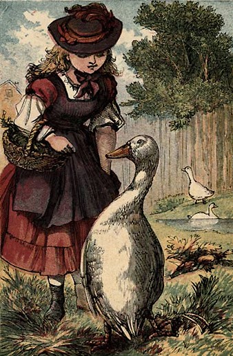
Goosey goosey gander
Goosey goosey gander,
Whither shall I wander?
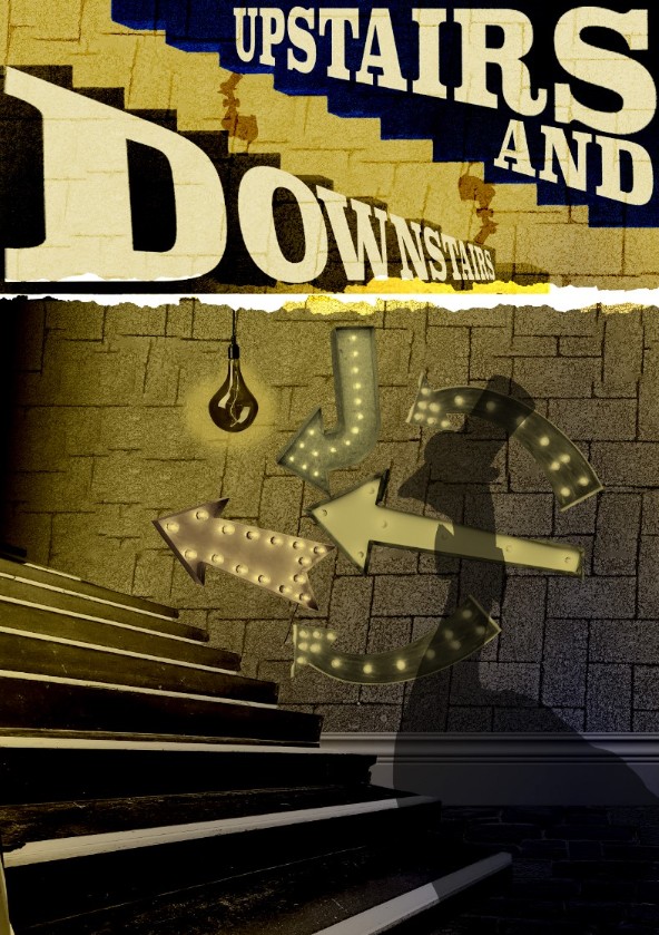
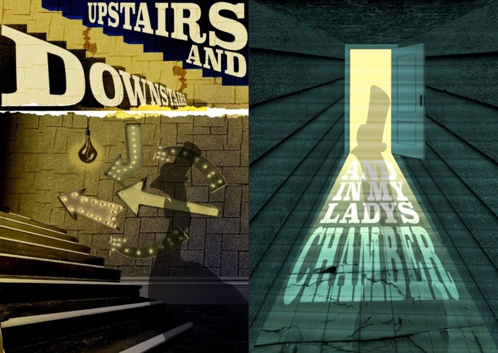
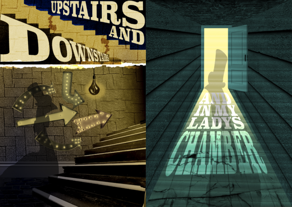
Upstairs and downstairs
And in my lady’s chamber.
There I met an old man
Who wouldn’t say his prayers,
So I took him by his left leg
And threw him down the stairs.
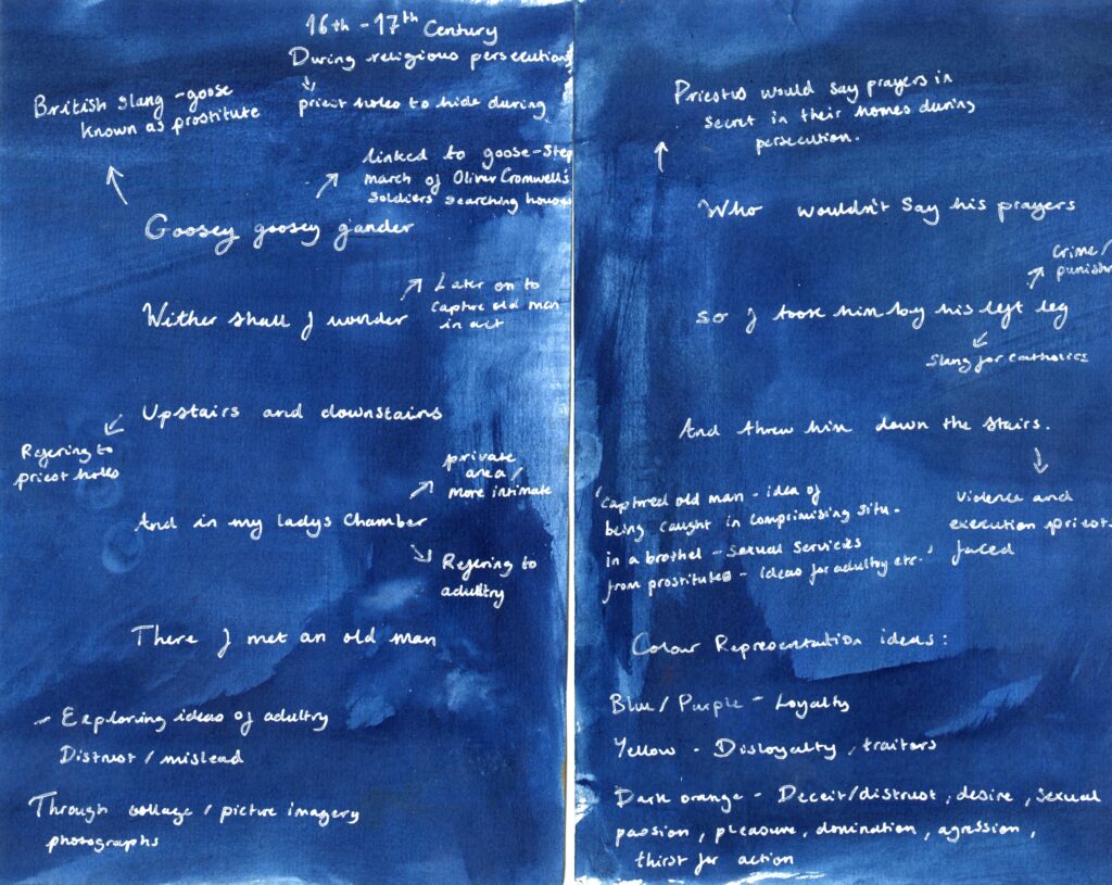
Goosey Goosey Gander
- Reference to 16th/17th Century religious persecution of priests
- During reigns of King Henry and his children Catholic priests were hunted and persecuted by protestants
- Priests often hid out in secret rooms called ‘Priest holes’
- Refusal of those reciting new prayers of Protestant mandated book were marked as a Catholic
- Left leg was used a derogatory term for Catholics at the time
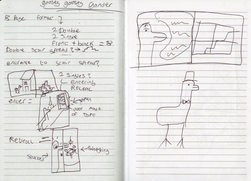
Planning:
Brief analysis of what the nursery rhyme is about and adding our own ideas and spin to them.
Looked at what colours to use throughout the comic so it had a theme throughout.
Looking at different variations of ideas for more imagery of how we could lay it out.
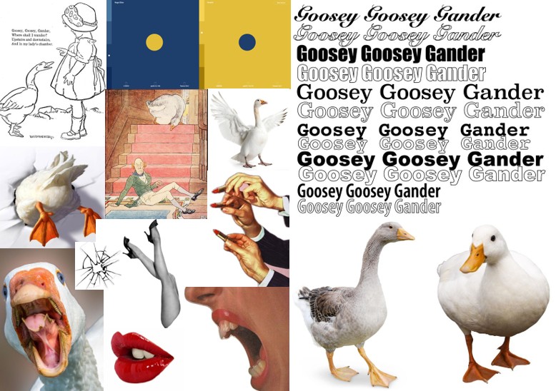
Some quick imagery that we wanted to convey across and possibly images to use withing the comic.
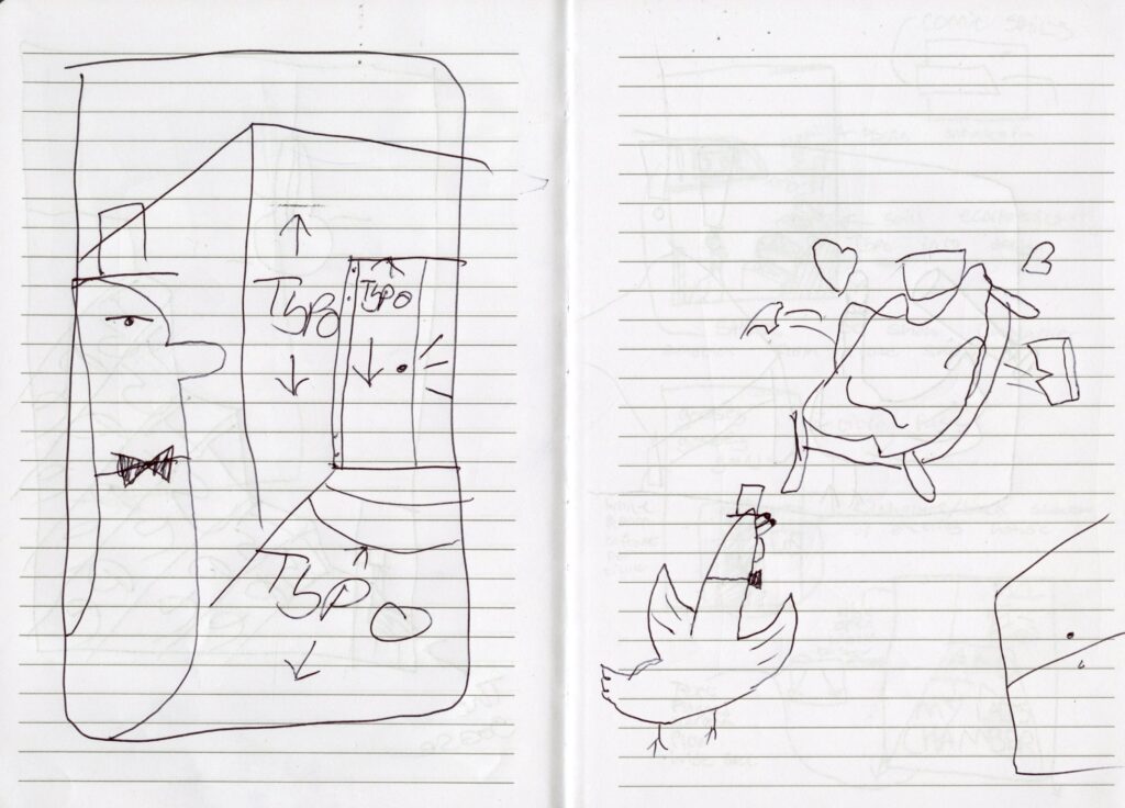
Thumbnails:
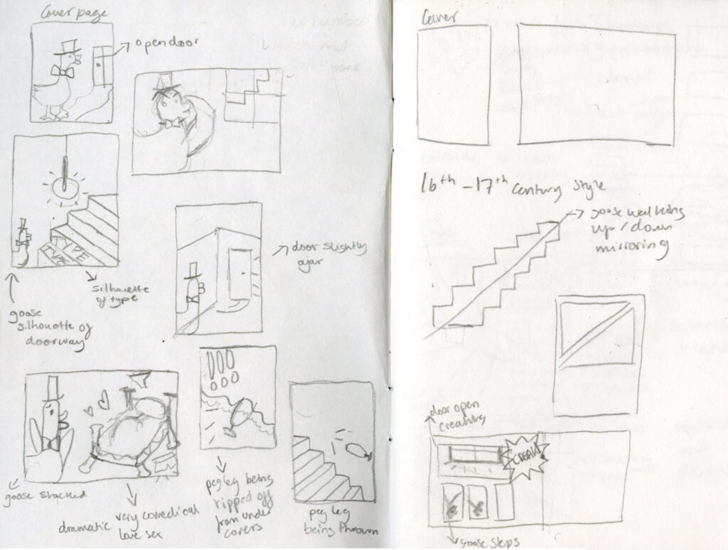
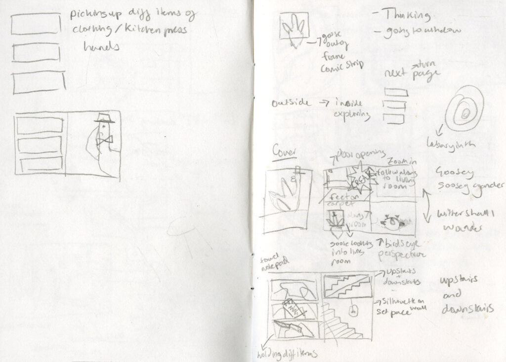
Few thumbnail sketches, ideas for composition.
We wanted to make the goose into a character and therefore why we chose to add a top hat and bow tie to him.
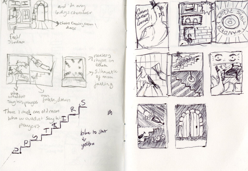
Below are Jack’s sketches, as we worked in collaboration to compare our ideas and combine them together to one so that the comic flows as one idea rather than two.
Few quick ideas of possible imagery and placement of type.
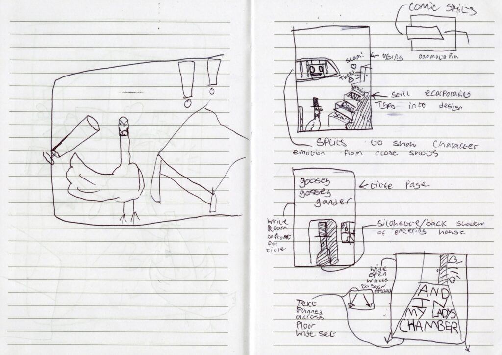
We wanted to create a comical twist into or story and interpret it in a different way to what the original story is about, which is about the religious persecution of priests during the 16th and 17th Century.
Photographs/Sources:
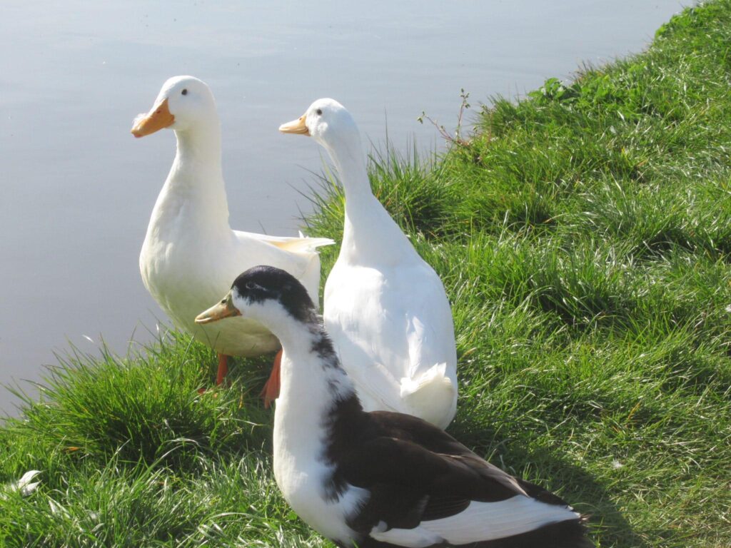
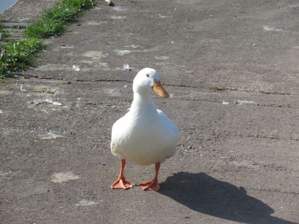
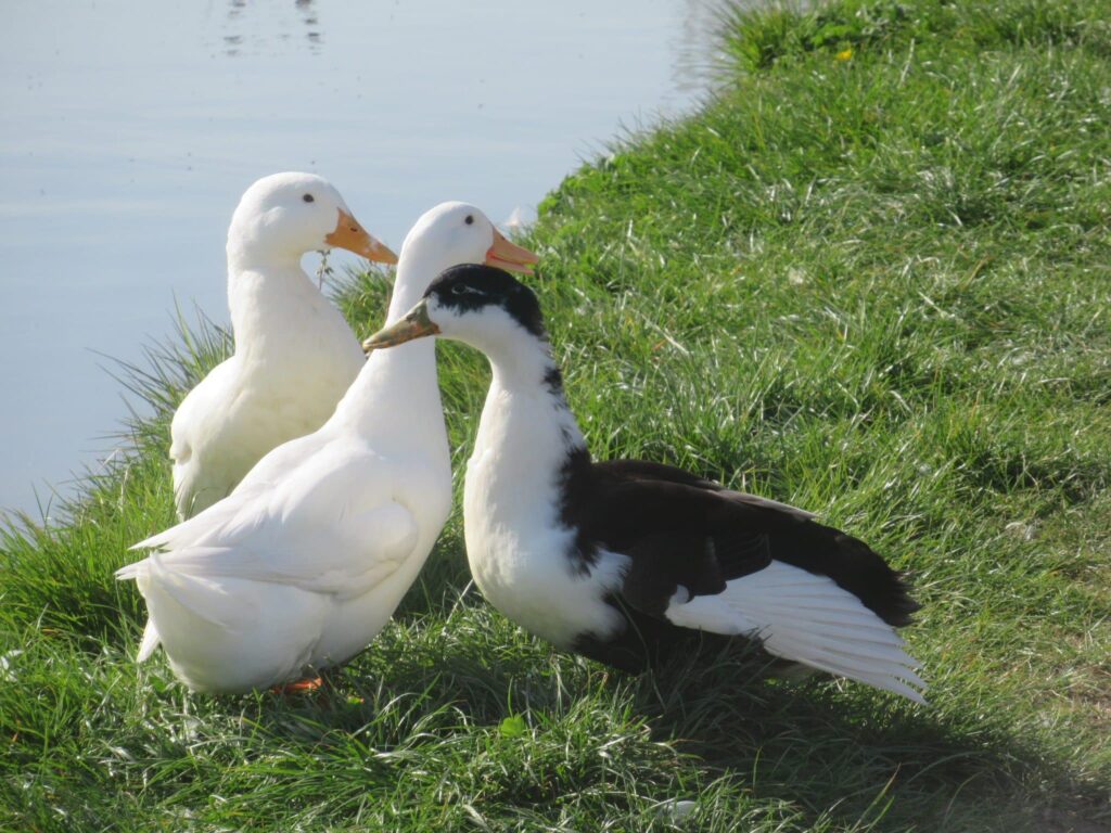
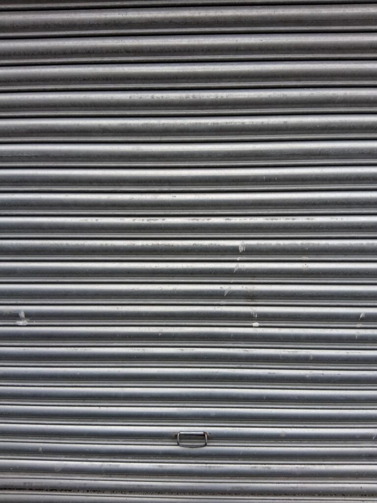
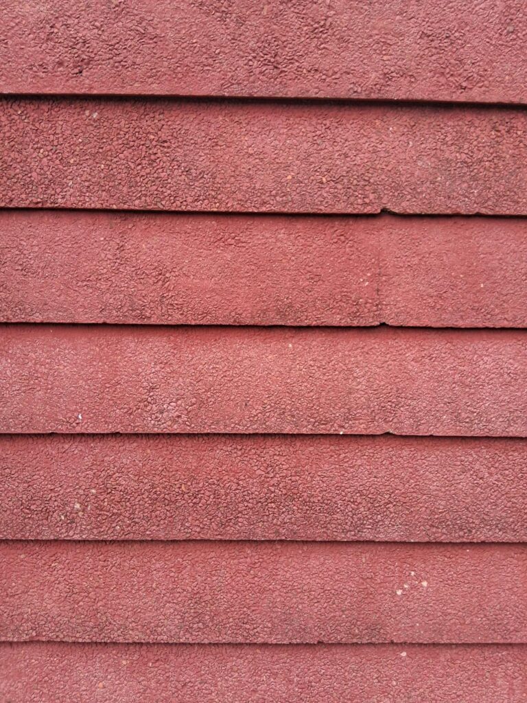
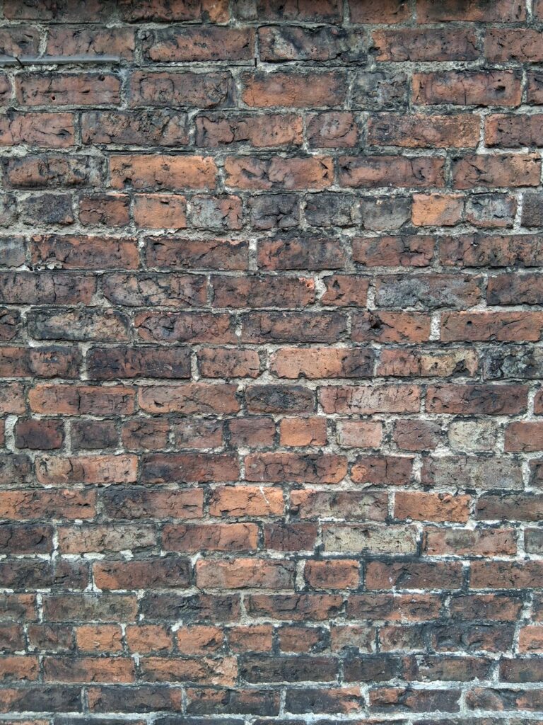
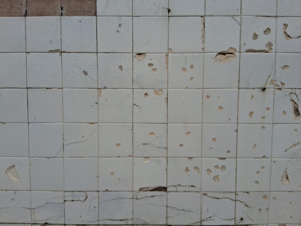
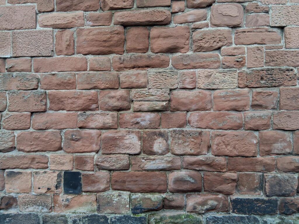
Primary photographs for possible use in the comic zine. Different textures.
We took our primary images first before beginning anything, mostly different textures that would be included.
Development:
It was hard to transfer some of the ideas from paper to digital to express what we wanted. We mainly used Adobe Photoshop, where we used the gradient mapping tool to colour the images.
Feedback:
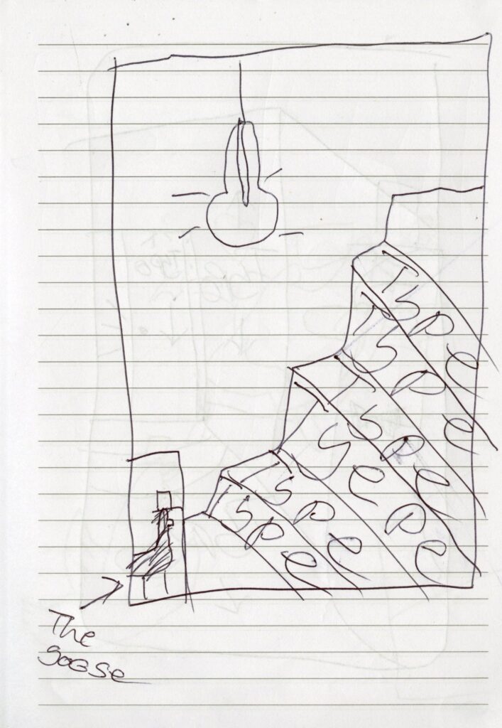
The book didn’t flow as the stairs were leading the viewers eye out of the book rather than to the next page, so we ended up flipping the stairs so that the page would flow together.
Final Outcome
Final piece produced for 8 page comic with a twist to it, using graphic elements.