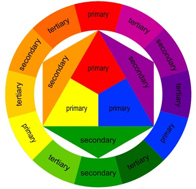
Colour Theory
Task 1:
Through visuals explore designs that capture and celebrate the essence of the music, with given colour restrictions. With one of the designs being abstract, using colour, shape and design to communicate the nature of the music.
Task 2:
Using only letterforms, we want you to create six final digital typographic designs, each should be in a portrait (upright) format and be A6 in size.
Task 1:
Design Parameters
Size: LP covers are 314mm X 314mm although you may work to
a smaller scale if desired.
Cover text: Artist and album title.
Means of execution: analogue or digital, abstract or figurative.
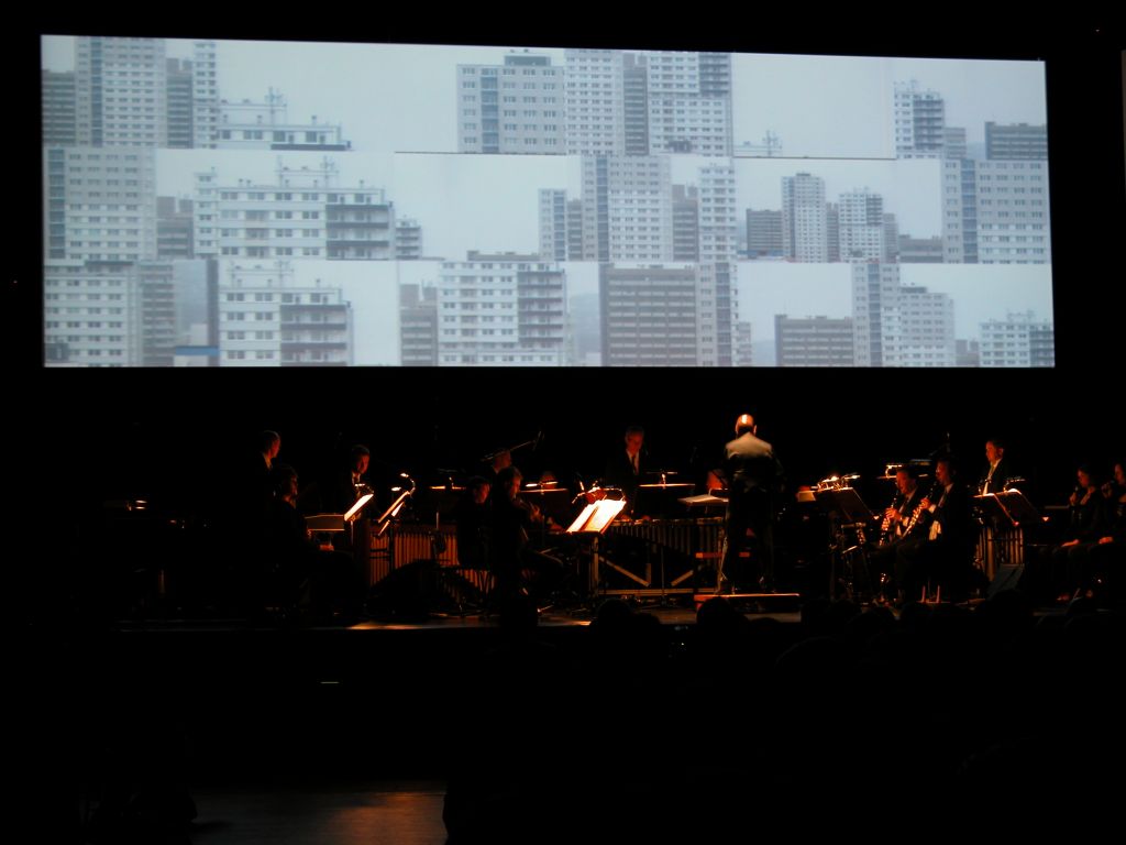
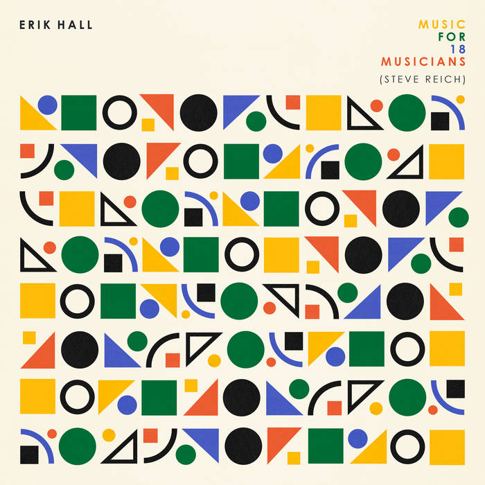
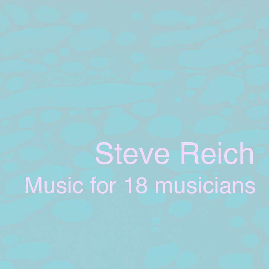
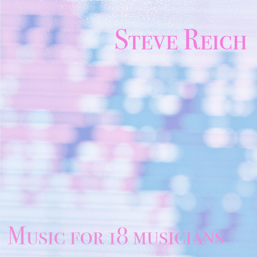
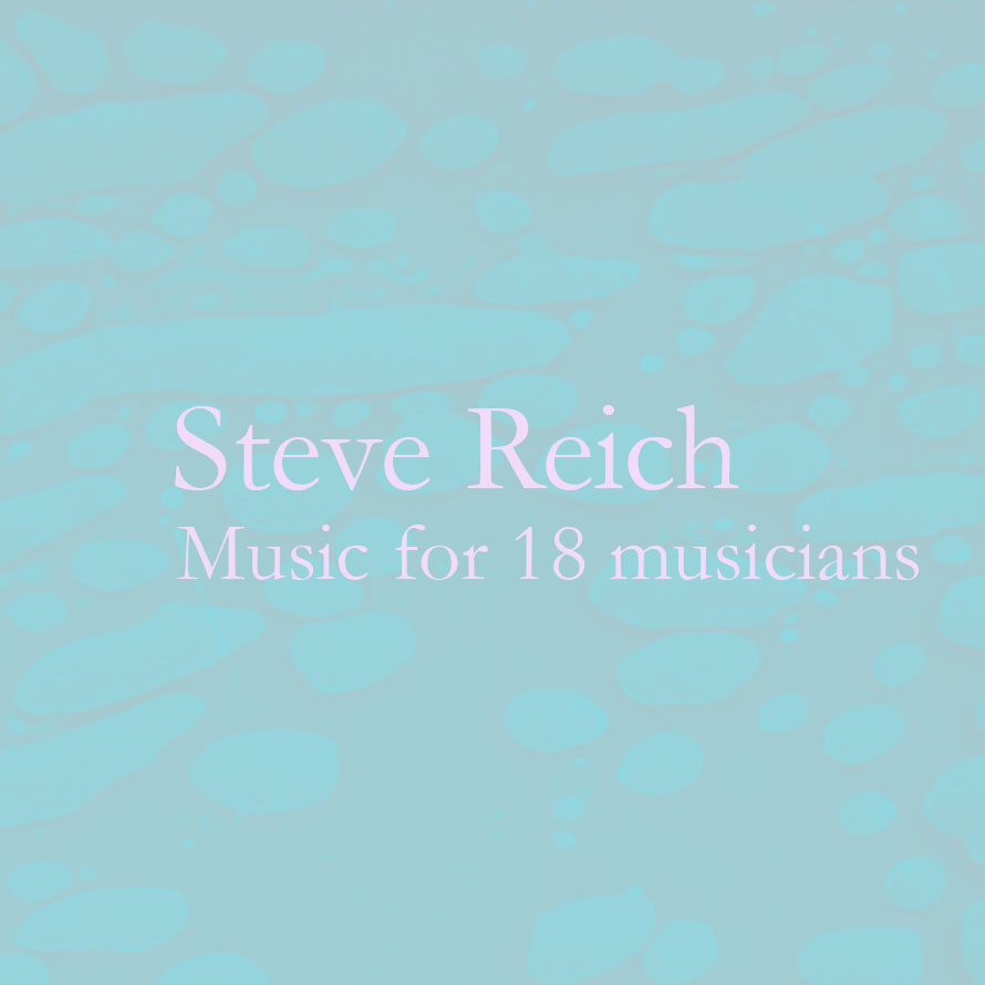
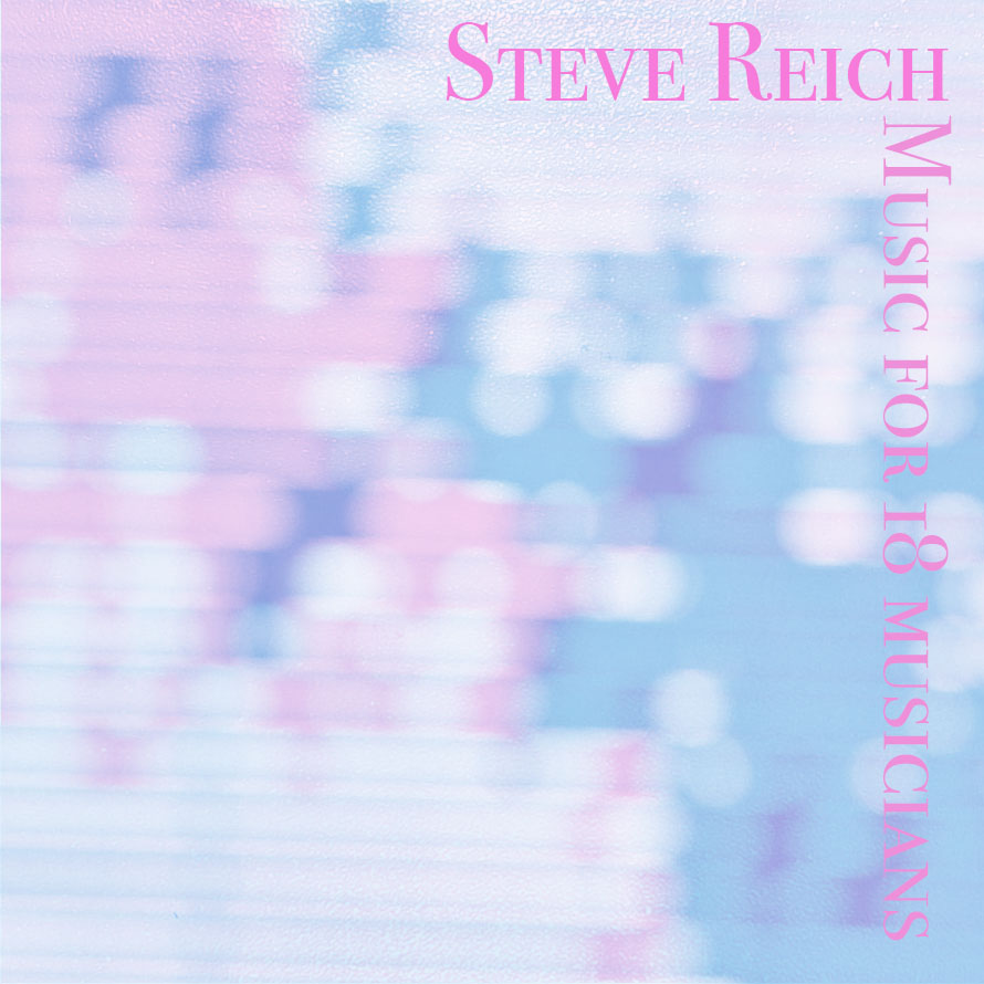
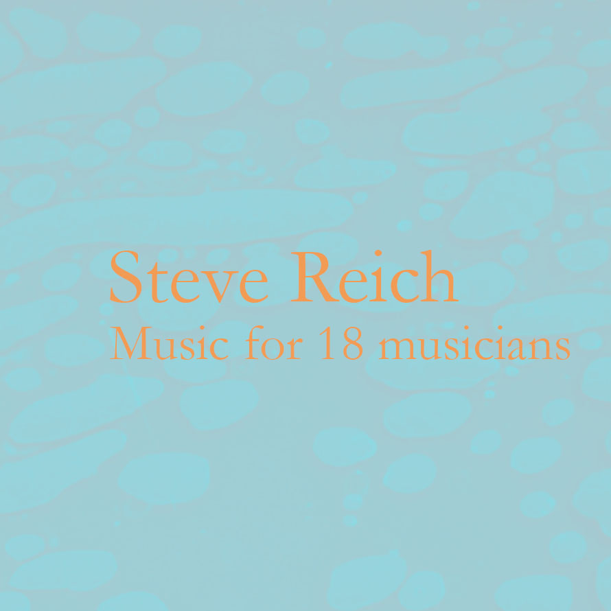
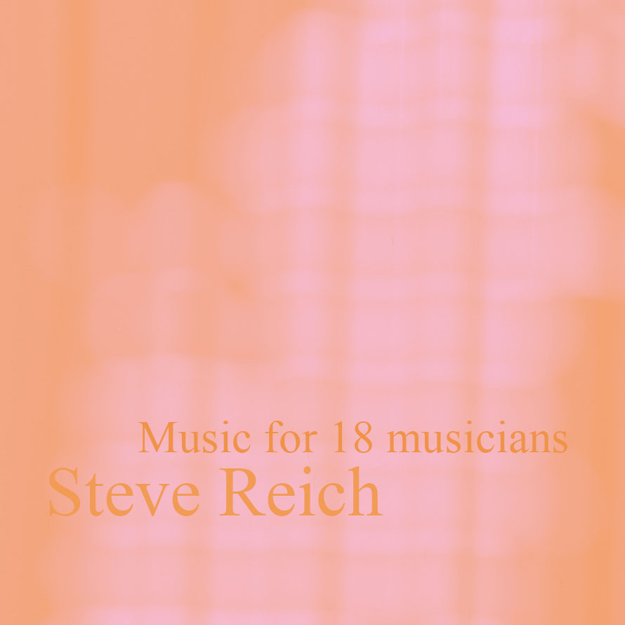
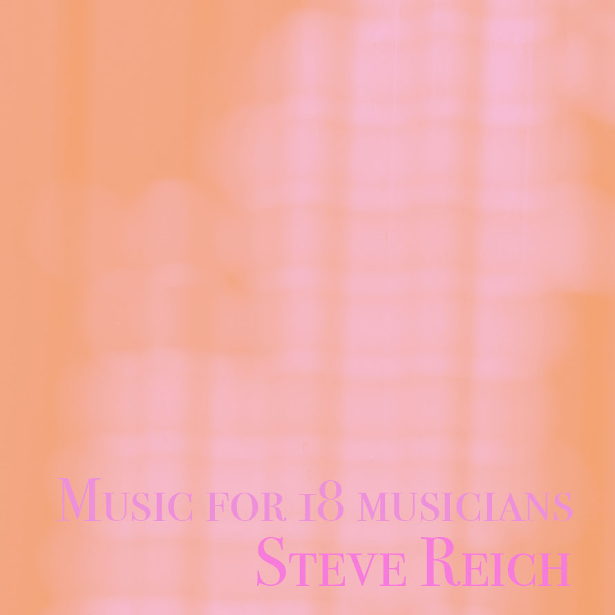
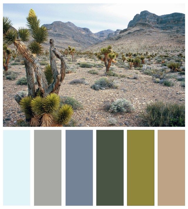
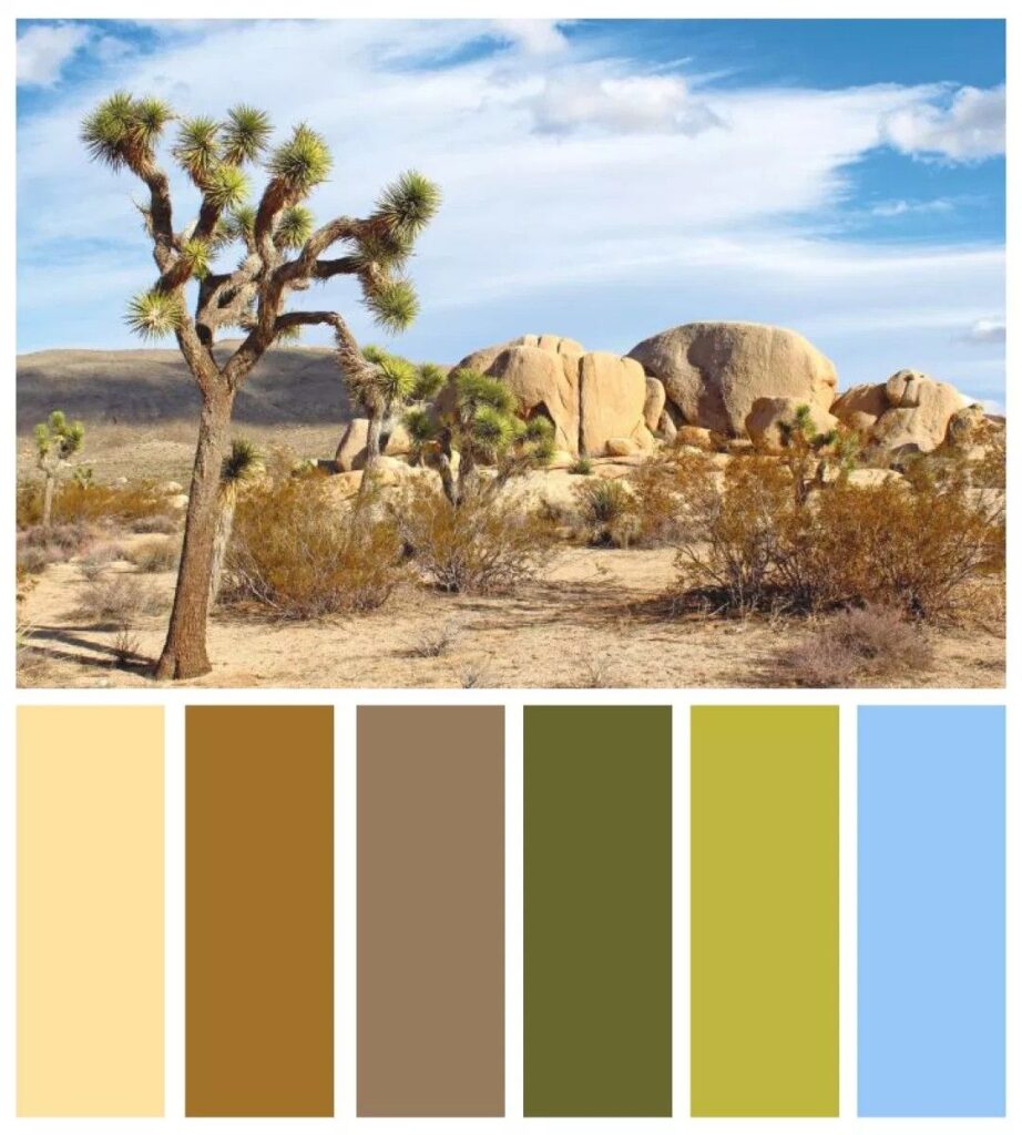
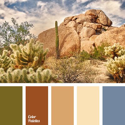
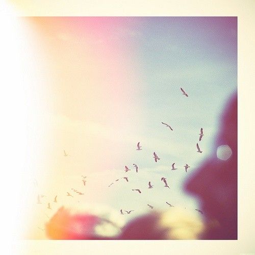
Steve Reich: Music for 18 musicians
Some influential ideas from studying Gamelan and African drumming. Involving repeating patterns, pulsing rhythms and shifting harmonies.
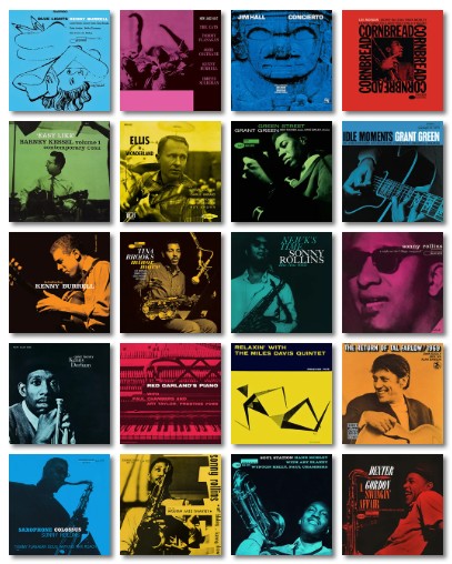
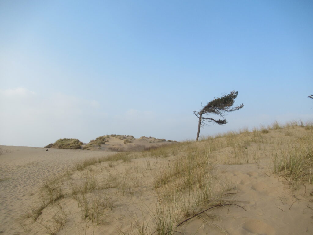
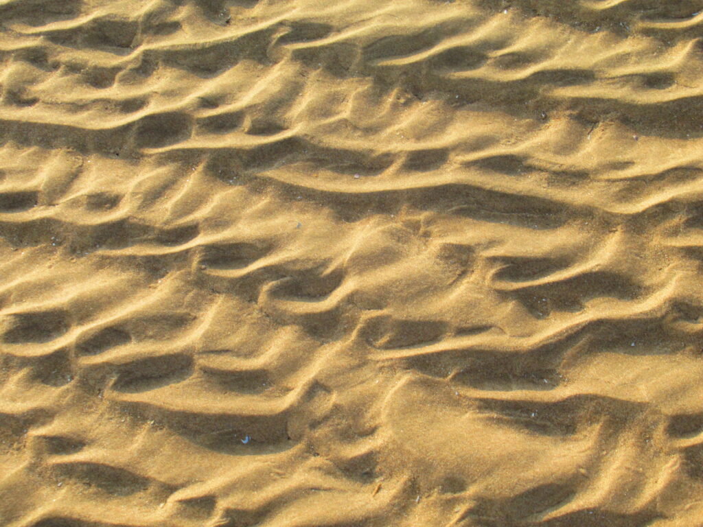
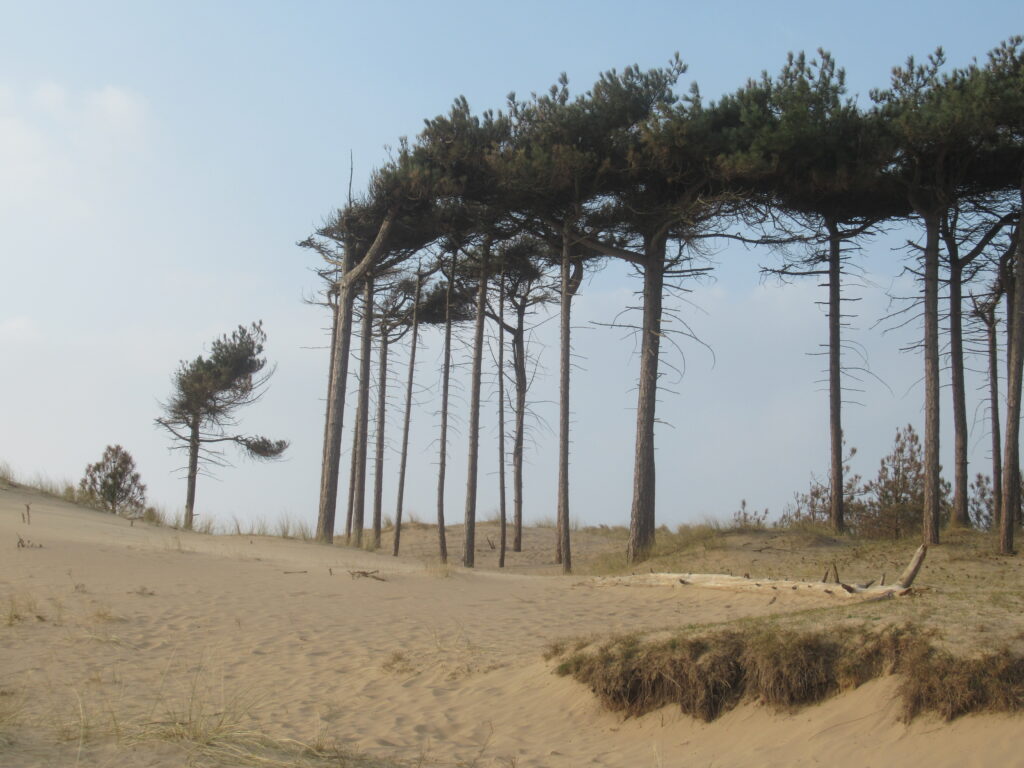
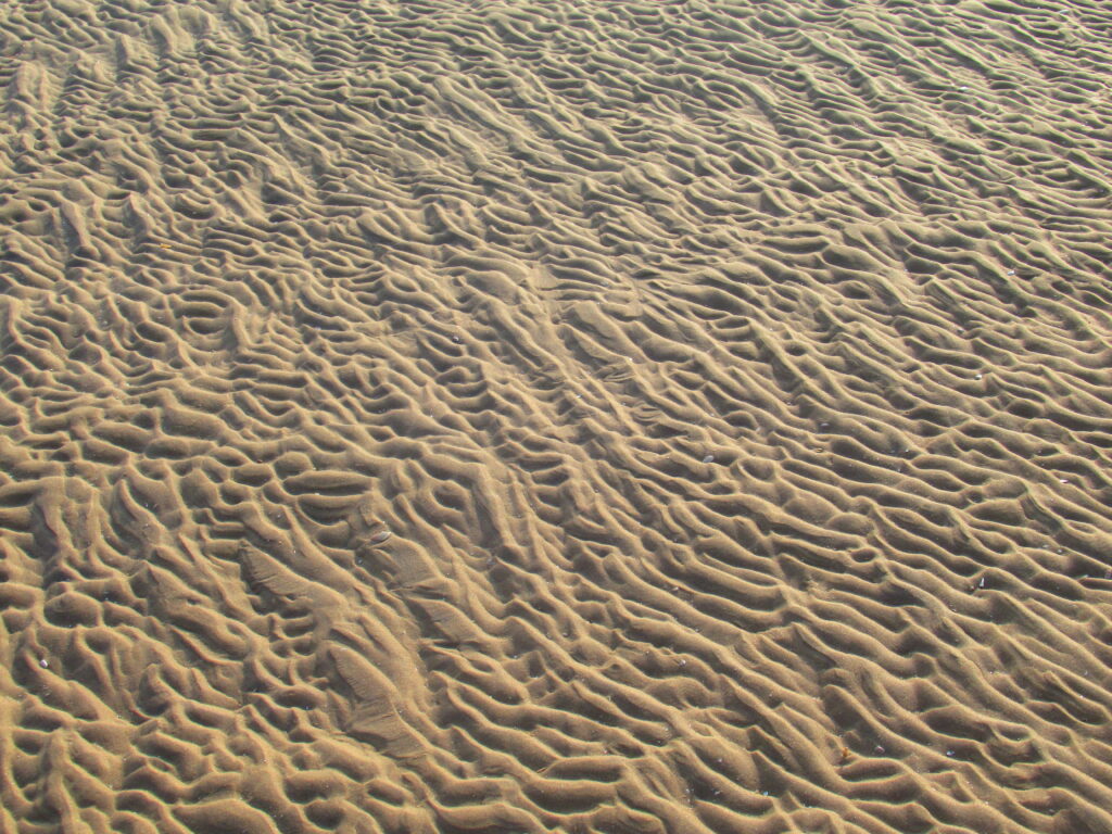
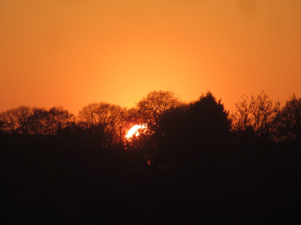
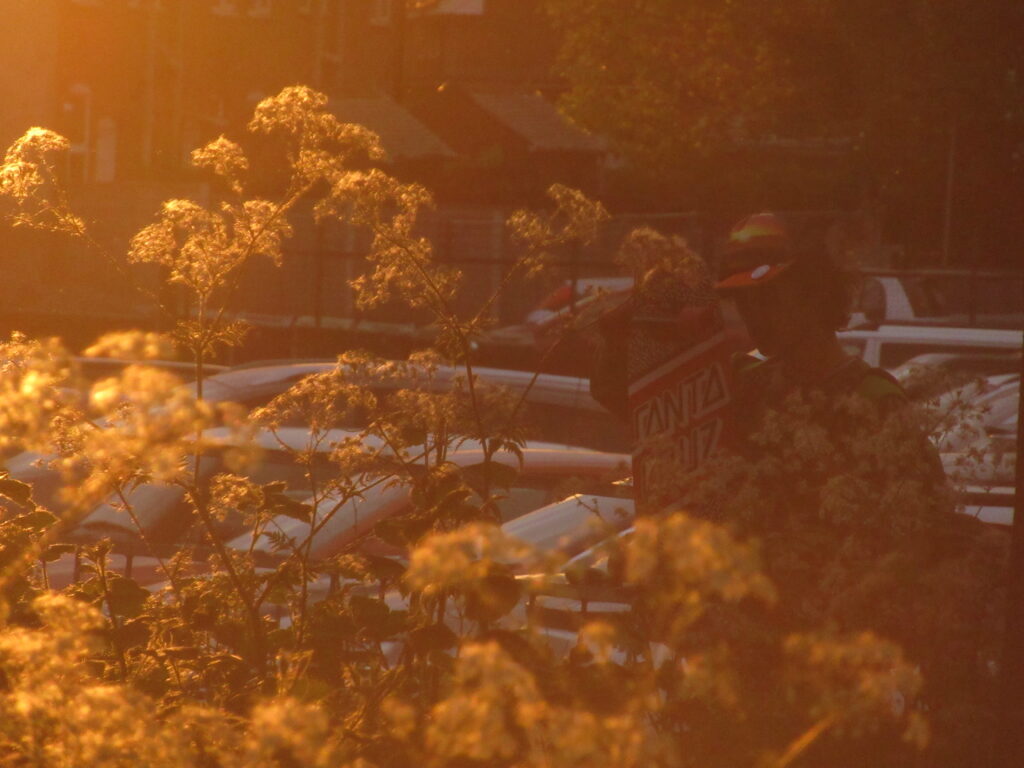
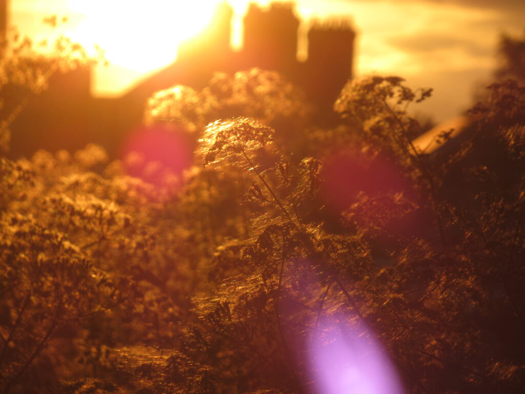
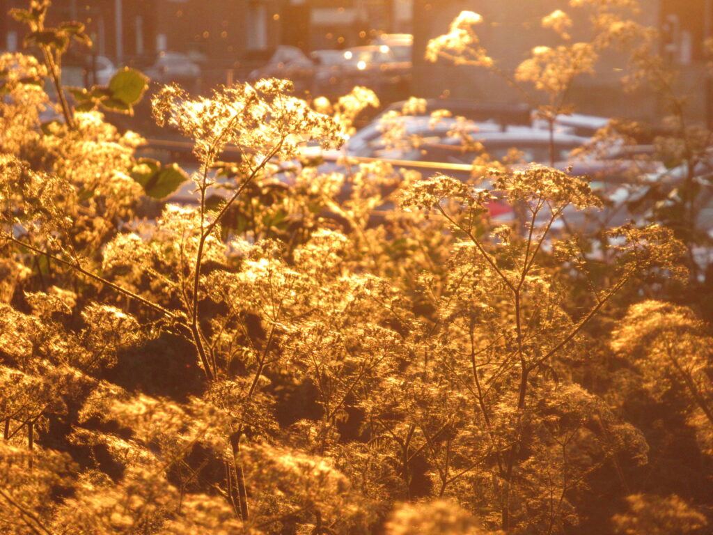
Visuals
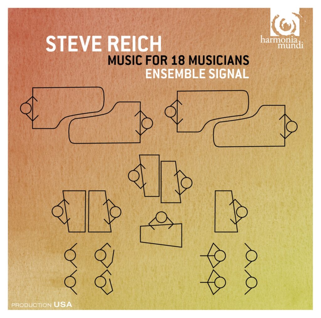
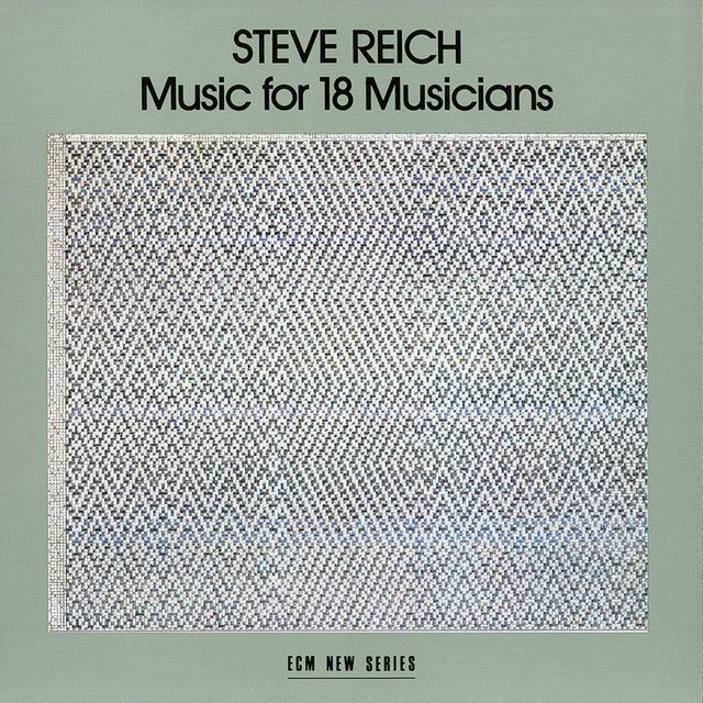
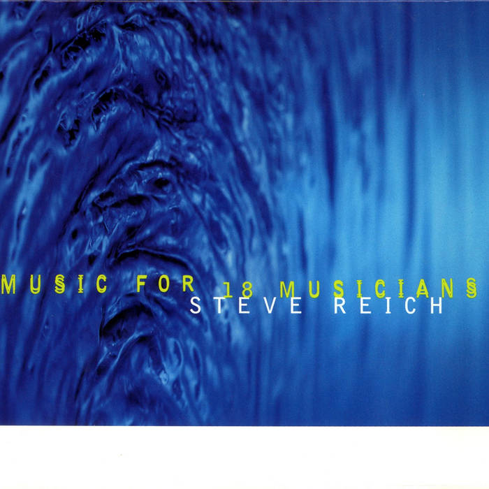
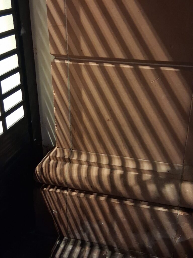

Just images I took that I thought would work well with this. Above some visuals of some of the albums by Reich. I will be using some of this as to where I place my text.
Thumbnails
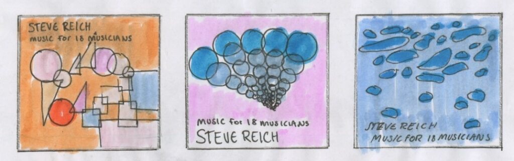
Development
I was not quite as happy with these as I do not think the colours matched and worked as well.

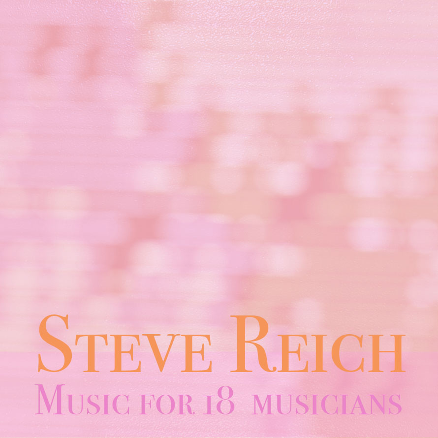
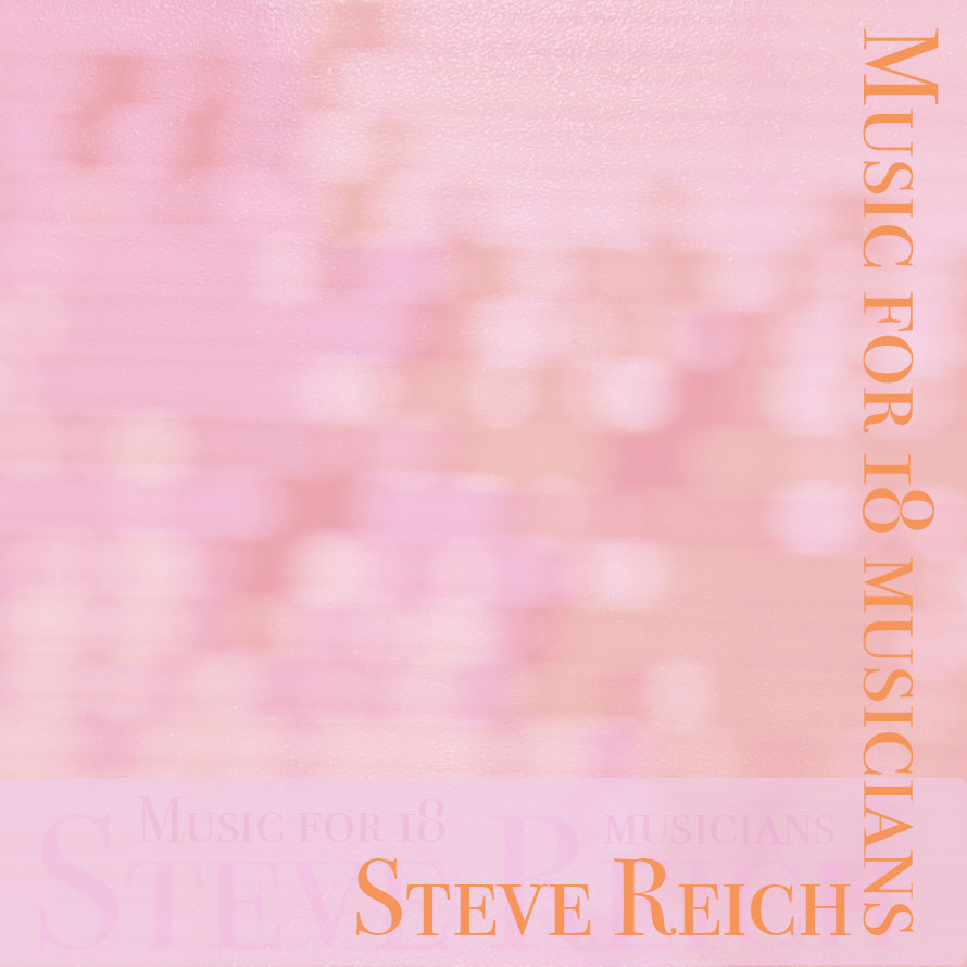
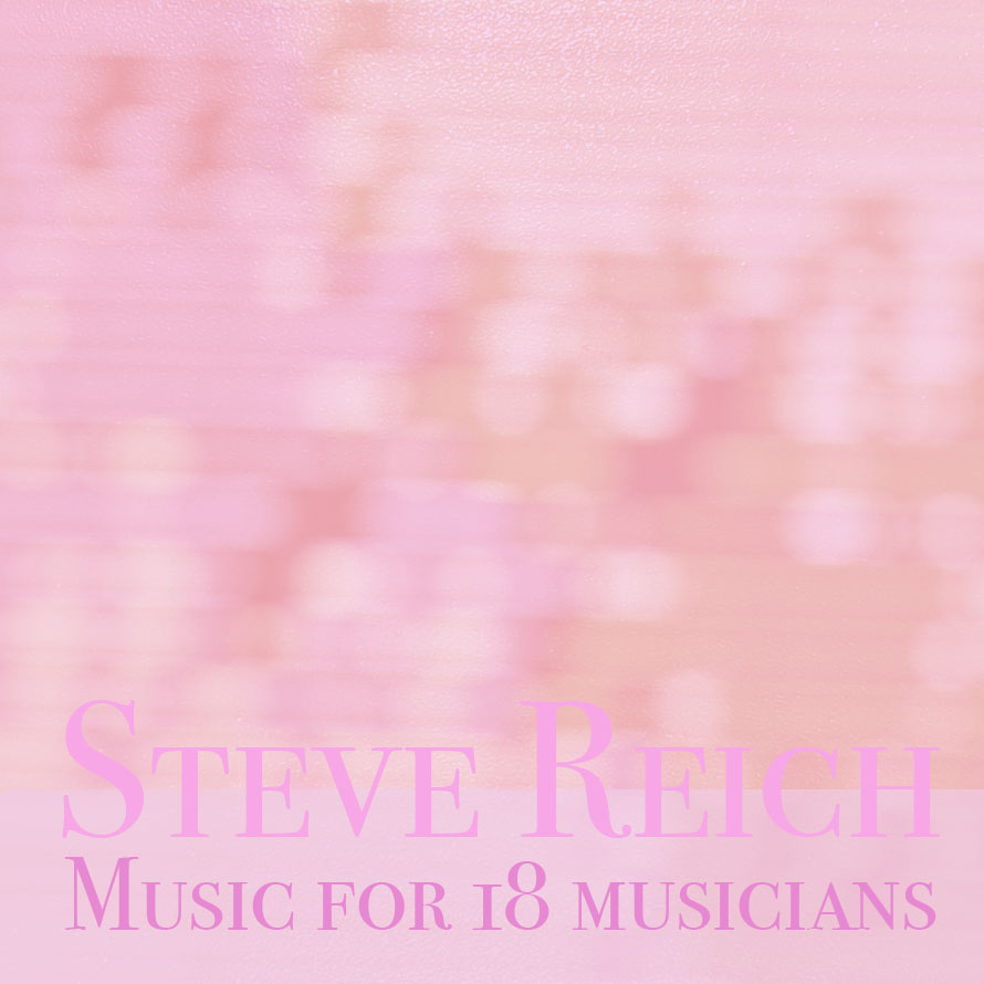
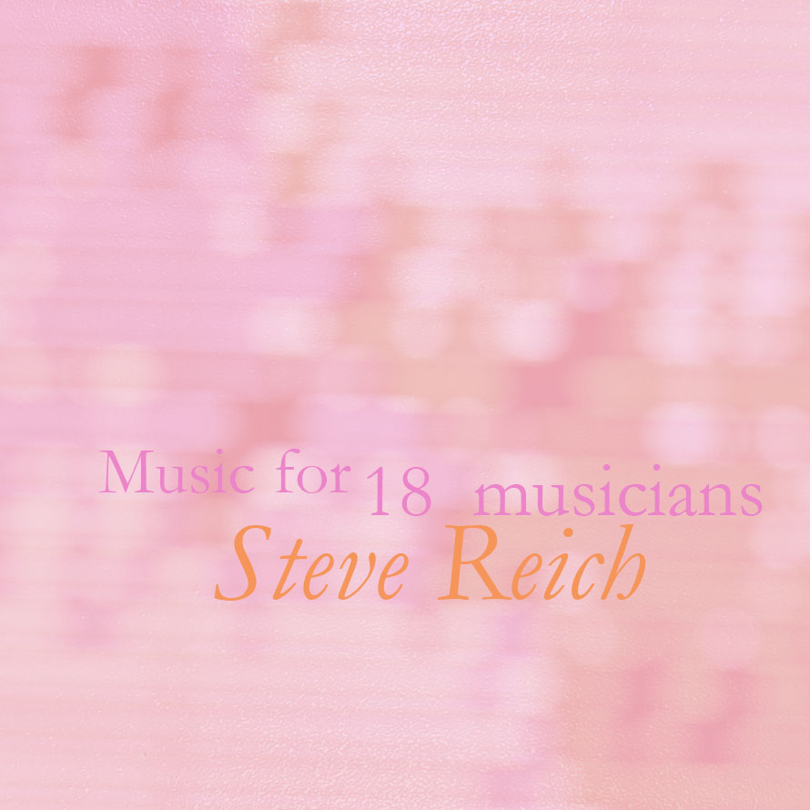
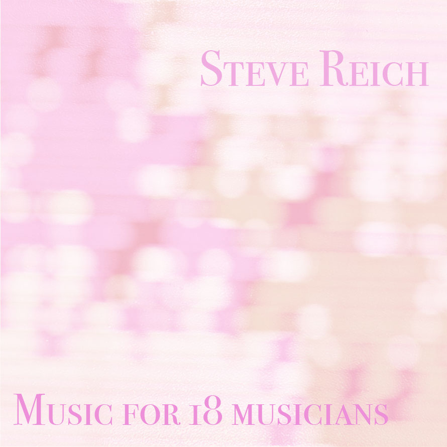
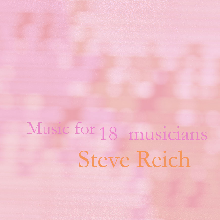
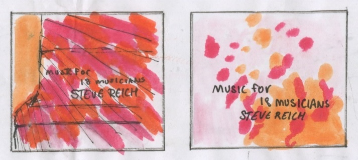
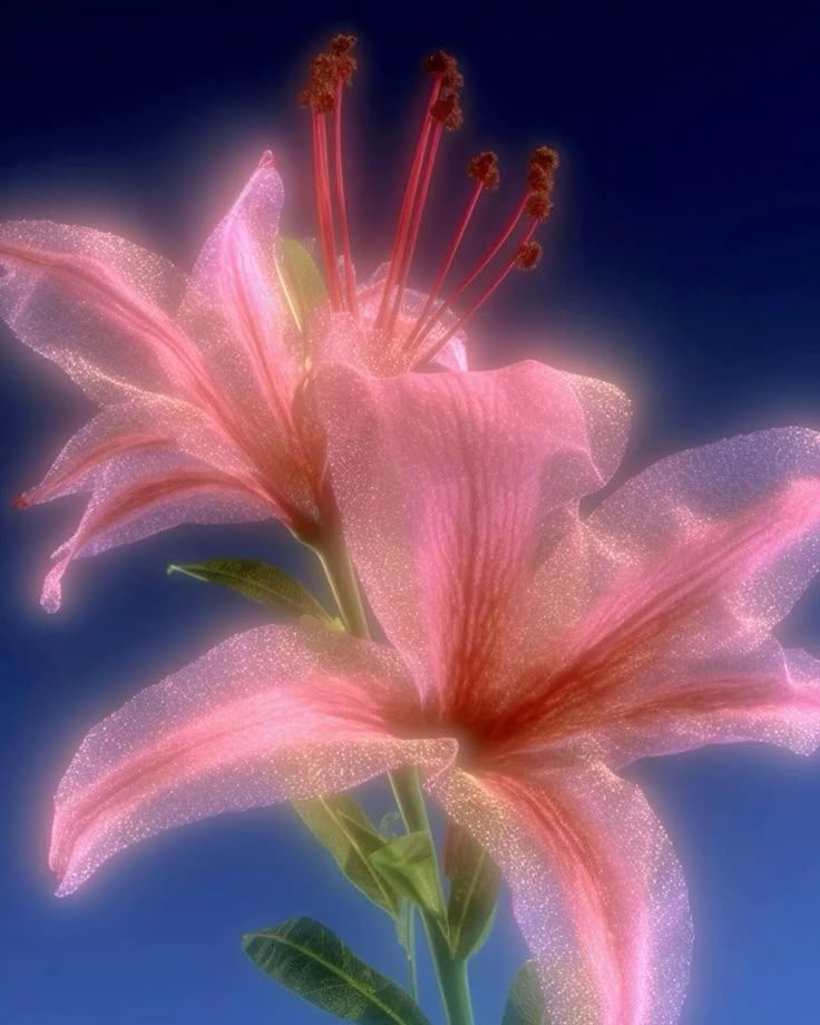
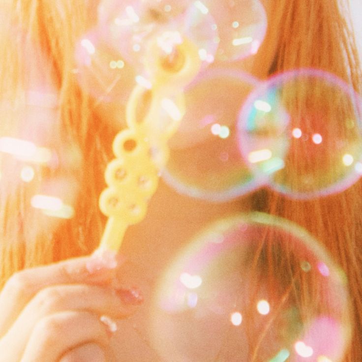
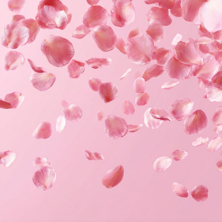
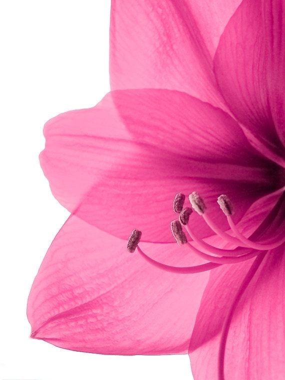
I played around with a different variations of where the type was placed and with patterns. I originally went with blue and pink but I prefer the pink and orange pastels as they are more harmonious and work well together. As well as using two different colour fonts to establish some hierarchy within the album name and artist.
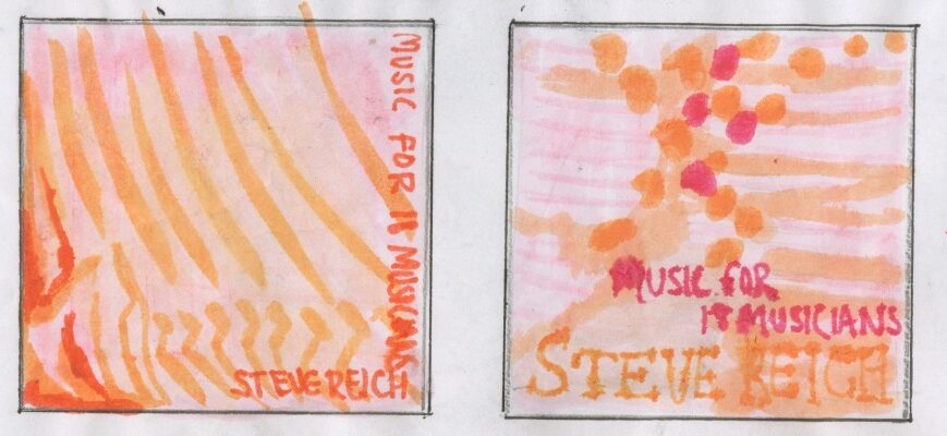
Outcome (Pastel colours)
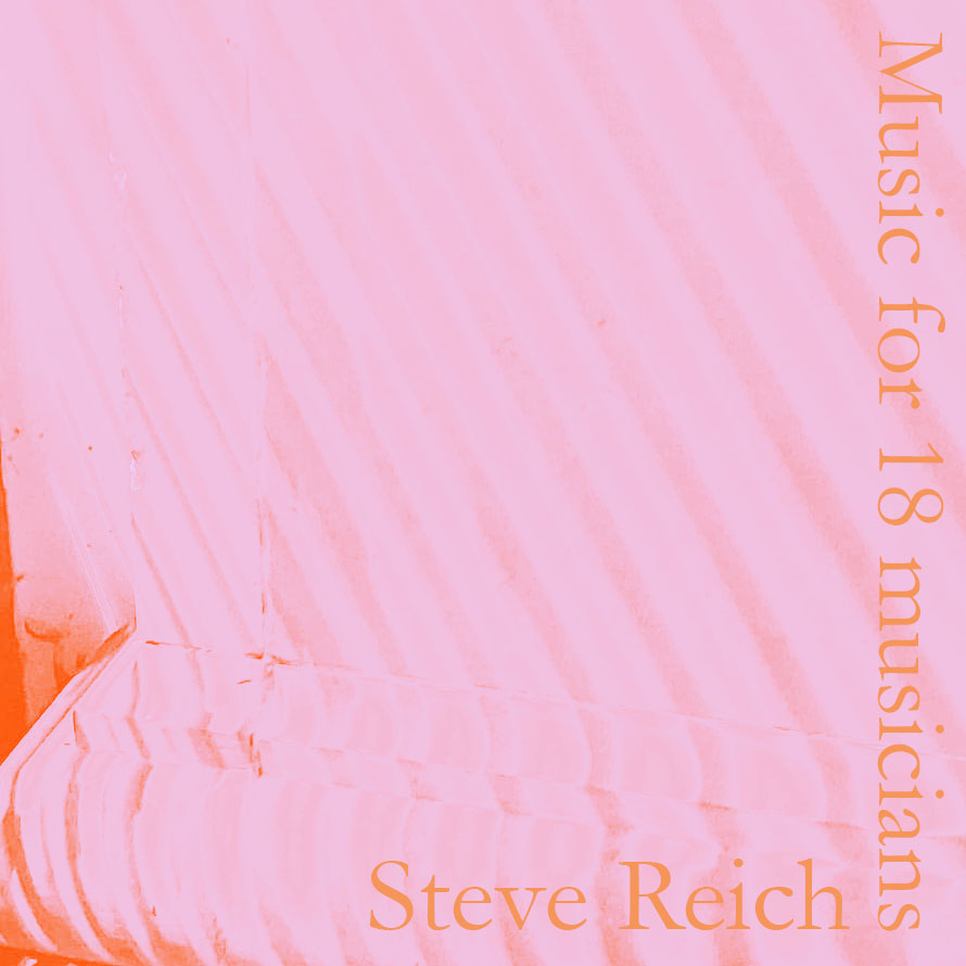
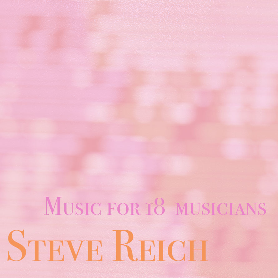
These are the two final ones that I think work well and are refined within the use of colour (pastels), using different photographical imagery. I made these on Photoshop editing the images and overlaying them to create this effect.
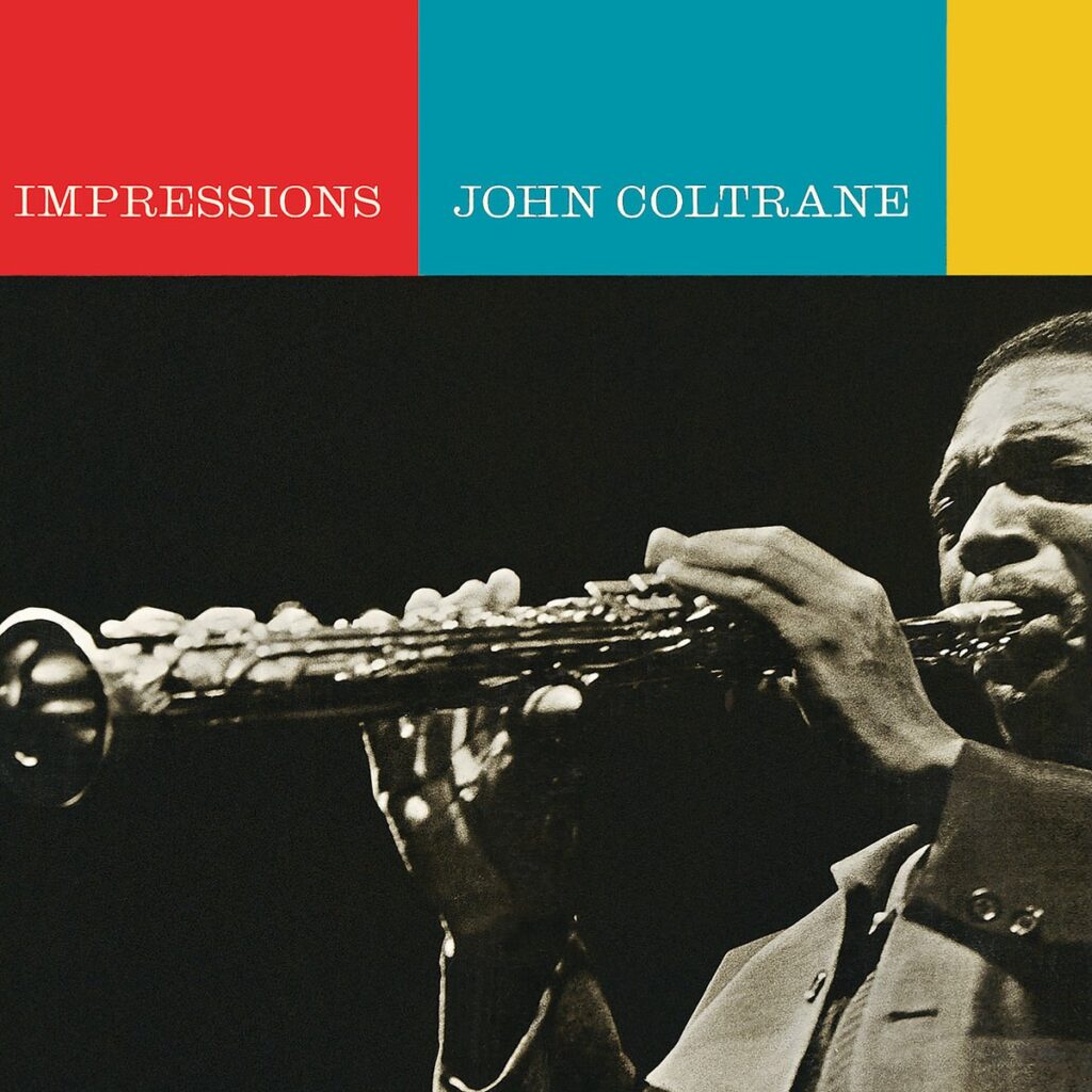
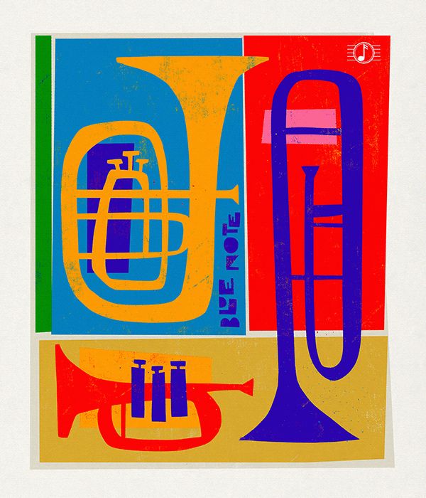
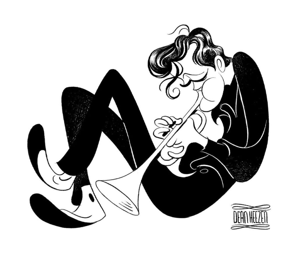
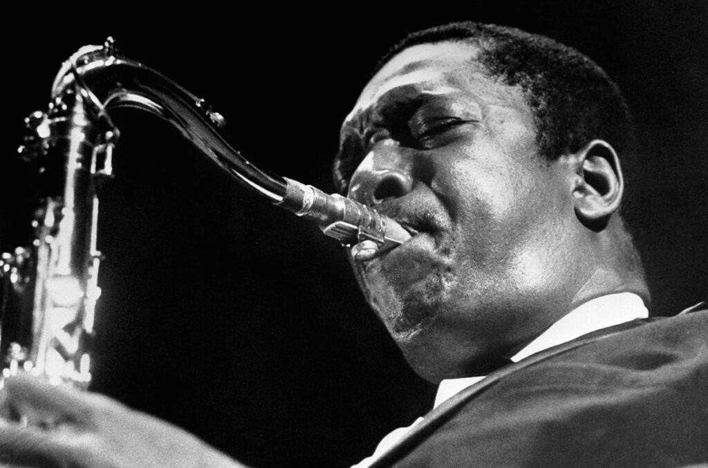
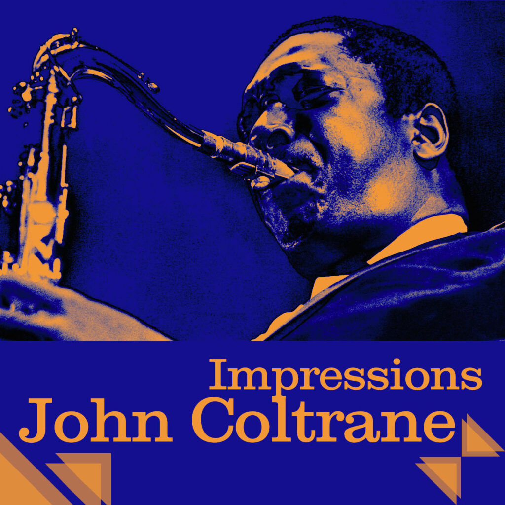
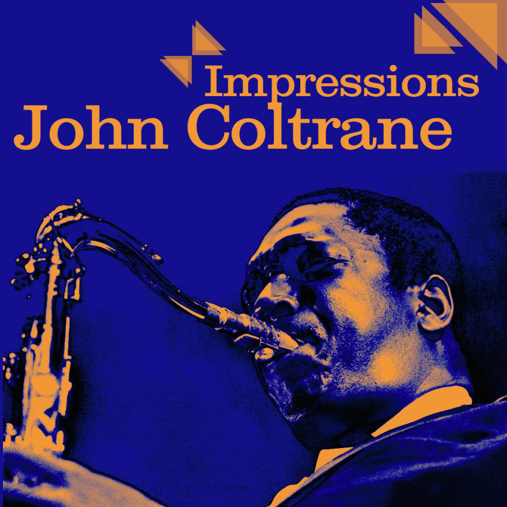
John Coltrane: Impressions
Evolving music from the early 1960s from hardbop into a more experimental spiritual jazz, delving deeper into a more modal jazz, a style that focuses on scales, rather than traditional chord progressions.
https://jazzomat.hfm-weimar.de/dbformat/synopsis/solo225.html
Visuals
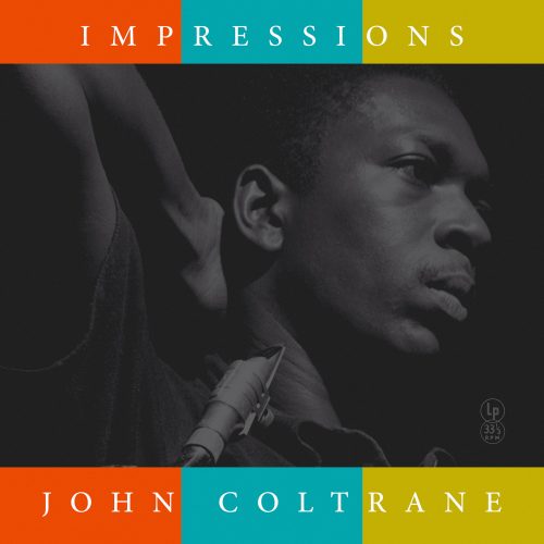
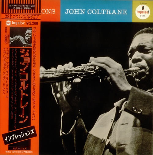
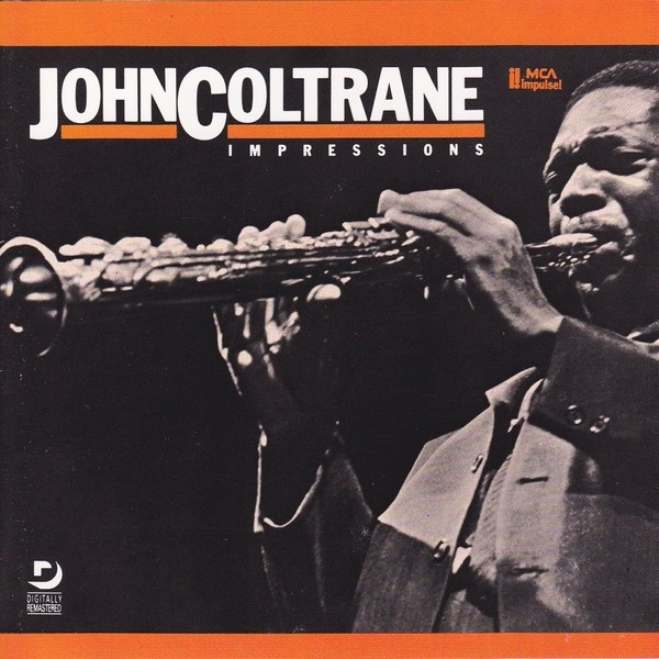
Thumbnails
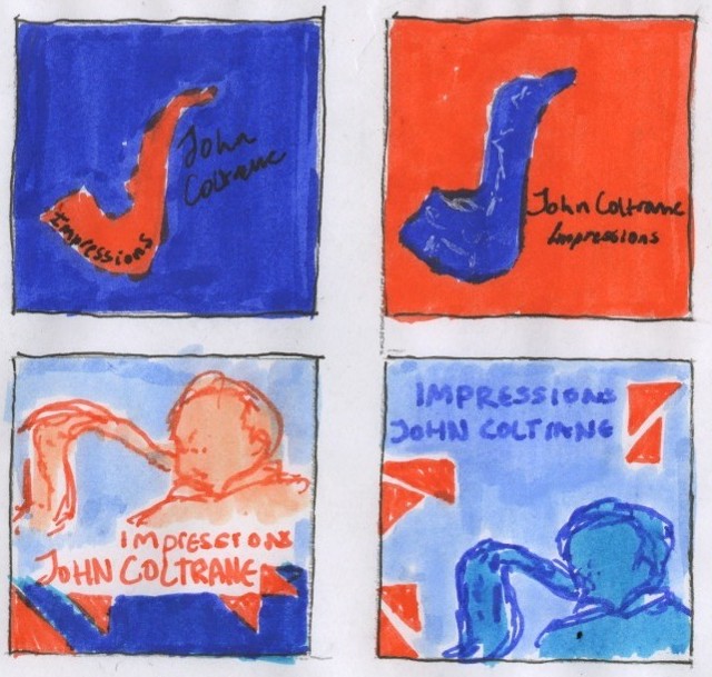
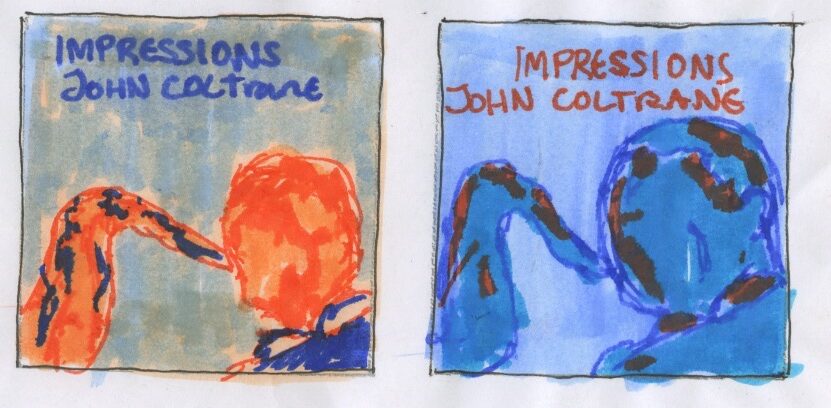
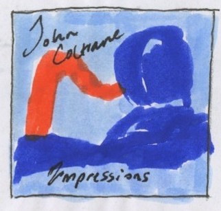
Development
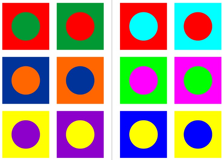
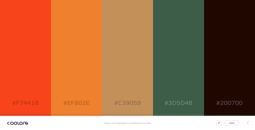
A few experiments using colour range and using complimentary colours.
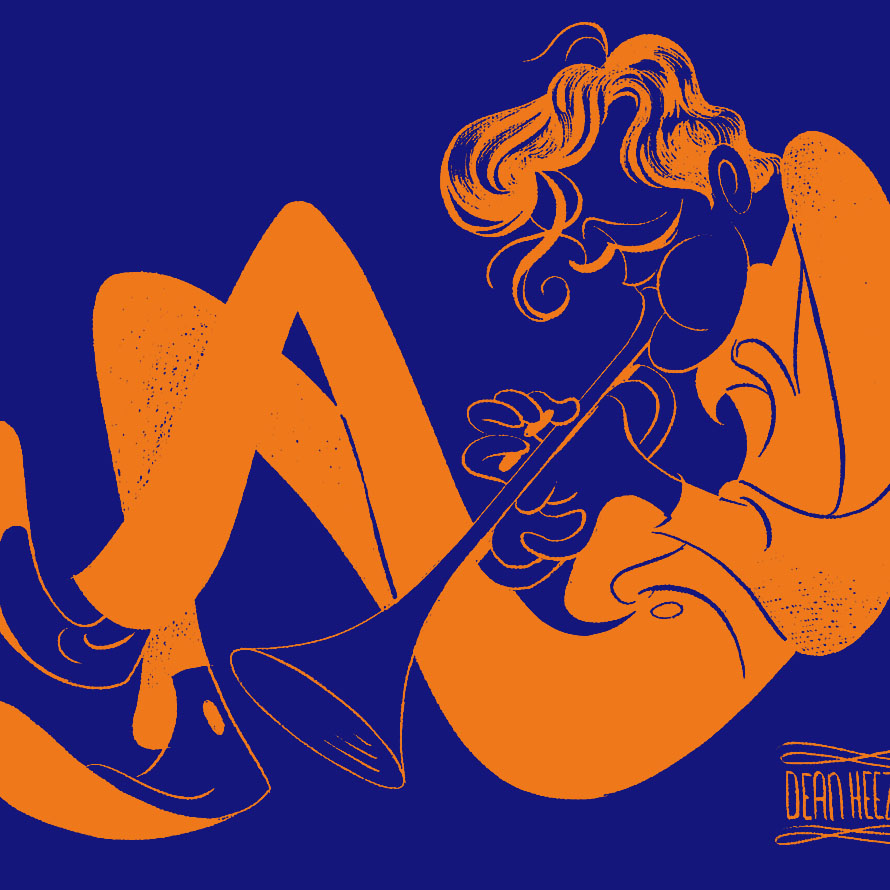
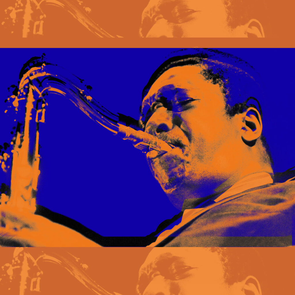
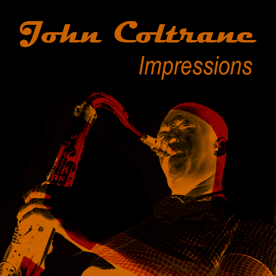
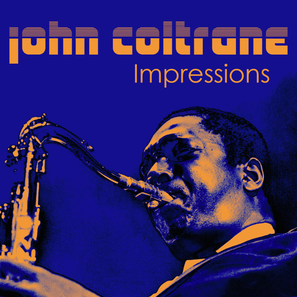
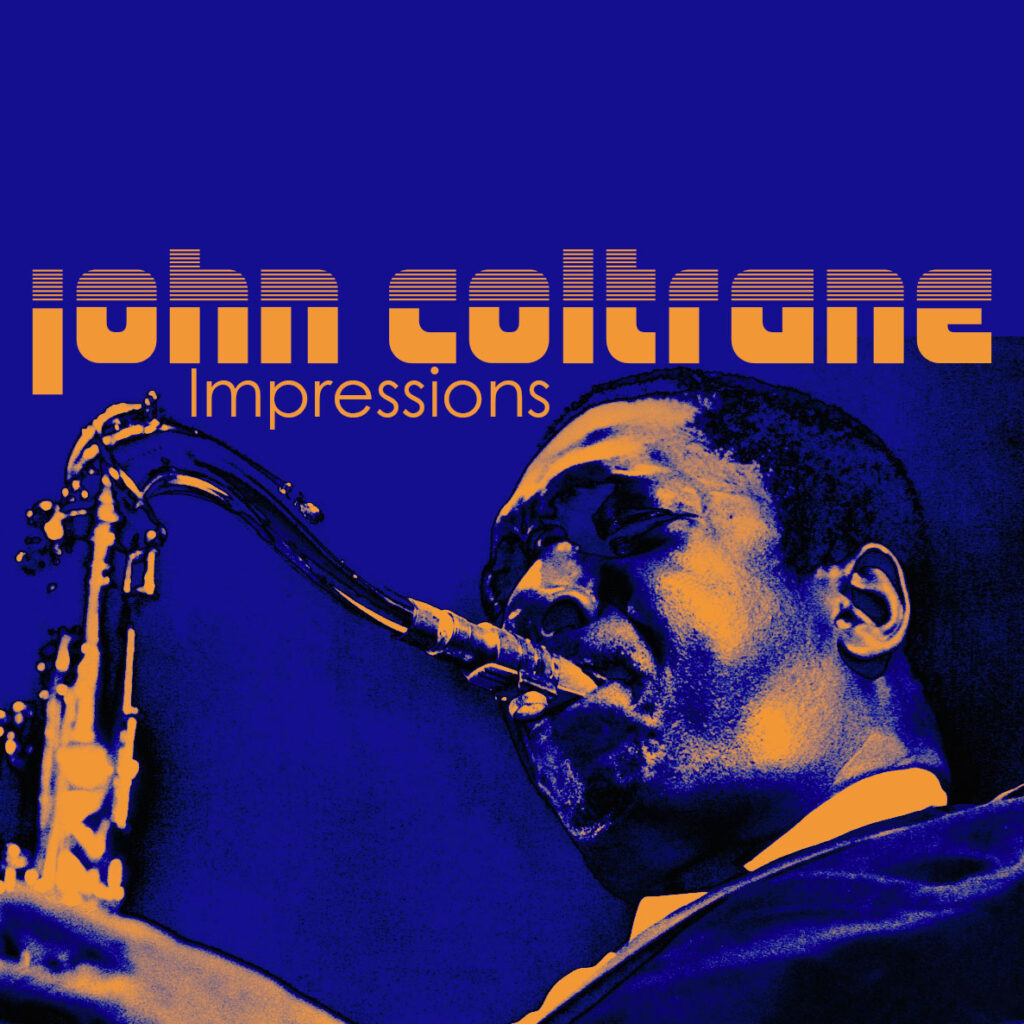
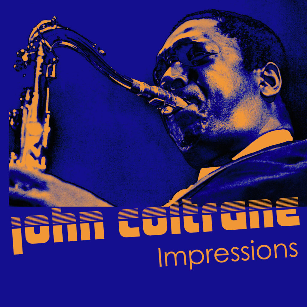
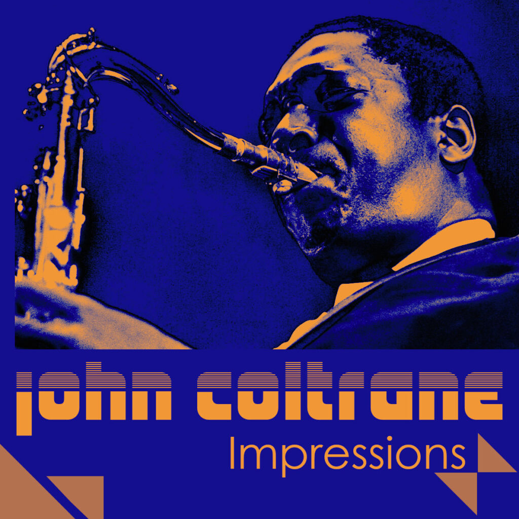
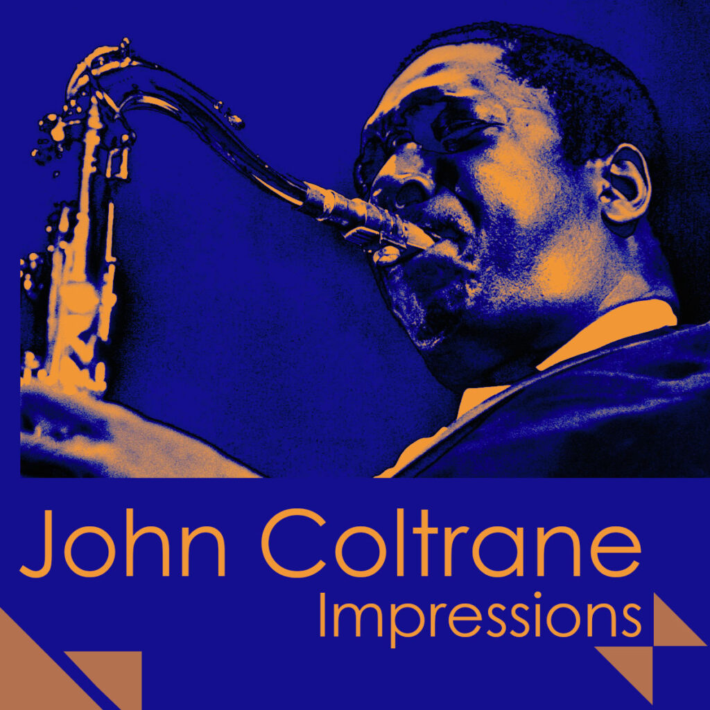
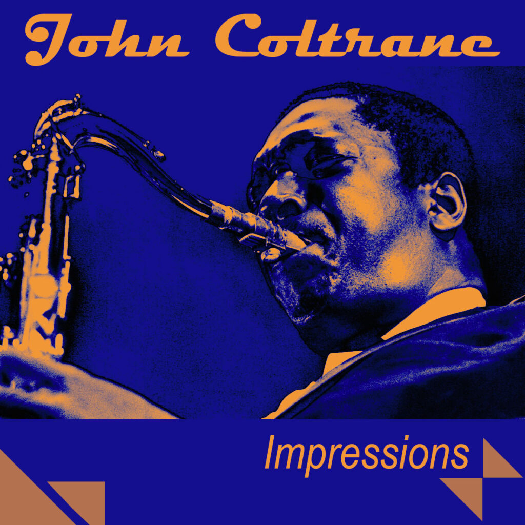
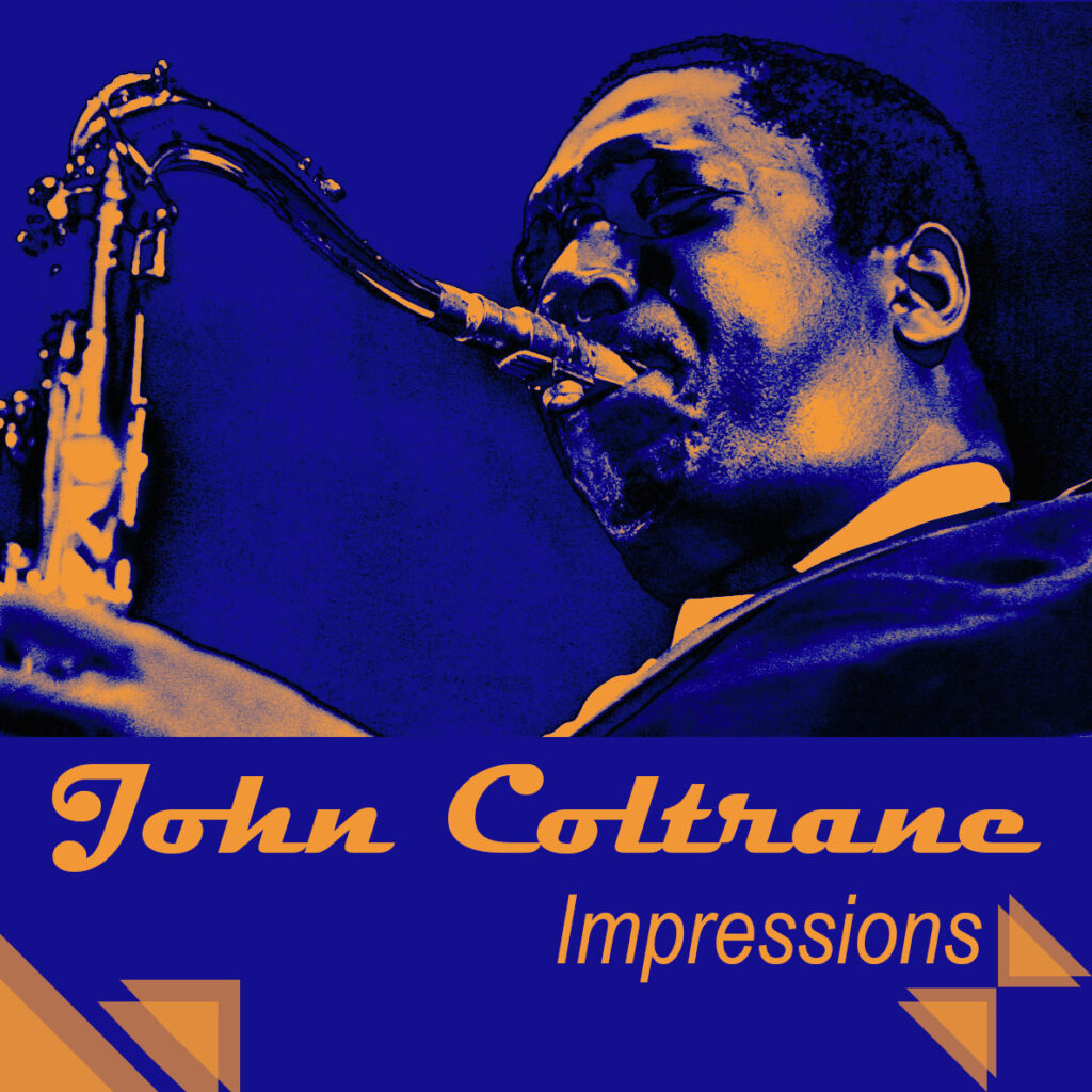
Outcome (Complimentary colours)
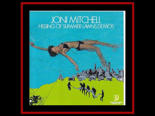
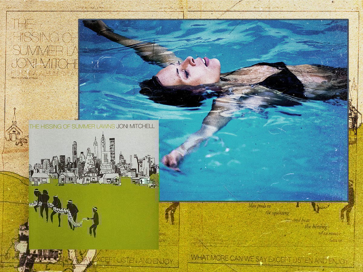
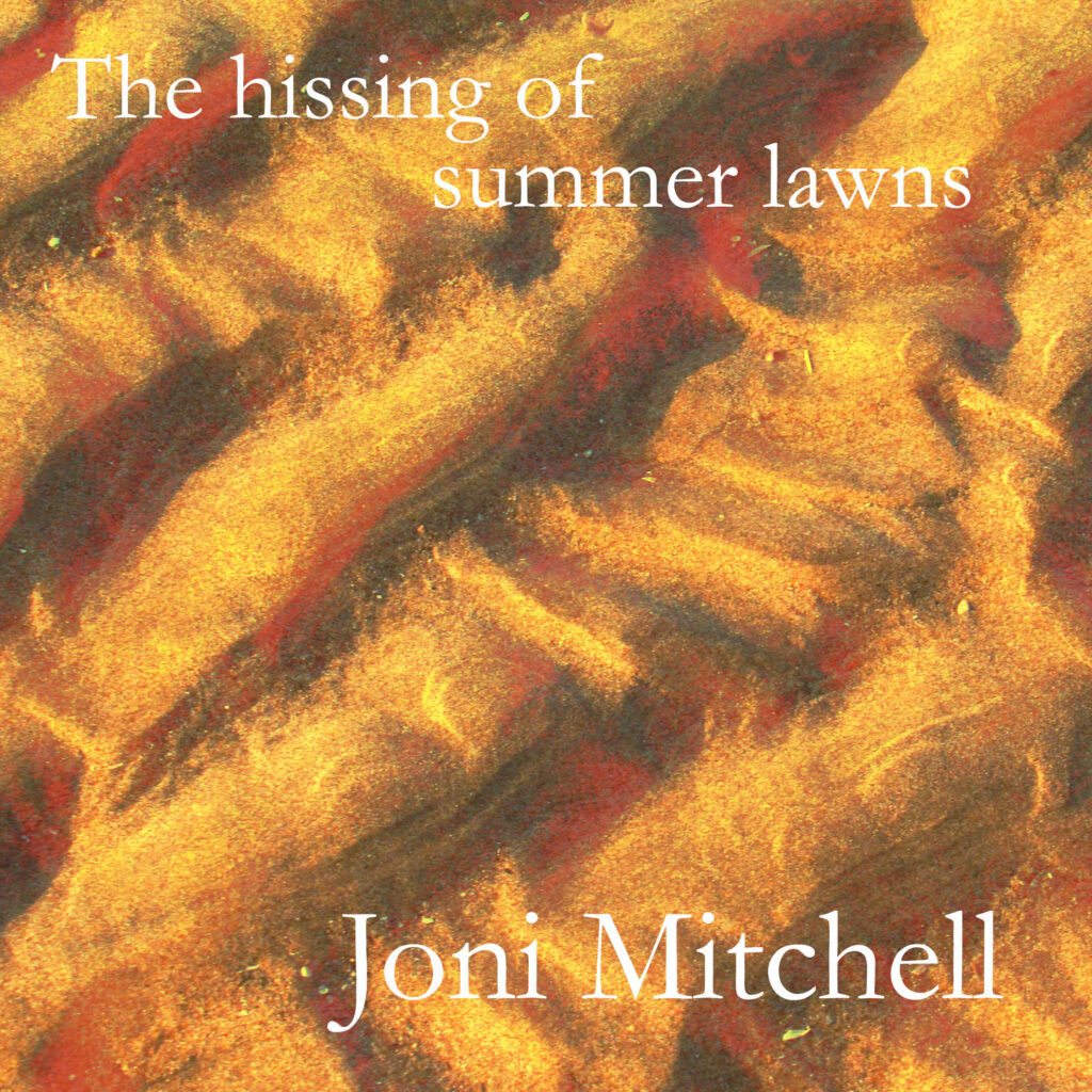
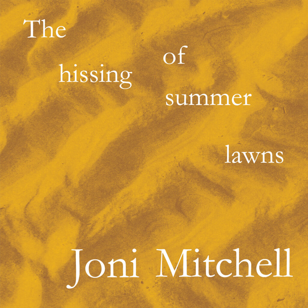
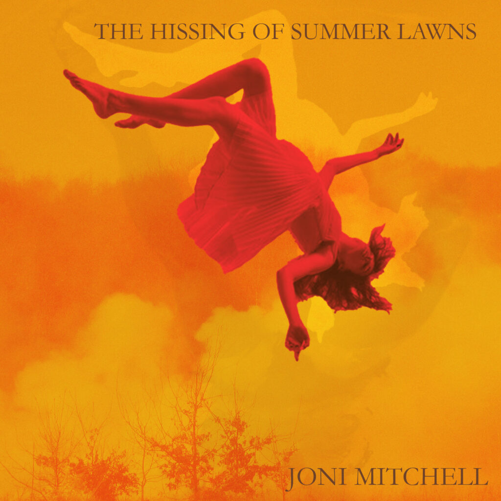
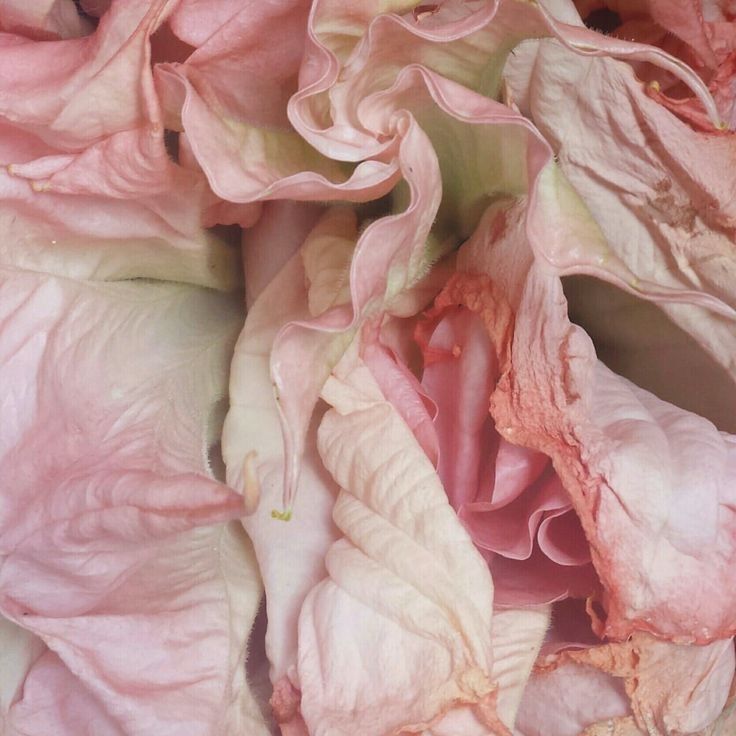
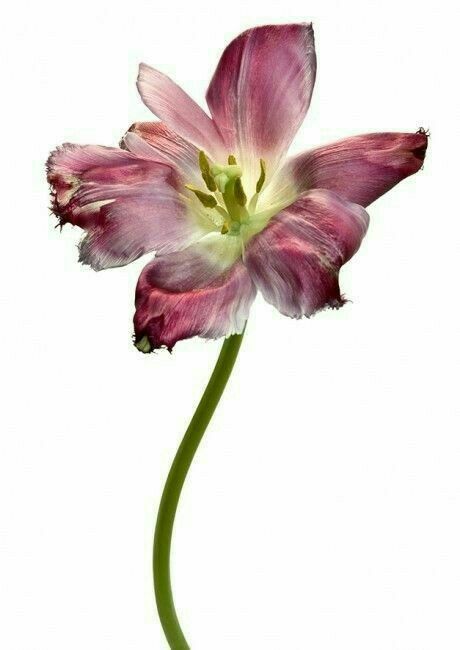
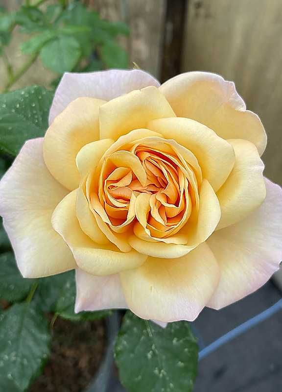
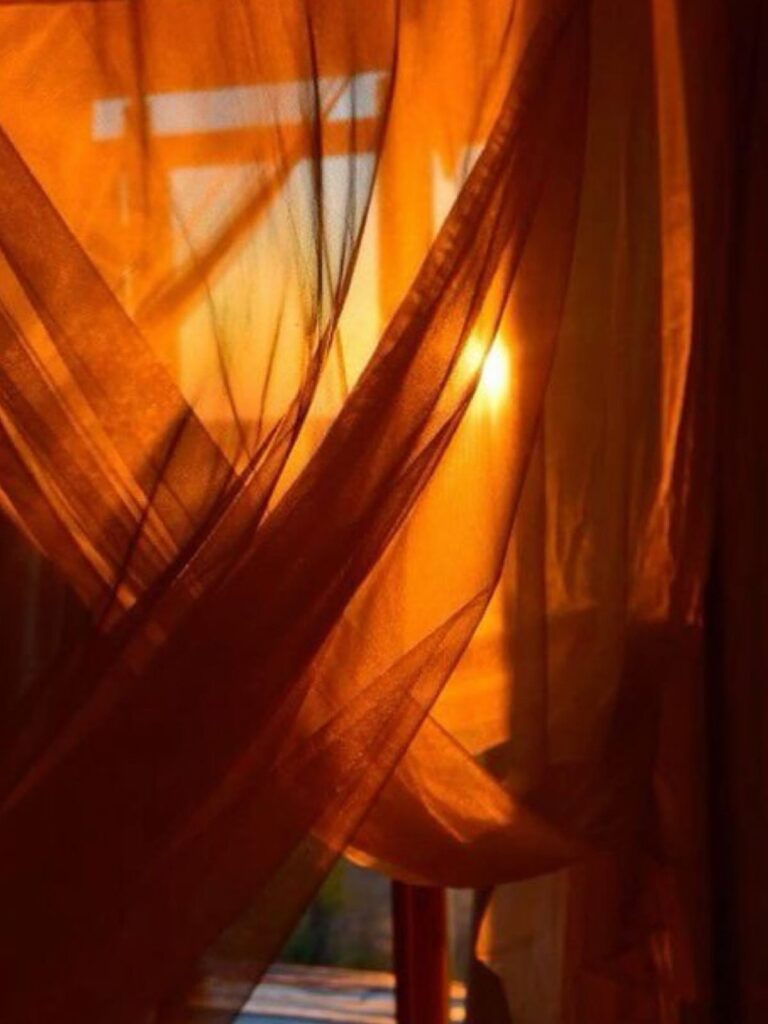
Joni Mitchell: The hissing of summer lawns
Album produced in 1975, ideas of LA suburban life, wealth, and the domination of women through sophisticated, jazz-infused lyrics and experimental production.
https://jonimitchell.com/library/print.cfm?id=5362
Visuals
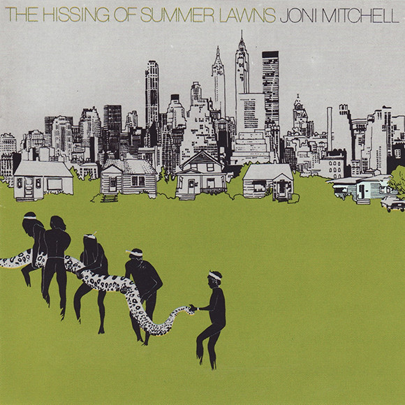
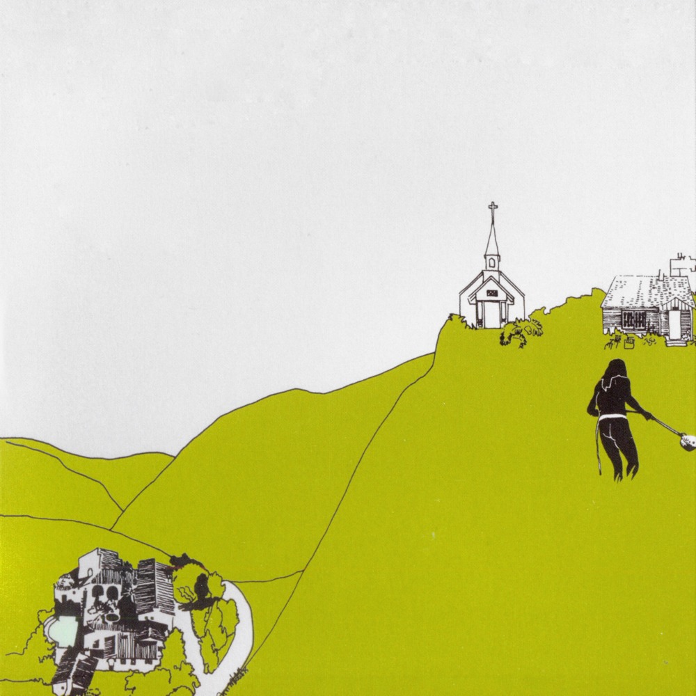
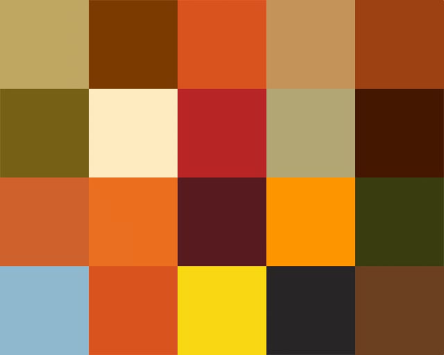
Looking for possible colour pallets that resonate with the album itself and the title itself.


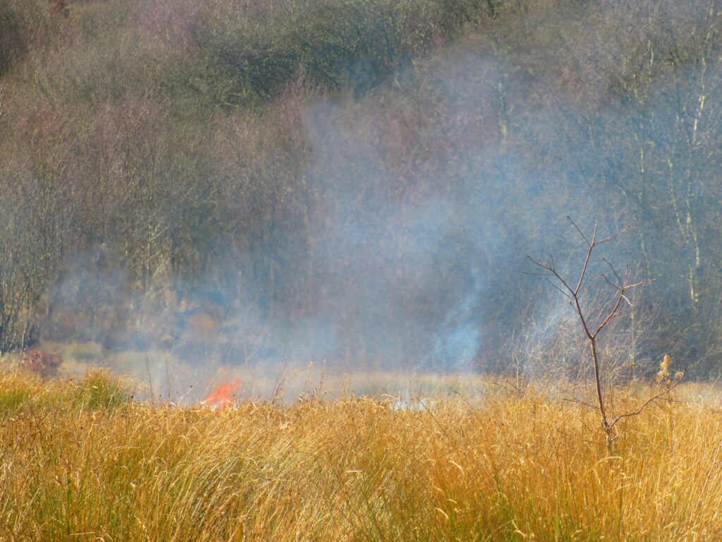
Some primary images that I think resonate well with the title ‘The hissing of summer lawns’, although the saturation is slightly too high for the intended colour palette I’m looking for.
Thumbnails
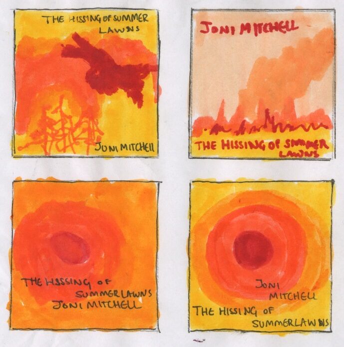
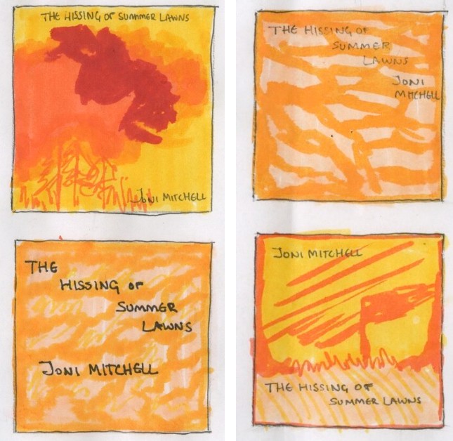
Development
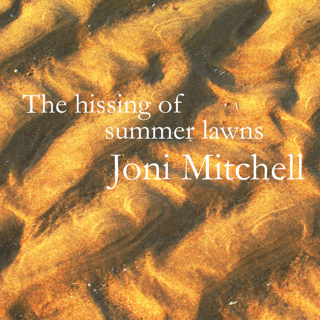
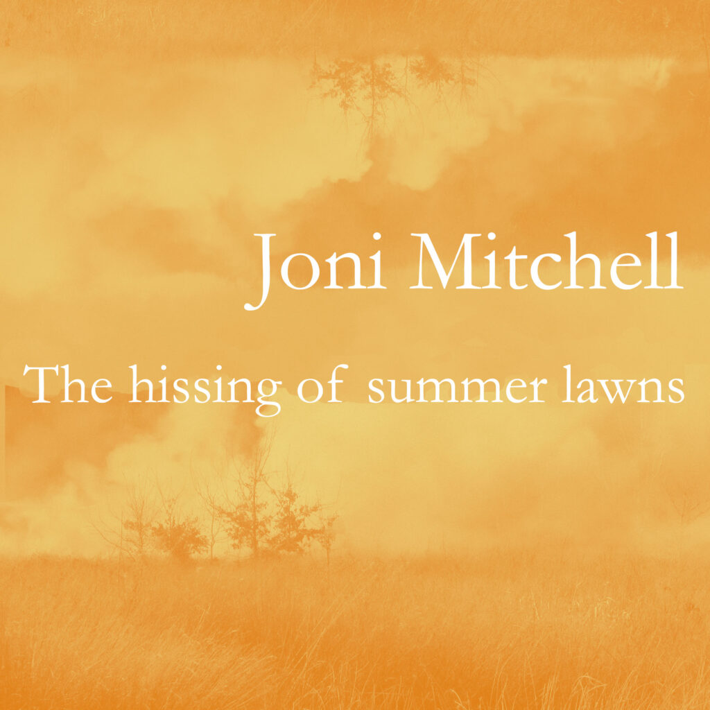
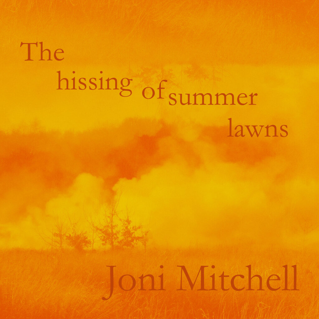
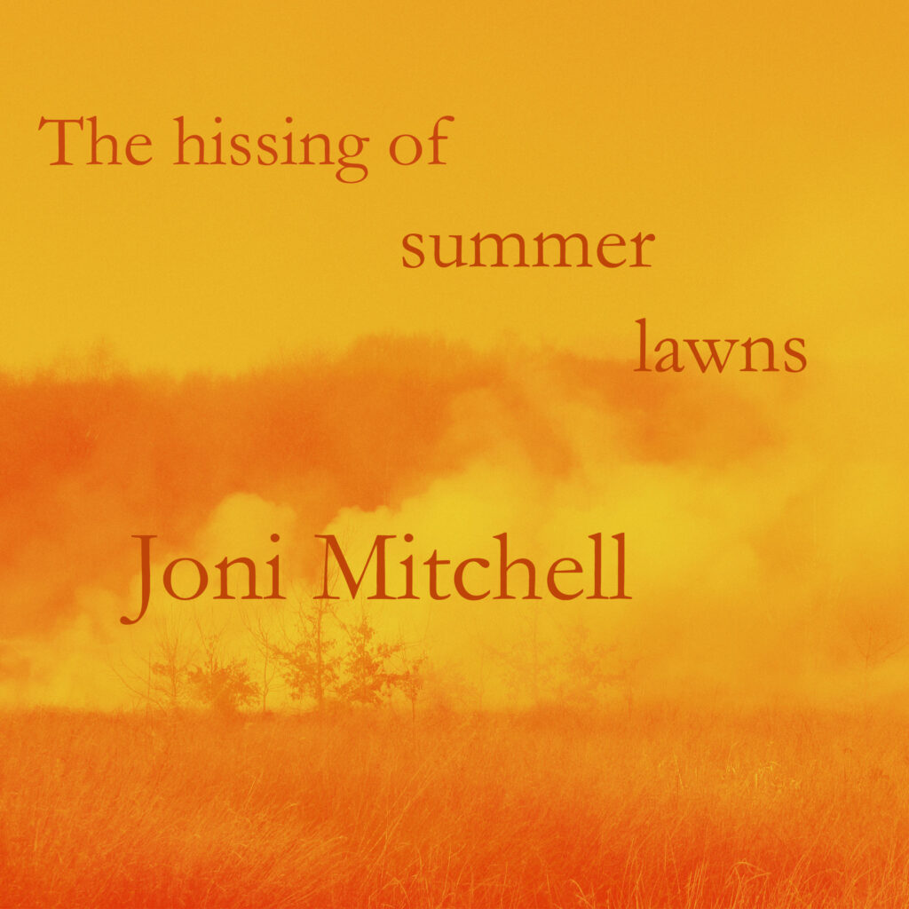
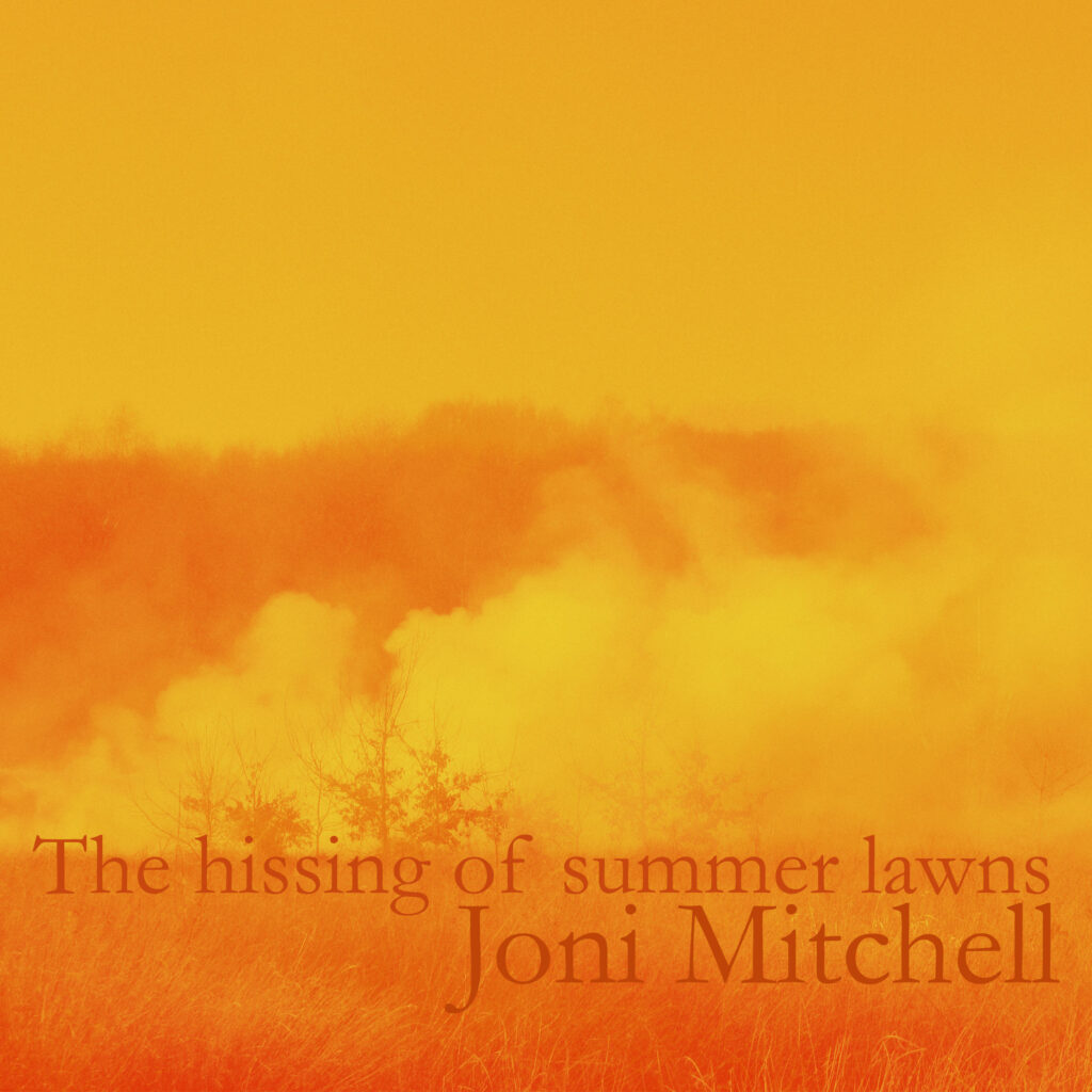
Outcome (Harmonious colours)
Task 2:
Only using letterforms create 6 typographical designs in A6
Problem Typeface (in any weight)
Scale, Playful Bodoni, Rockwell
Power, Pattern Helvetica, Clarendon
Feminine, Masculine Calibri, Myriad Pro
I used Helvetica for this as I wanted something bolder for scale so decided on a Sans serif font using harmonic colours.
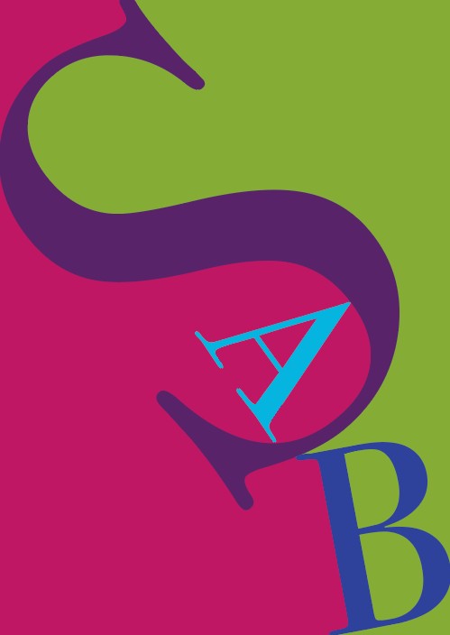
I used Bodoni for this and I used split colours that would contrast against each other nicely.

I used Rockwell for this, using black and red which are strong and bold well contrasting colours to determine power.
I used Calibri for this and I thought using S would link together quite nicely as above.
I used Clarendon for this as it was a Serif font and looked less formal to use as a symbol for femininity.

I used Myriad Pro for this and used darker blue colours contrasting against the background.
Task 3:
Composition
Producing three A5 book jackets(front only) in the style of each designer for the following three novels:
- Vaughan Oliver
- Peter Grundy
- El Lissitzky
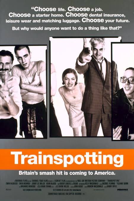
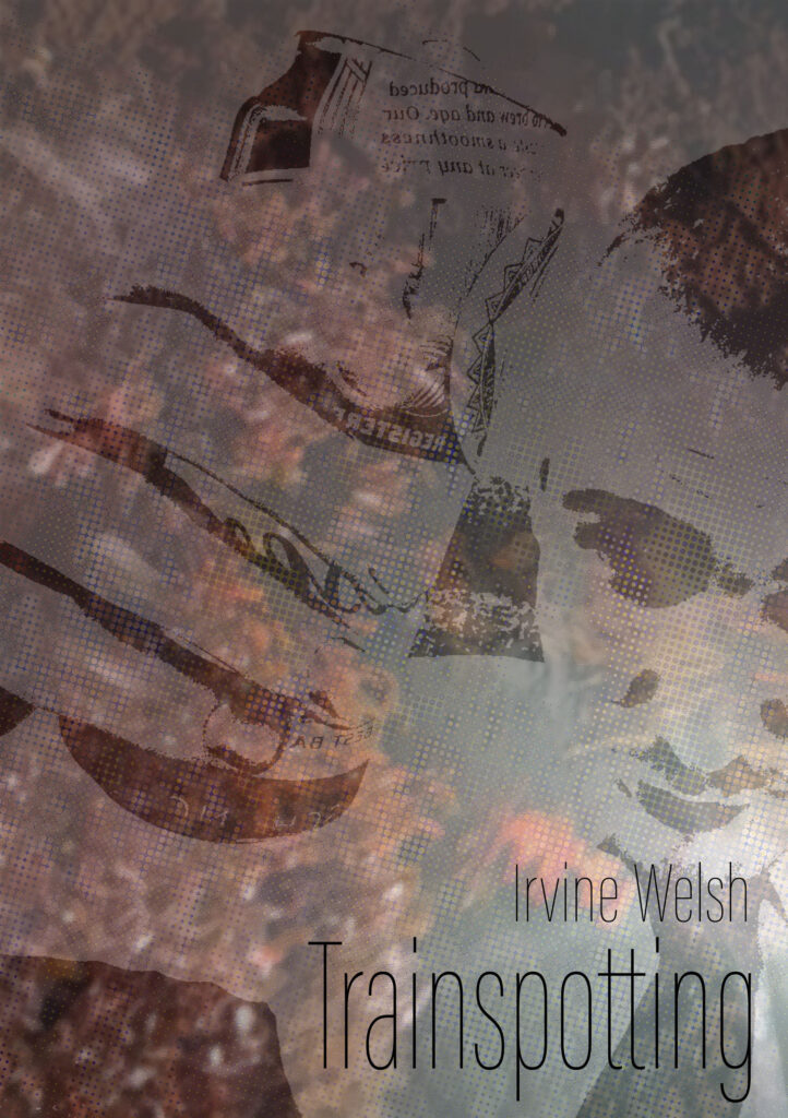
- Trainspotting
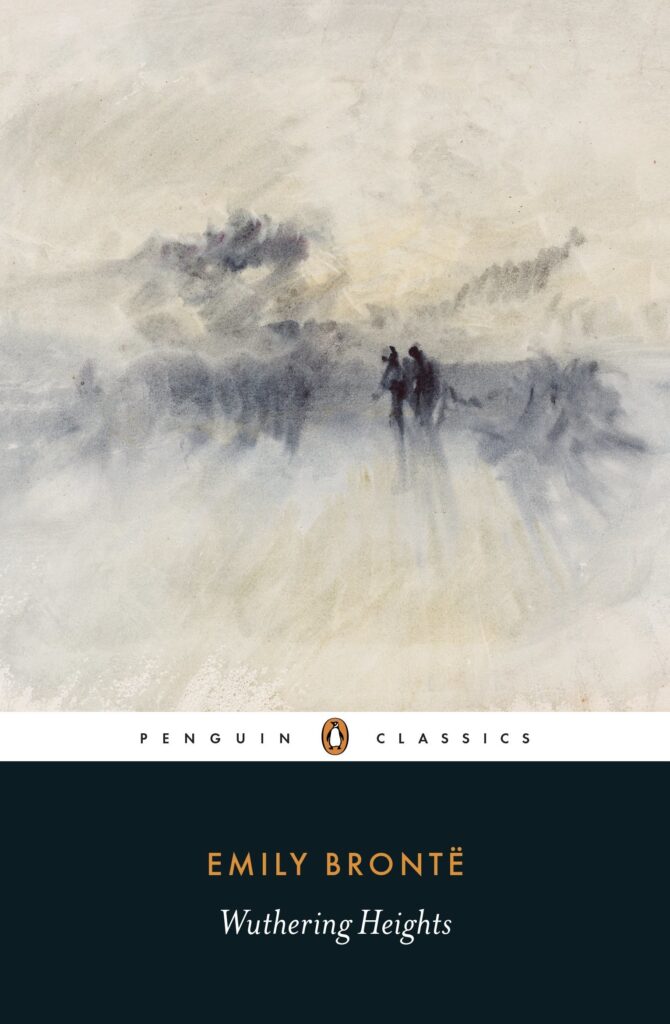
- Wuthering heights
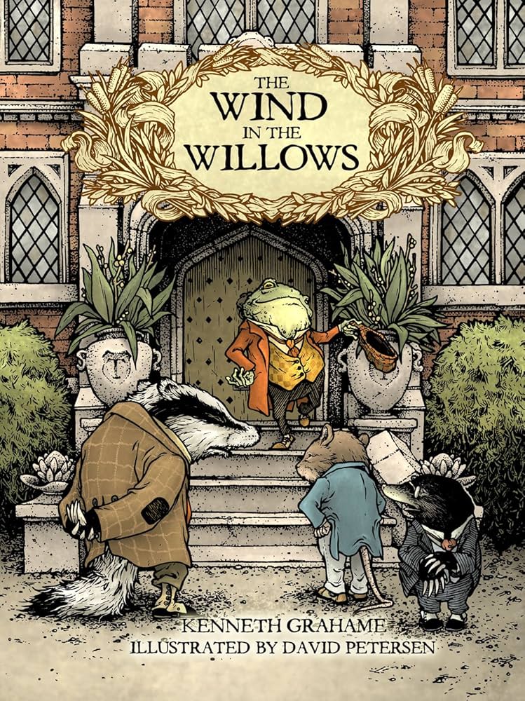
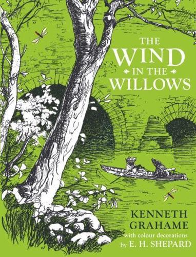
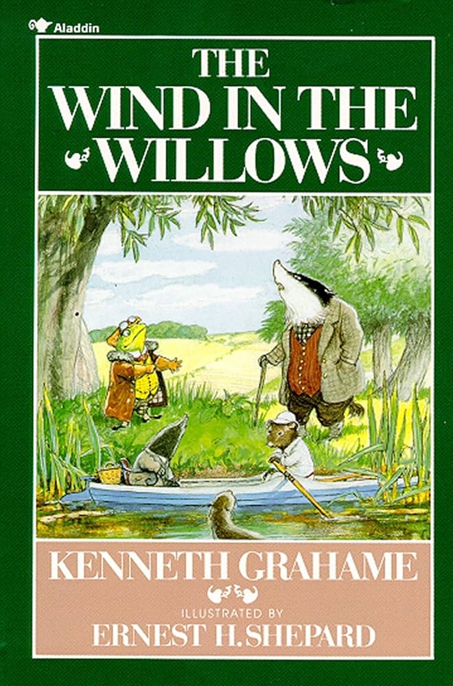
- The wind in the willows
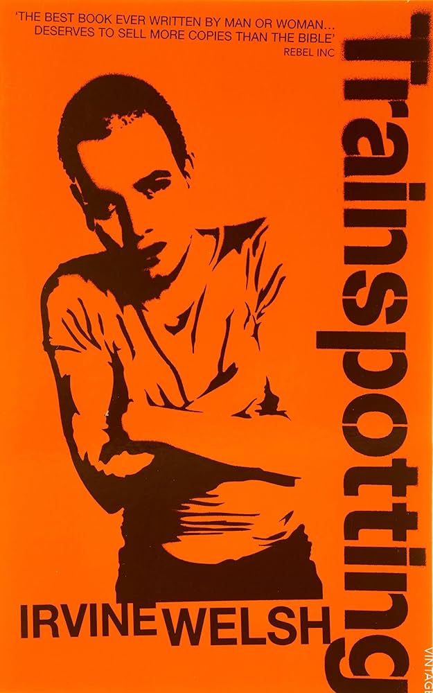
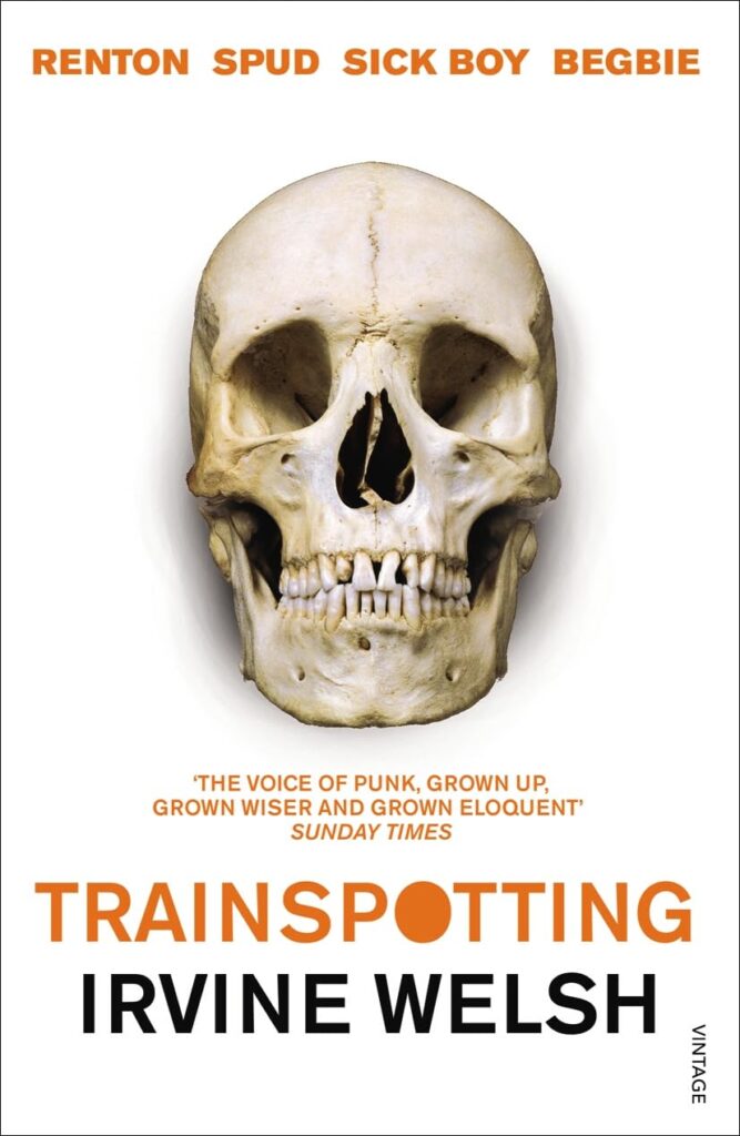
Train Spotting:
They are four inseparable friends who share a childhood, a city, neighbours and unemployment. And above all, a devoted devotion to a single heroine in the form of a syringe. We hear these four, we listen to them: each one tells their story of Edinburgh, between two pints of beer, after a fix, before a cup of tea, or during a fight with sharpened knitting needles. We see bodies ravaged by the virus, drugs, hallucinations, and then something stands out: we are from Edinburgh, but we are also from Fresnes or La Santé. We must escape. A cult book of the 1990s, Trainspotting was adapted for the screen by Danny Boyle.
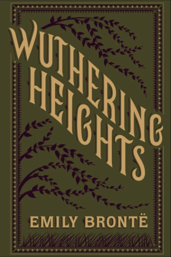
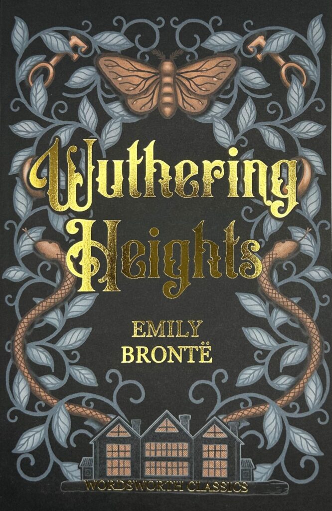
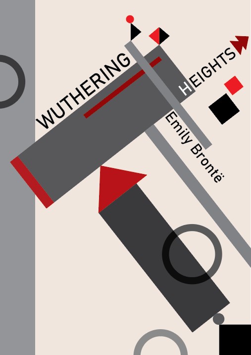
Wuthering heights
Wuthering Heights is a gothic novel about the destructive and obsessive love between Catherine Earnshaw and Heathcliff, and the cycle of revenge it creates.
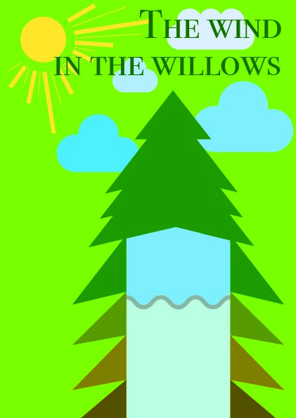
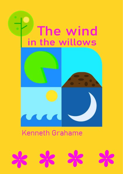
The wind in the willows
The Wind in the Willows and its endearing protagonists—Mole, Water Rat, Badger, and, of course, the incorrigible Toad—have enchanted children of all ages. Whether the four friends are setting forth on an exciting adventure, engaging in a comic caper, or simply relaxing by the River Thames, their stories will surprise and captivate you. Hailed as one of the most enduringly popular works of the twentieth century, this story is a classic of magical fancy and enchanting wit.
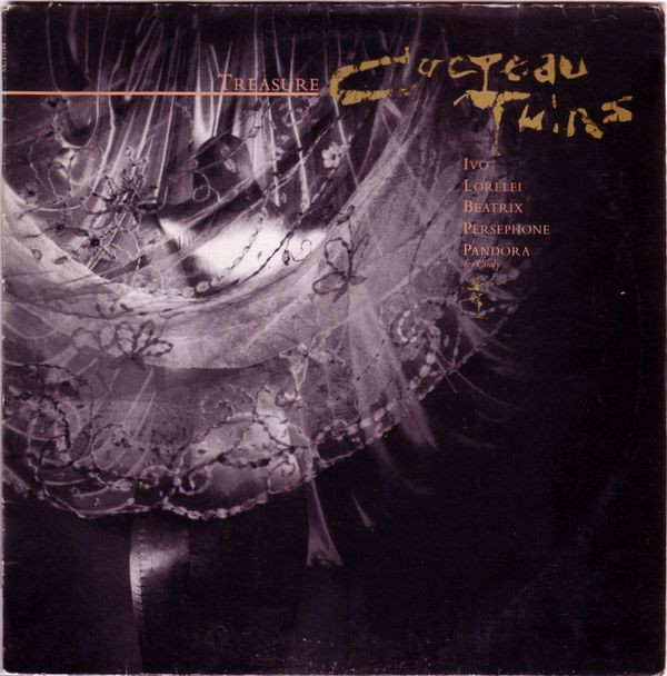
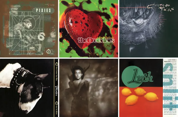
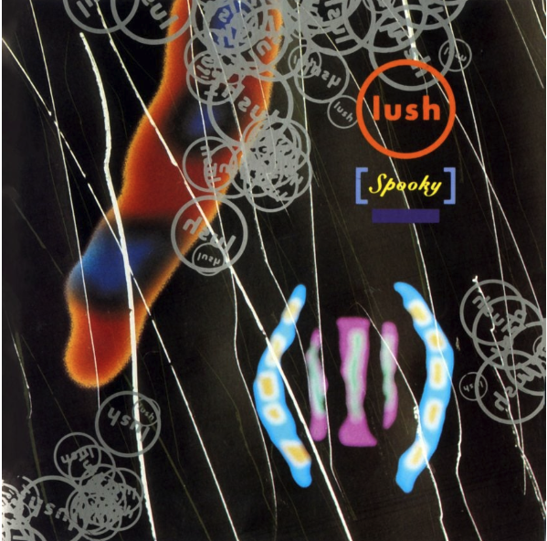
Vaughan Oliver (1957-2019)
Oliver is a British album cover, primarily creating covers made from photographs manipulating them with layers, before there was Photoshop. They are photo heavy and quite imaginative, such as the cover where he photographed himself with eels strapped to himself. As well as being quite abstract, creating experimental covers for bands such as Pixies, Cocteau twins and Lush. Texture is a big part of his work, as it has history and is suggestive and provocative and prefers that to wor being pristine and well kept.
https://magazine.tank.tv/tank/2020/01/vaughan-oliver
https://craigberry93.medium.com/in-memory-of-vaughan-oliver-e513f9b9eecd
An interview with Vaughan Oliver which talks about his background and inspirations, which I thought was quite insightful and moving forward with this I will go and take photographs with textures.
Outcome
I wasn’t happy with the outcome of this as it all blends into one and doesn’t play about as much with type as Oliver does and the colours aren’t quite on point.
Peter Grundy
Grundy is a well known British Infographic designer using simple, colourful lines to bring across. Including work with maps, infographic and bold iconography. One of the inspirations of Grundy is taken from Le Corbusier, who created the model based on human form, in conjunction with the golden section and a reference for proportions and his buildings.
Grundy’s work is quite bright and uplifting and so I am choosing to pair this with the wind in the willows which is more of a children’s books and is quite fitting with the colours.


Thumbnails (The wind in the willows)
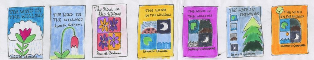
Imagery for wind in the willows with Grundy’s work:

As the book I chose was a children’s one, the colours that Grundy uses worked quite well with it so I tried to find further imagery that I could possibly work with.
Copy of Grundy’s work done on Illustrator:


Development
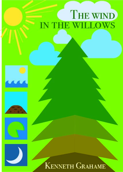
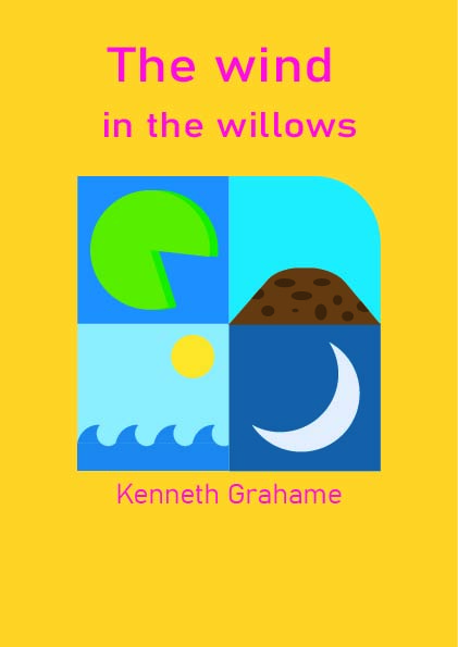
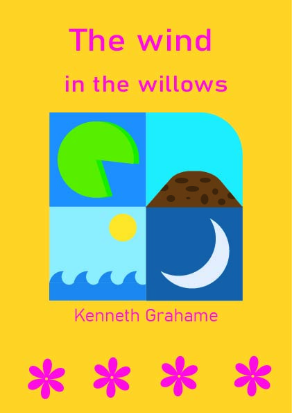
Outcome
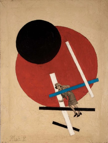
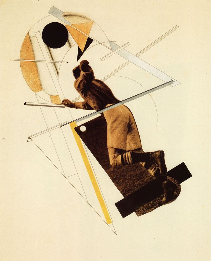
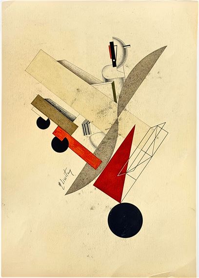
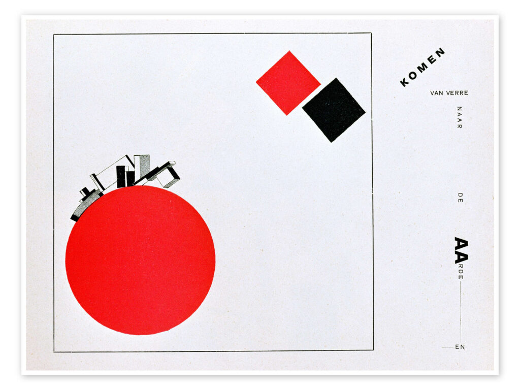
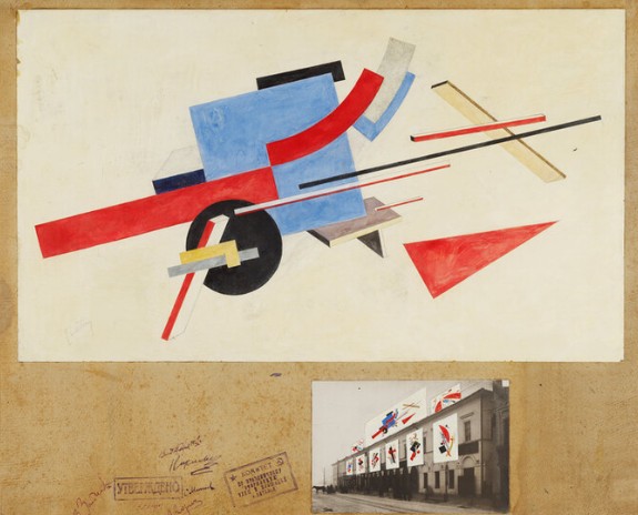
El Lissitzky
Constructivism is an early 20th century art movement founded in 1915 by Vladimir Tatlin and Alexander Rodchenko. Rejecting traditional art for social and political purposes, it embraced industrial materials and geometrical shapes to reflect the modern times. It had an influence on architecture, graphic design and sculpture.
El Lissitzky brought a significant innovation and change to typography, exhibition design, photomontage and book design.
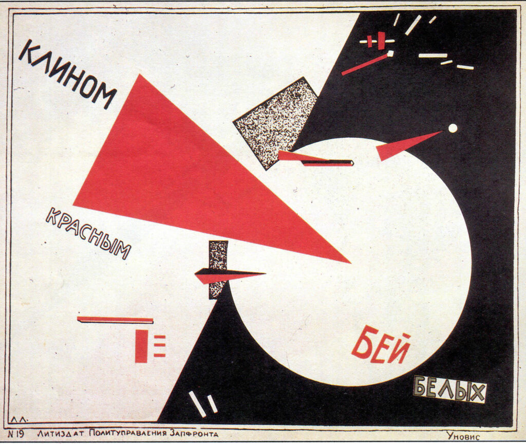
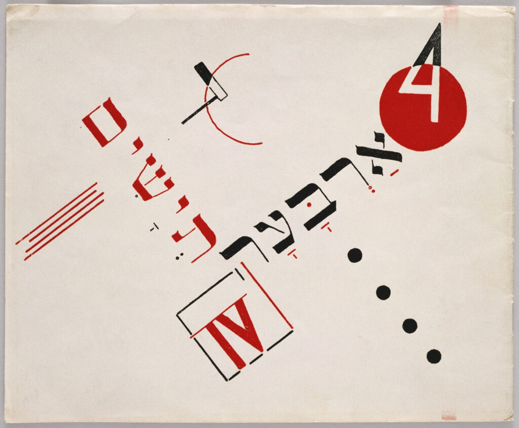
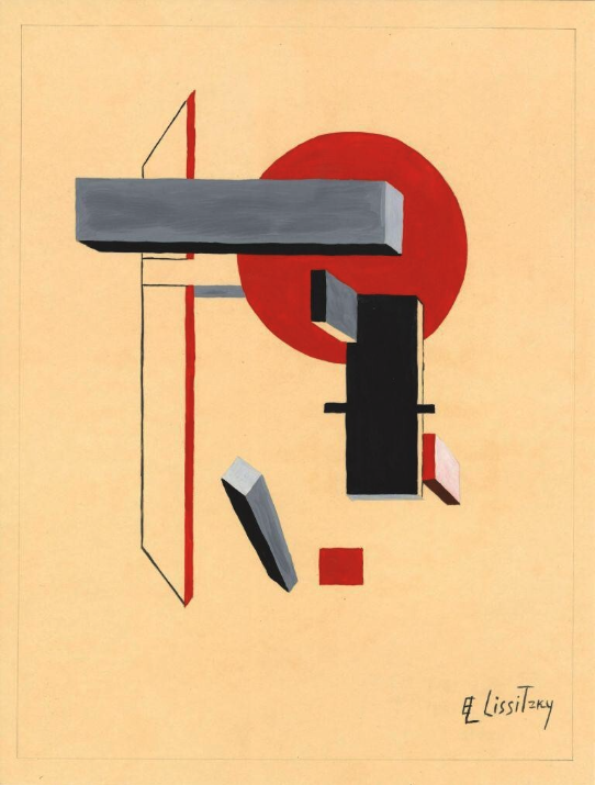
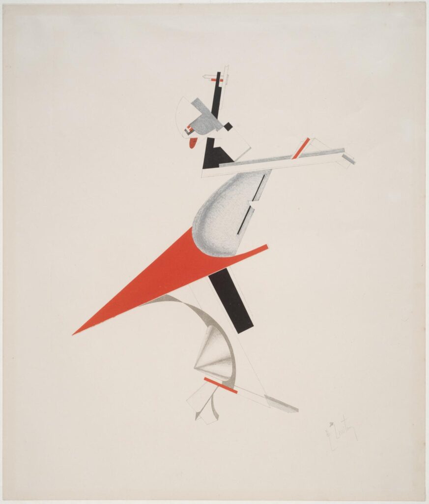
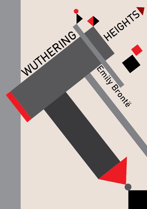
Thumbnails (Wuthering heights)
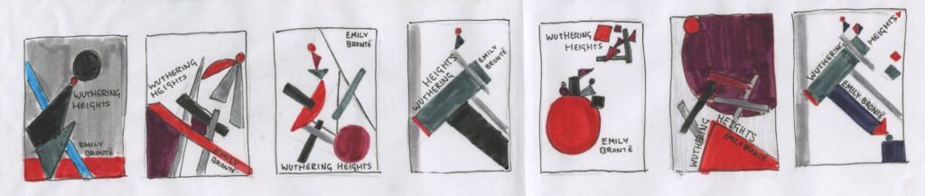
Imagery from El Lissitzky’s work for Wuthering heights. I chose this because the perspective of them as well as verticals making it seem higher.
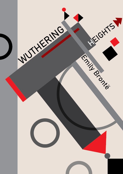
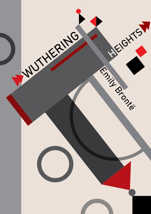
Copy
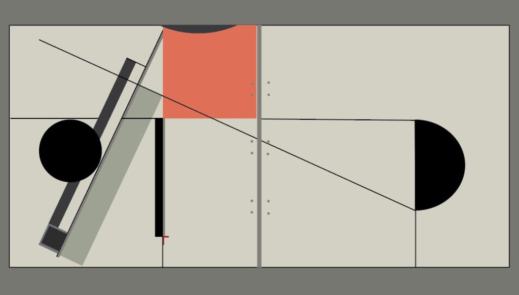
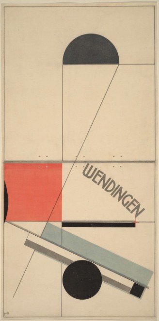
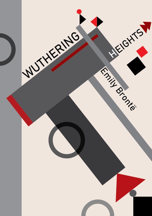
Development
Week 11
Brief:
Create an eight-page ISSUU book (comprising
two double-sided sheets bound together). The book is your
personal response as a Graphic Designer or Illustrator to the
lyric of one of the following songs:
Magic (Ben Folds Five)
Sport (The Odd Boy) (Bonzo Dog Doo-Dah Band)
Rossmore Road (Barry Andrews)
My Sister (Juliana Hatfield Three)
The Bright Light (Tanya Donelly)
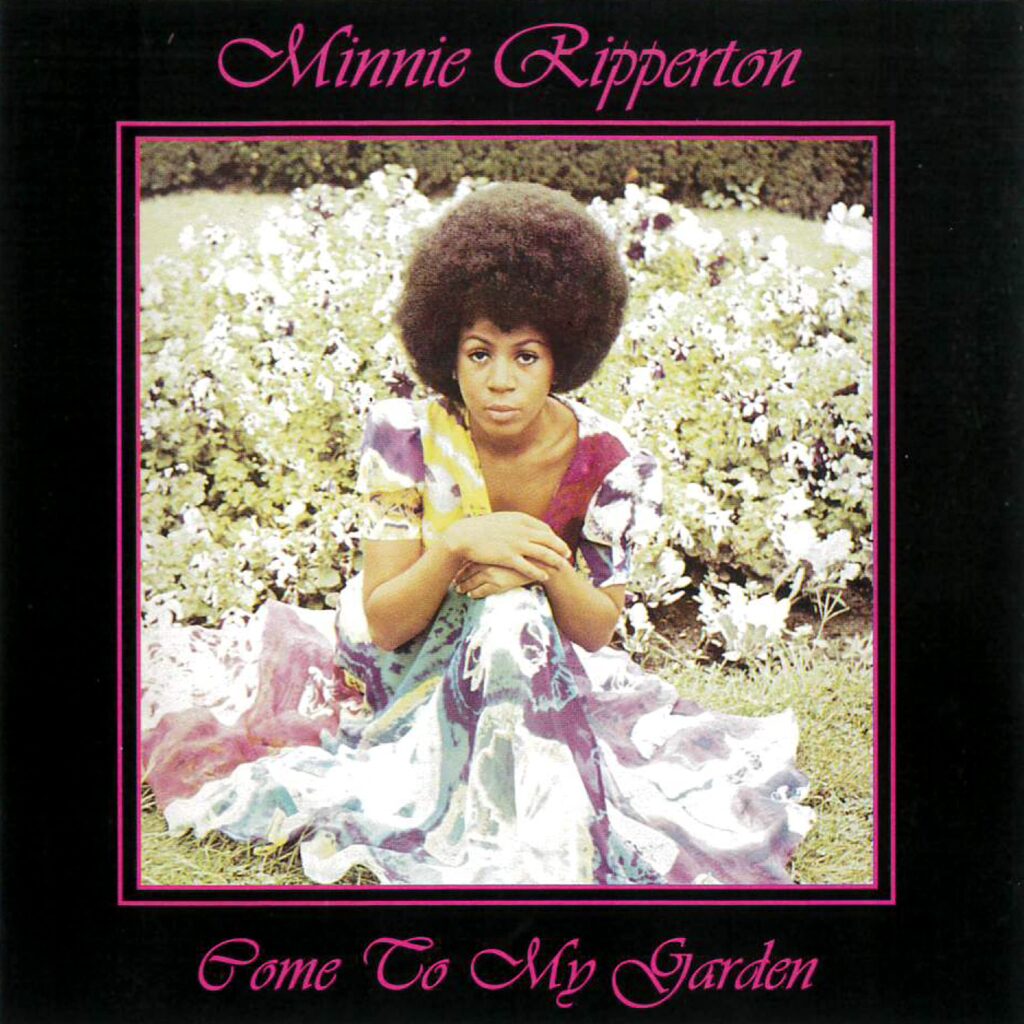
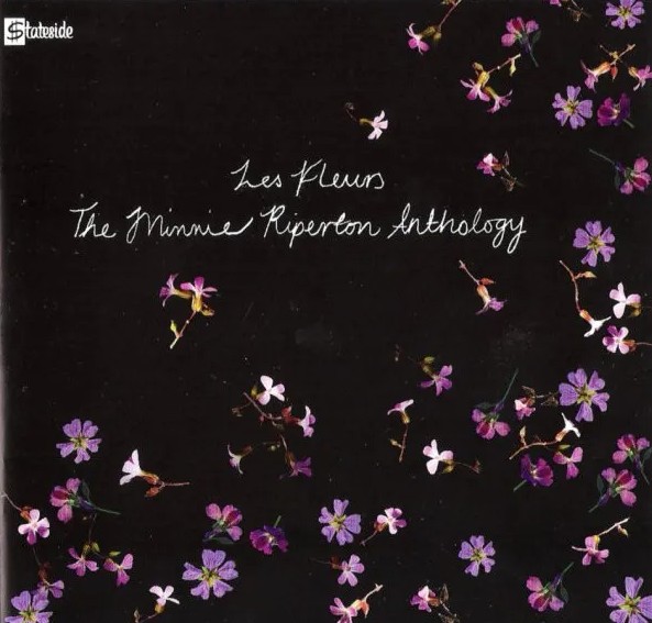
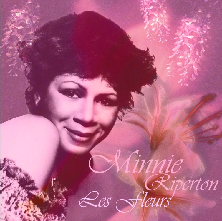
Les Fleurs (Minnie Riperton)
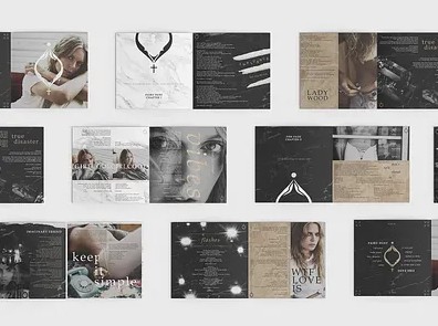
I am going to create an eight page CD inlay booklet (Dimensions 120mm2) for this put together on InDesign created on Photoshop.
- Thumbnails.
- Small mock-ups exploring how the book is structured and paced/
- Artwork (analogue or digital) for the cover and three interior double-page spreads.
- A final book (uploaded to ISSUU).
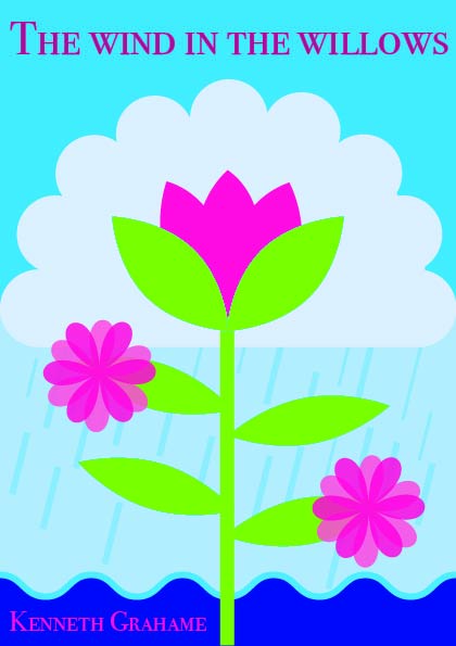
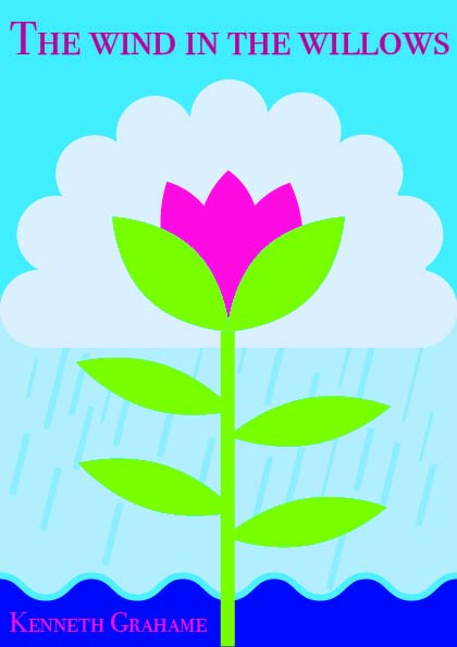
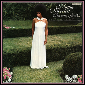
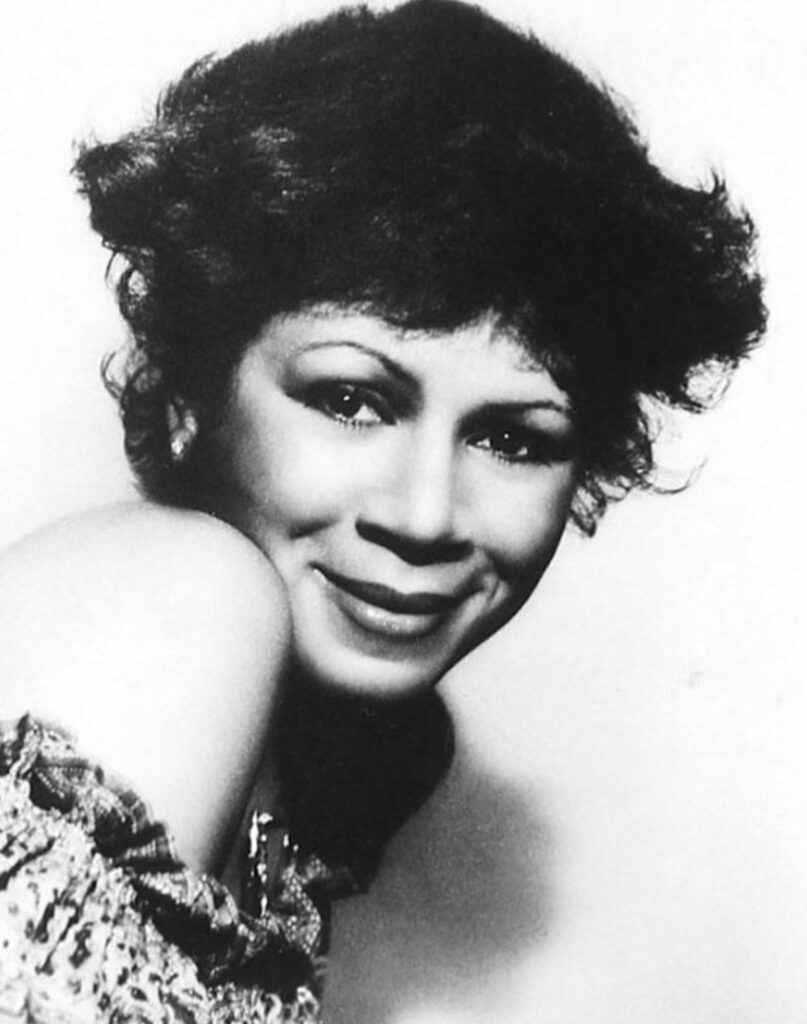
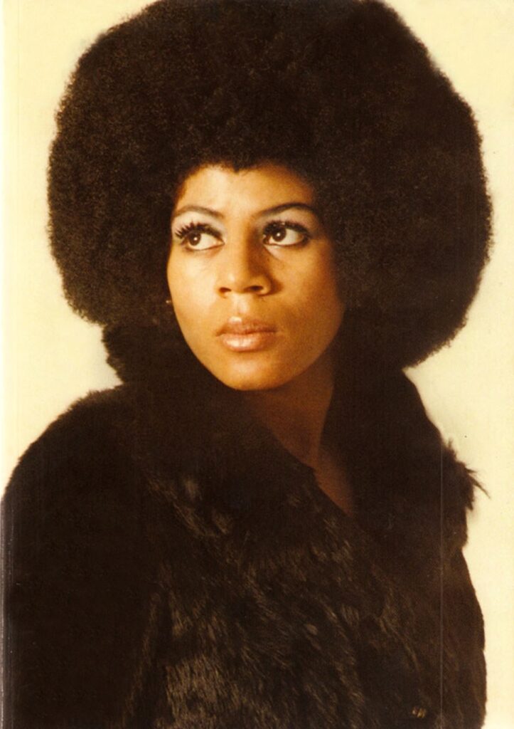
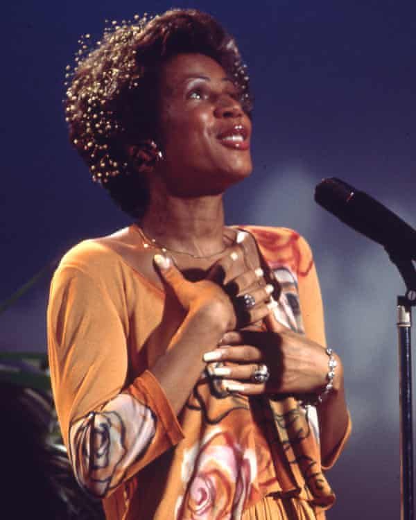
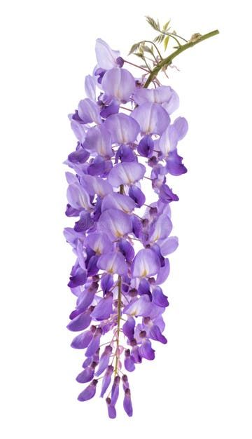
“Les Fleur” is the first track on Minnie Riperton’s debut album, Come to My Garden. The LP was a commercial failure, but a critical success with appreciation for the album growing with time.
Riperton’s first solo album was come to the garden which is the leading track of Les Fleurs. Riperton’s artistic lyrics explore ideas and themes of love, spirituality, bliss and the pleasures of life which is what I want to showcase through in this small Inlay booklet.
Riperton is mainly known for her Soul and R&B music, which is a blend of Jazz, gospel and blues with a strong backbeat, it is a Black American music genre that originated in the 1940s. As well as some psychedelic soul, many of her songs are a fusion of soul, R&B and Jazz.
Will somebody wear me to the fair?
(To the morning, sings the lovely flower)
Will a lady pin me in her hair?
(Mmh, mmh-mmh, mmh)
Will a child find me by a stream?
(Gaily laughing in a sundream shower)
Ooh, kiss my petals, weave me through a dream
For all of these simple things and much more
A flower was born
It blooms to spread love and joy, faith and hope
To people forlorn
Inside every man, lives the seed of a flower
If he looks within, he finds beauty and power
Ring all the bells, sing and tell the people
Everywhere that the flower has come
Light up the sky with your prayers of gladness
And rejoice for the darkness is gone
Throw off your fears let your heart beat freely
At the sign that a new time is born
Mea mo sey lee ke lee lo ya roses
Se man ee eaa ney neyney na manah
No con fool lee vey no tey bree
Mea mo sey lee ke lee lo ya roses
For all of these simple things and much more
A flower was born
It blooms to spread love and joy, faith and hope
To people forlorn
Inside every man, lives the seed of a flower
If he looks within, he finds beauty and power
La-la-la-la, la-la-la, la-la
La-la-la-la, la-la-la, la-la-la
La-la-la-la, la-la-la, la-la
La-la-la-la, la-la-la, la-la-la
La-la-la-la, la-la-la, la-la
La-la-la-la, la-la-la, la-la-la
La-la-la-la, la-la-la, la-la
La-la-la-la, la-la-la, la-la-la
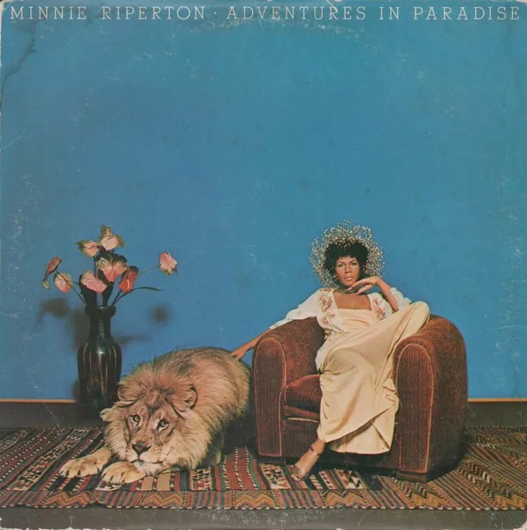
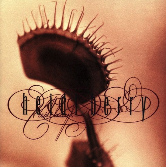
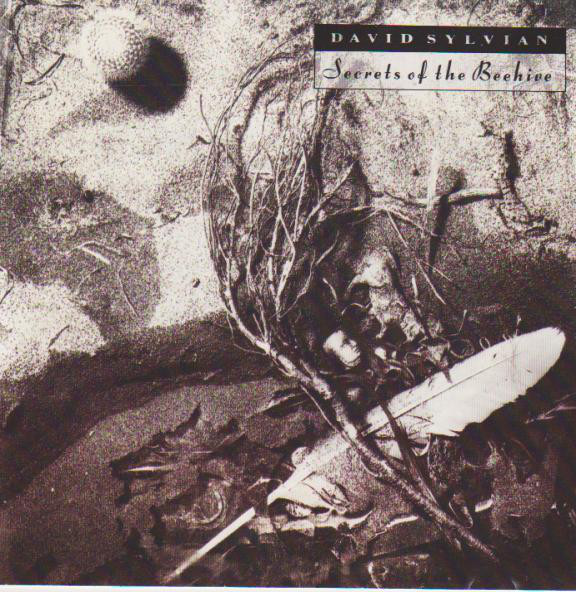
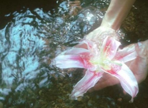
“The album covers should be just as conceptual as record itself”
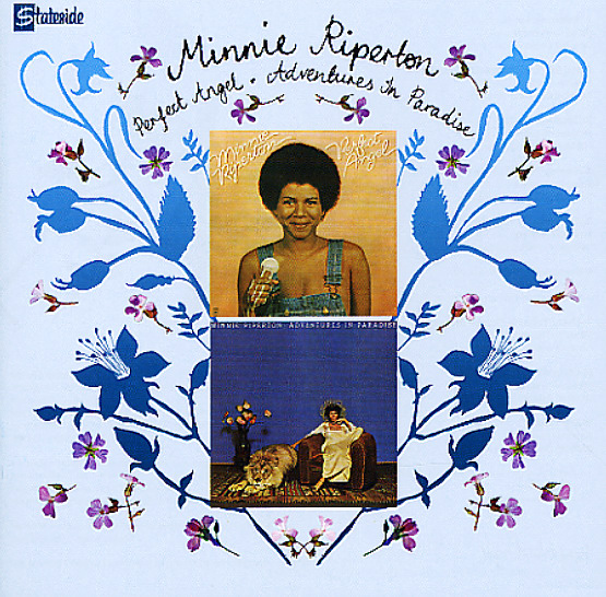
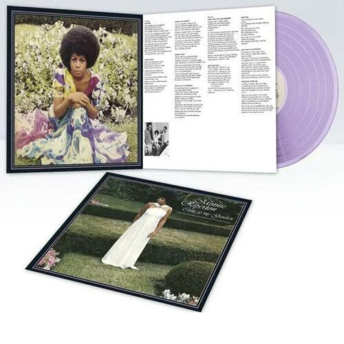
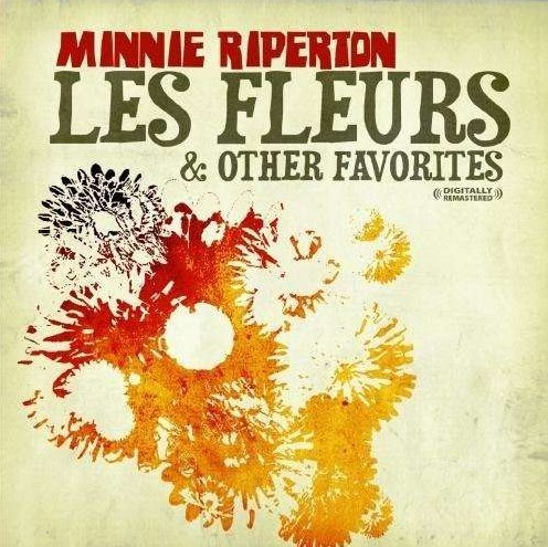
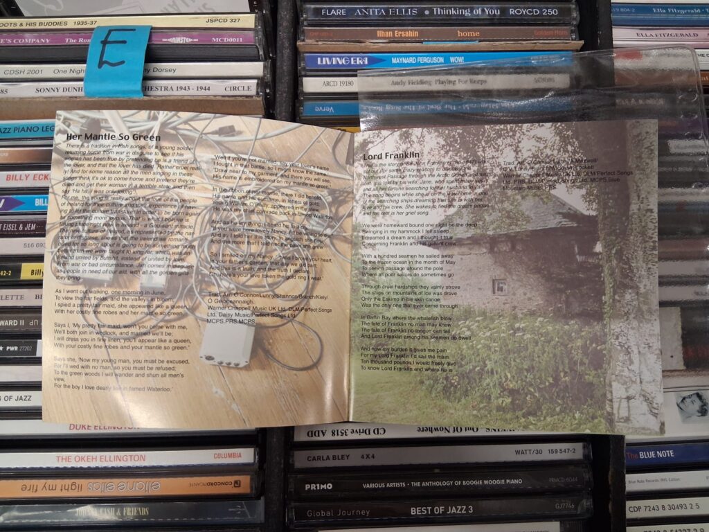
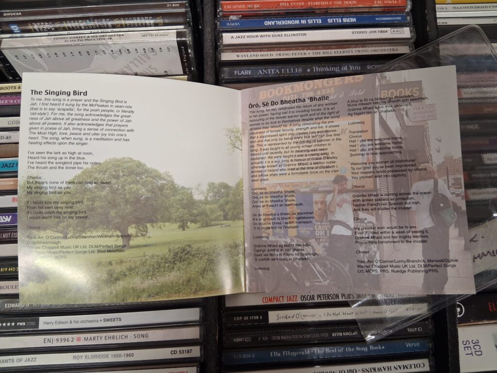
CD Inlays examples
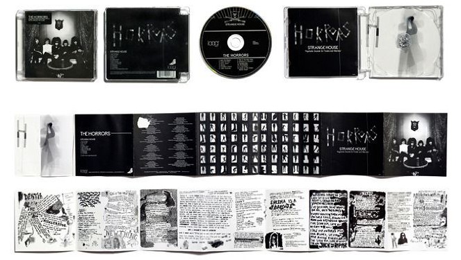
Bookends
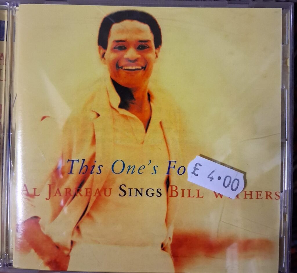
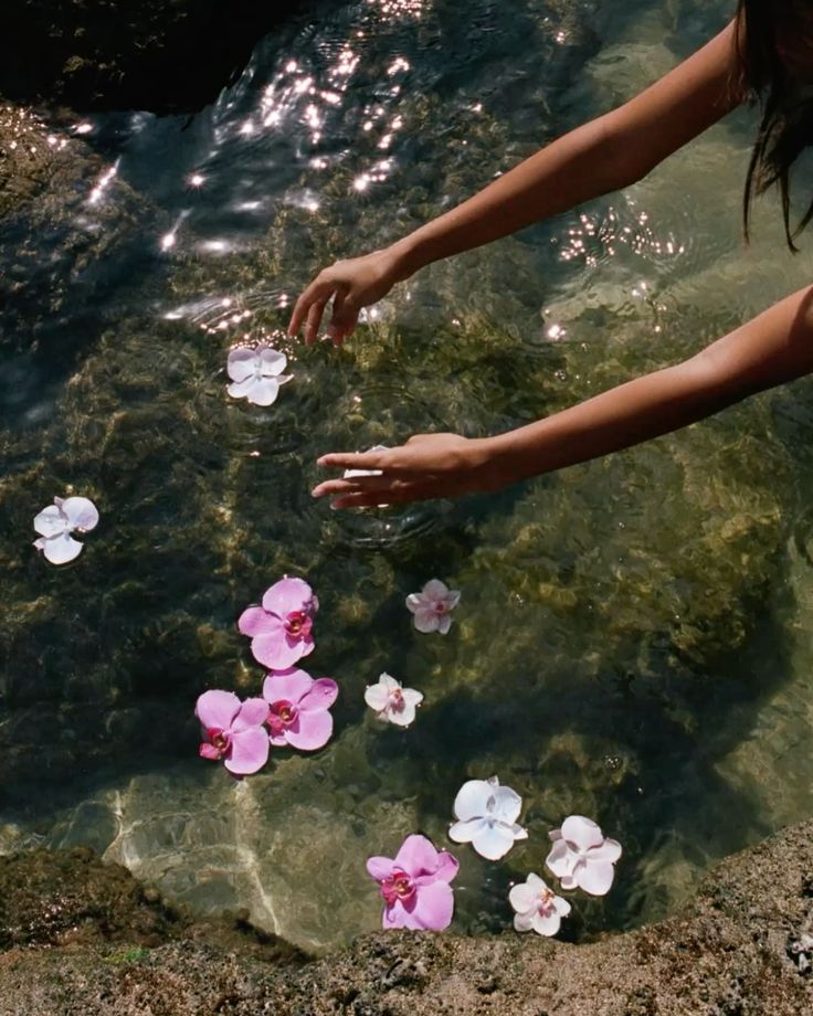
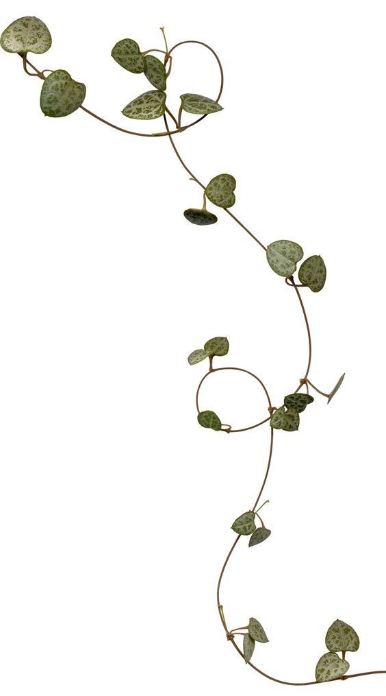
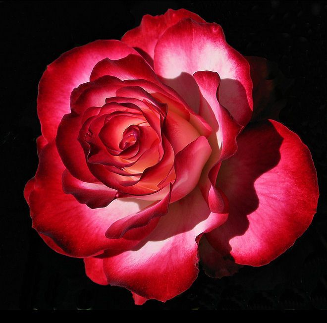
These here feel peaceful and quiet, I want somethings soft in mine as Riperton’s work is quite spiritual, as well as the use of flowers to represent the song Les Fleurs.
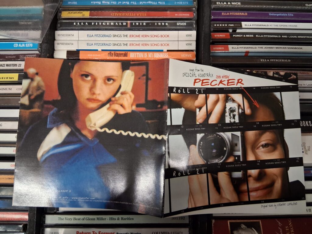
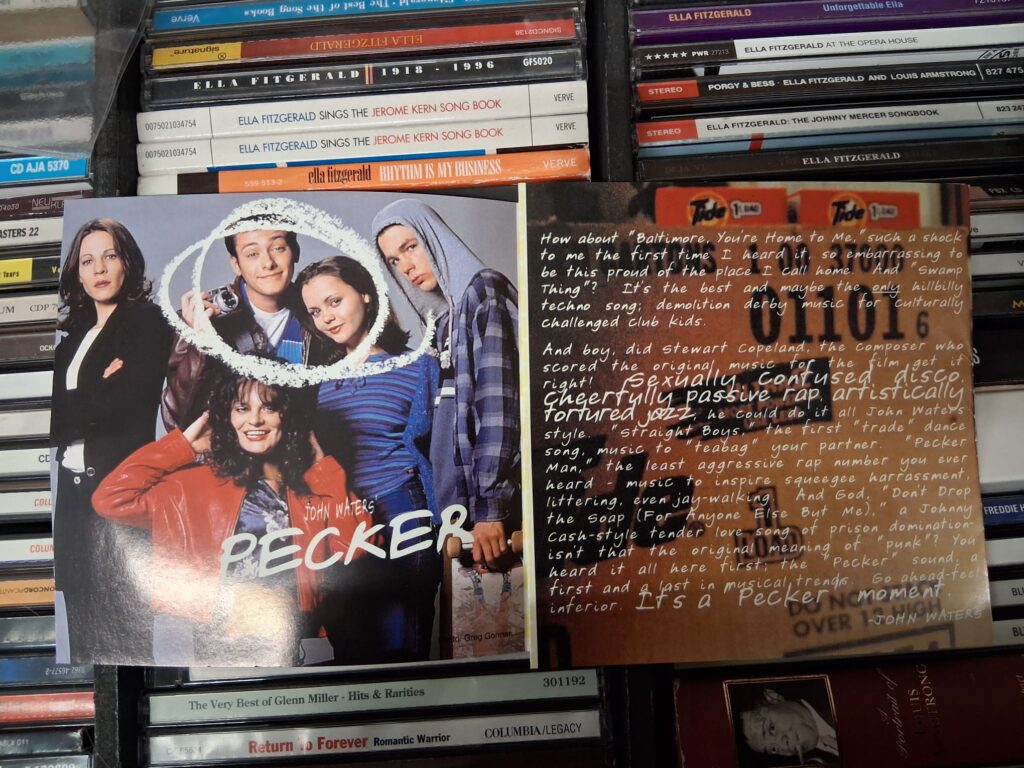
I went and looked at a few CDs to see what other artists had in their sleeve, I looked at a few soul and R&B covers mainly having the cover picture of themselves. I want to use different imagery for each of the eight pages whilst having a flow throughout so that it feels equal.
I am going to look at different type as for the current albums I have looked at use Serif type, so I will see what fits and utilising it within the work and how it fits within the image.
Thumbnails
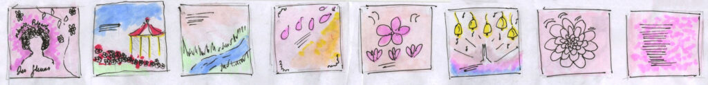
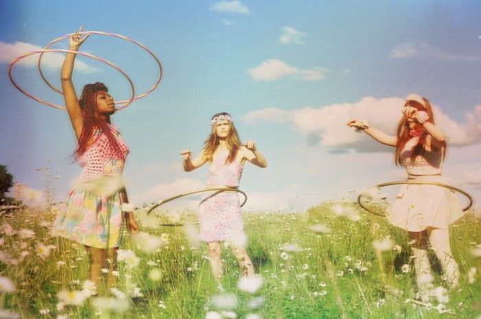
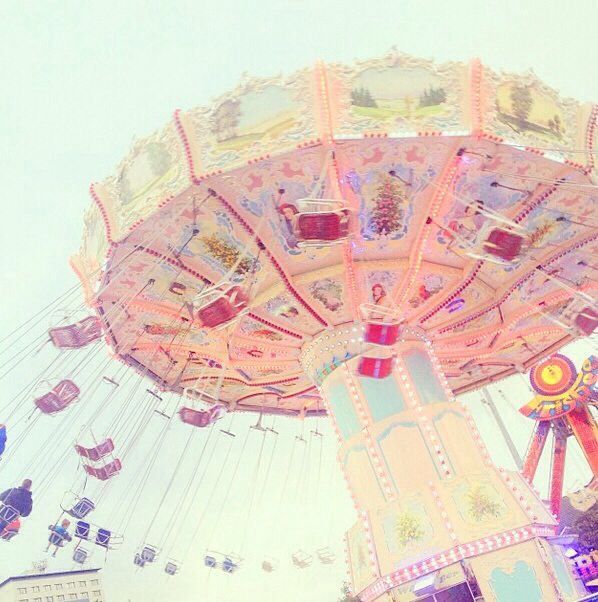
Images used (Internet)


Development
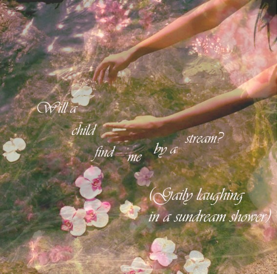
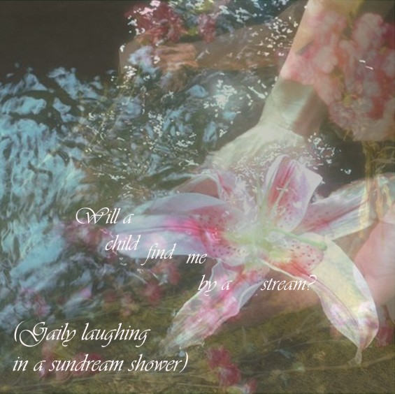

The imagery I chose was very feminine and soft choosing a lot of flowers and softer colours to level with angelic music that her work is about, using very similar tones and harmonic colours so that it comes across as one.
Outcome