2D PROJECT BRIEF: BAGEL CRISIS
For this brief, we have been given a band name which we will shaping the aspect of the bands visual identity. Designing a logo, utilising styles and techniques and exploring a range of different creative approaches capturing the essence of the band with a wide use if experimentation, representing the band’s style, energy and musical identity.
When first getting the name of the band, I wasn’t too sure on where to go from there, as well as trying to get away from the imagery of bagels and something round. I looked into what genre the band would and what would fit as well as the music I listen to to create a similar fit.
Research
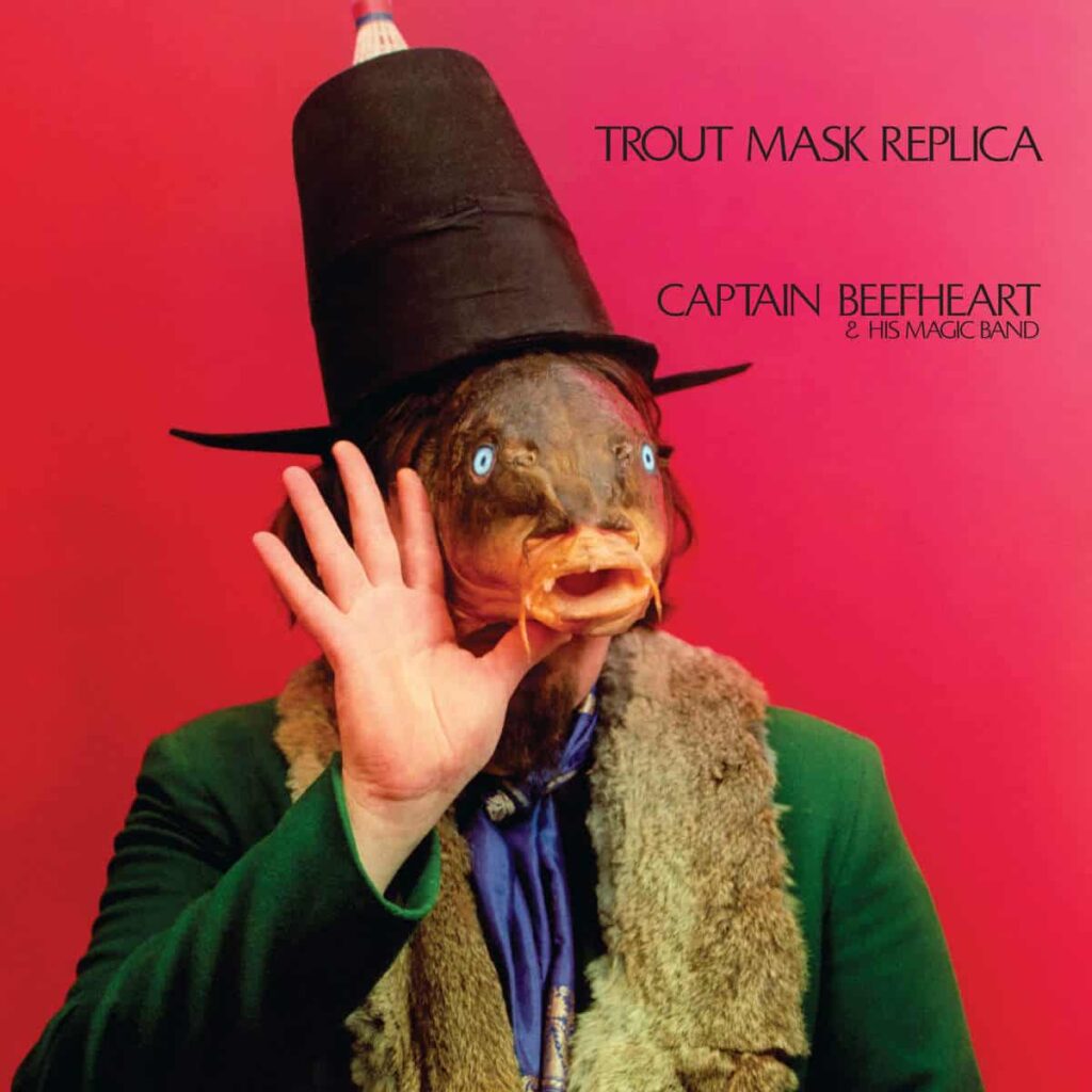
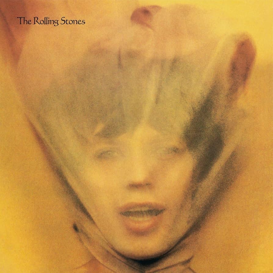
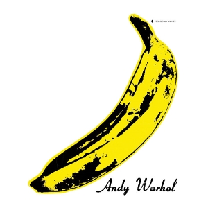
Just a few different album covers and how I wanted to represent my band as a Punk/Rock band as that is part of the music that I listen to and would fit nicely into a band to represent through the whole identity, and differnt ways these band’s have presented on an album cover and different elements they have used.
Music Videos
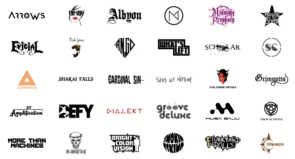
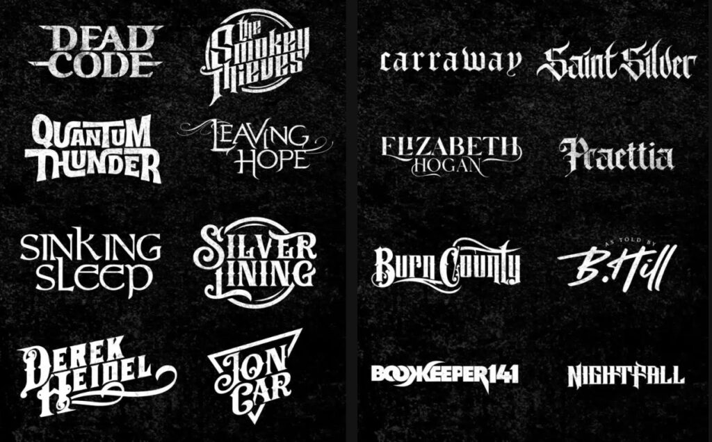
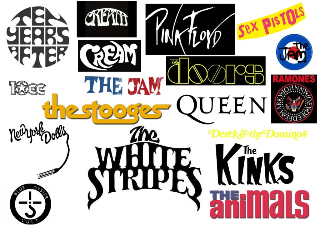
Logo Research
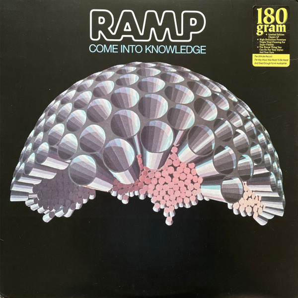
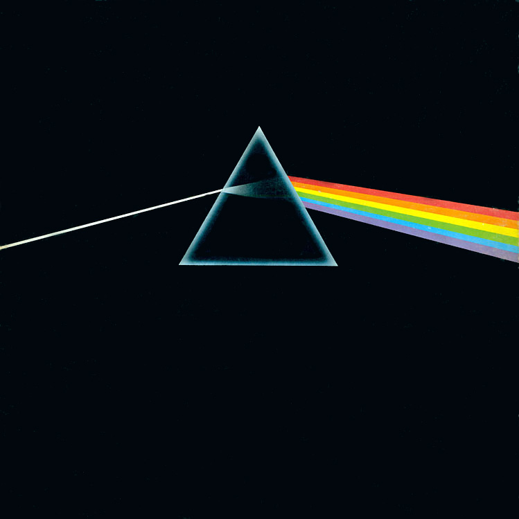
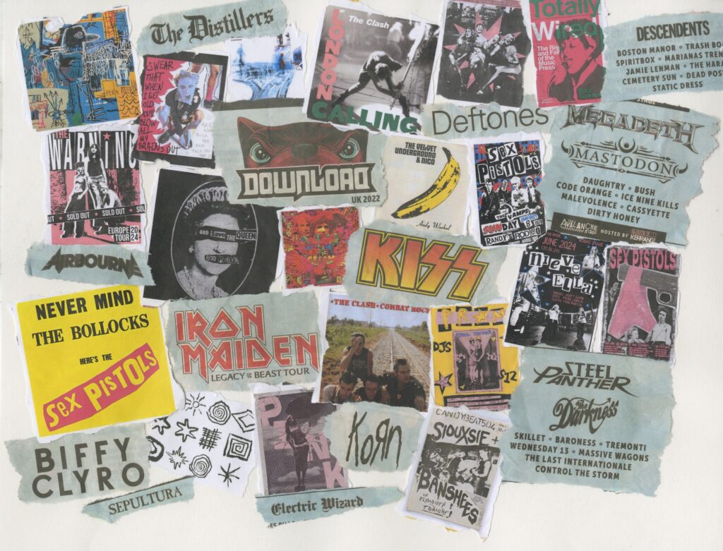
Rock/Punk bands
- The doors
- New York dolls
- The Stooges
- The Jam
- Sex Pistols
- Pink Floyd
- The Beatles
- Bread
- 10cc
- White stripes
- Iggy pop
- David Bowie
- Ten Years After
- The Kinks
- Cream
- Blur
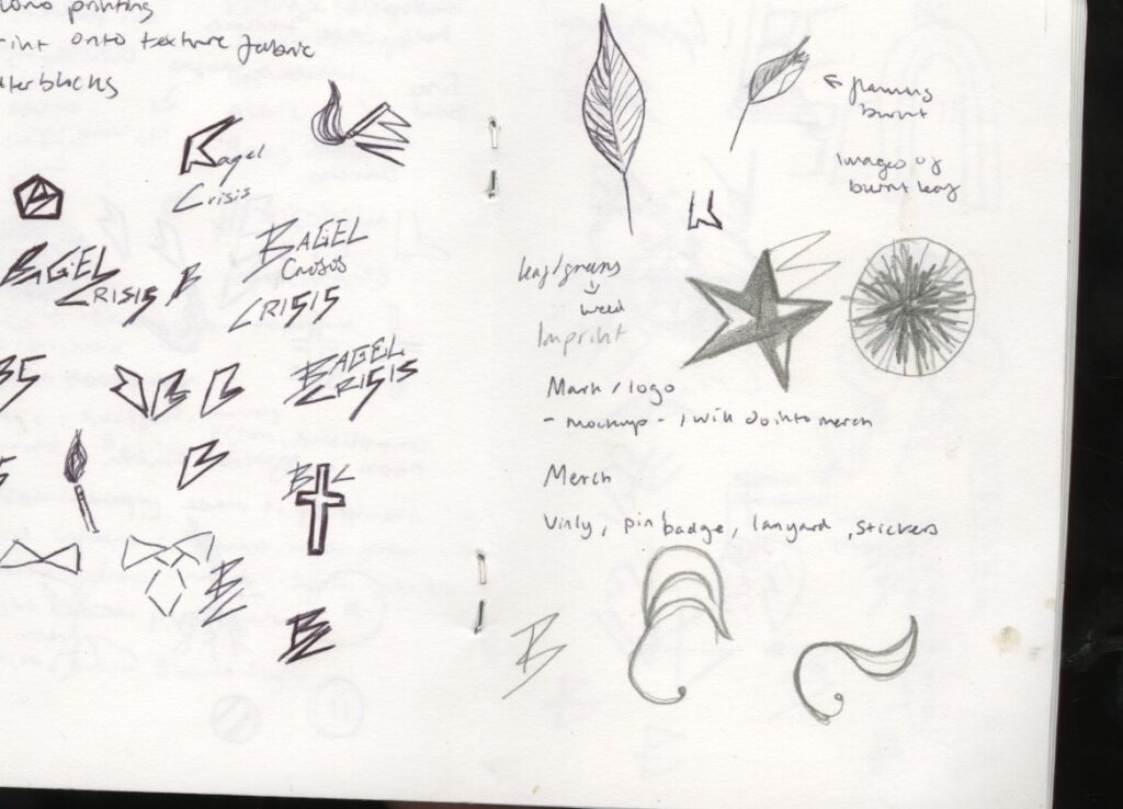
Sketches/mind map/moodboard (scan rest in upload)
These were a quick few sketches before when I was brainstorming possible ideas, I was trying to get away from the name bagel and having something round and with clean edges. I tried sketching out some emblems too, before moving onto the larger scale
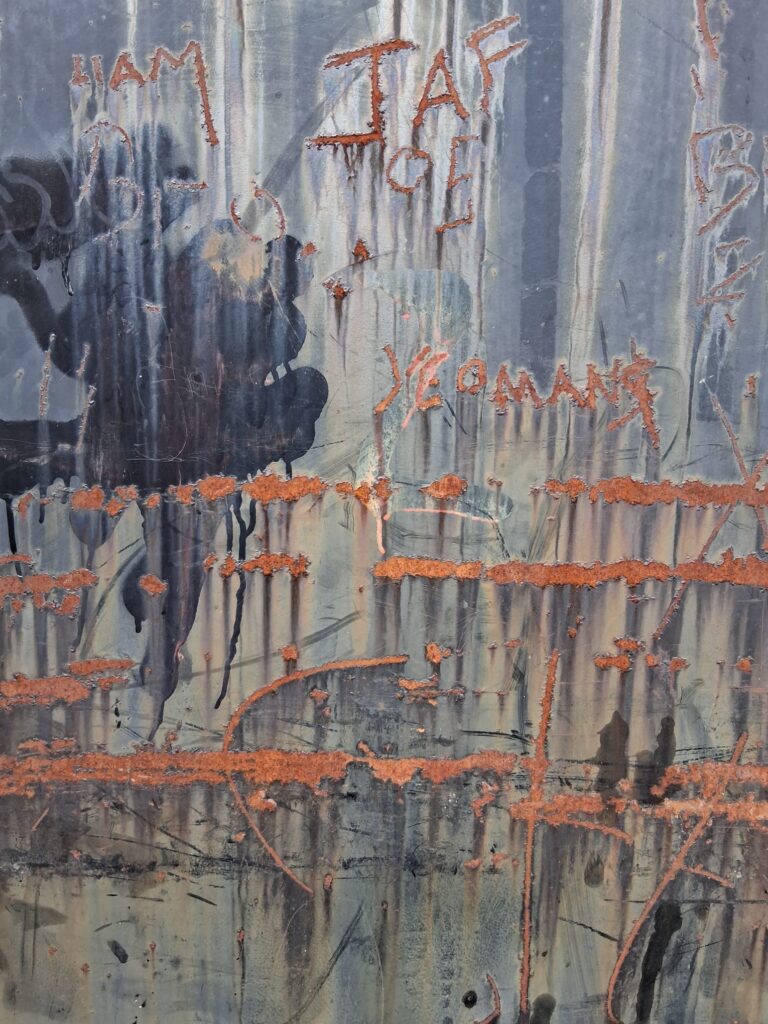
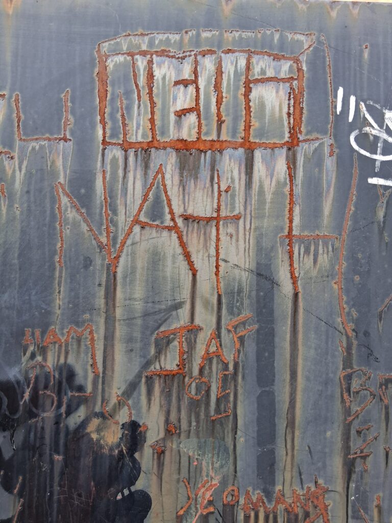
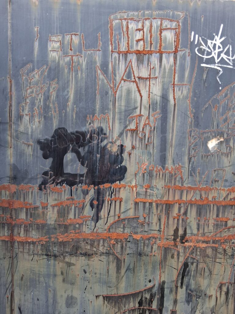
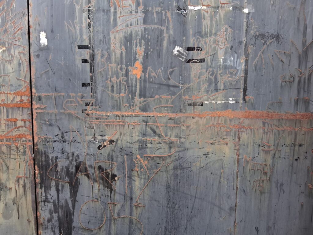
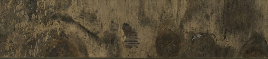
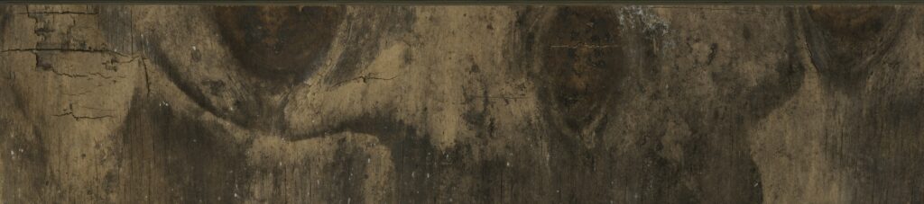
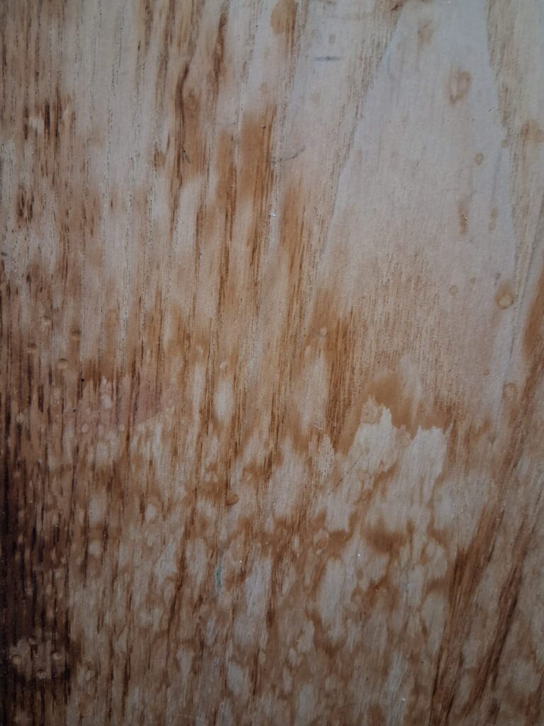
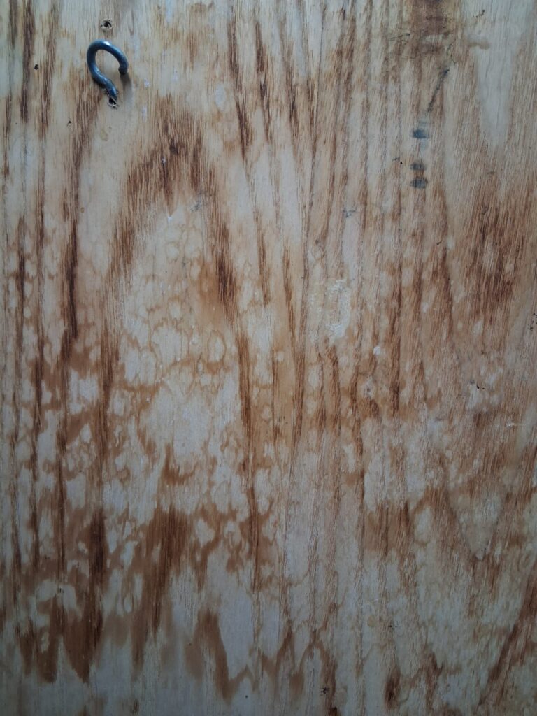
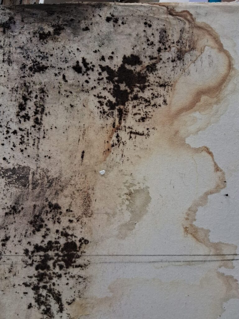
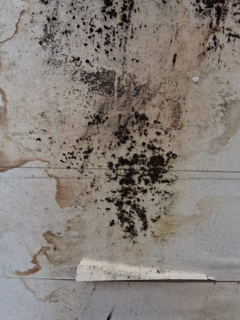
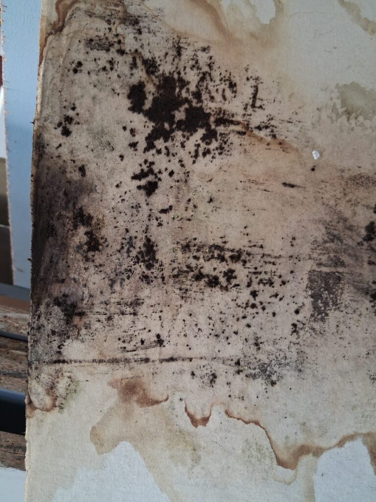
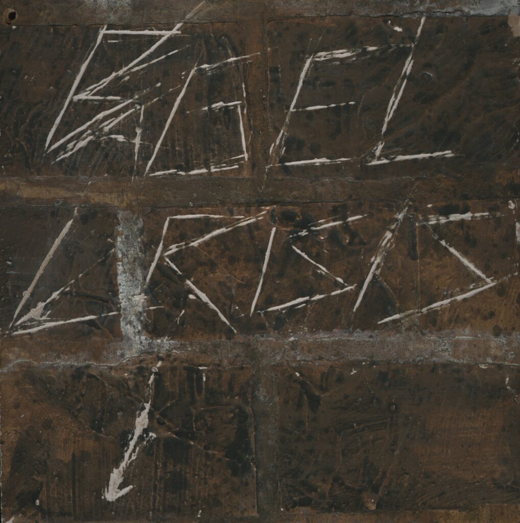
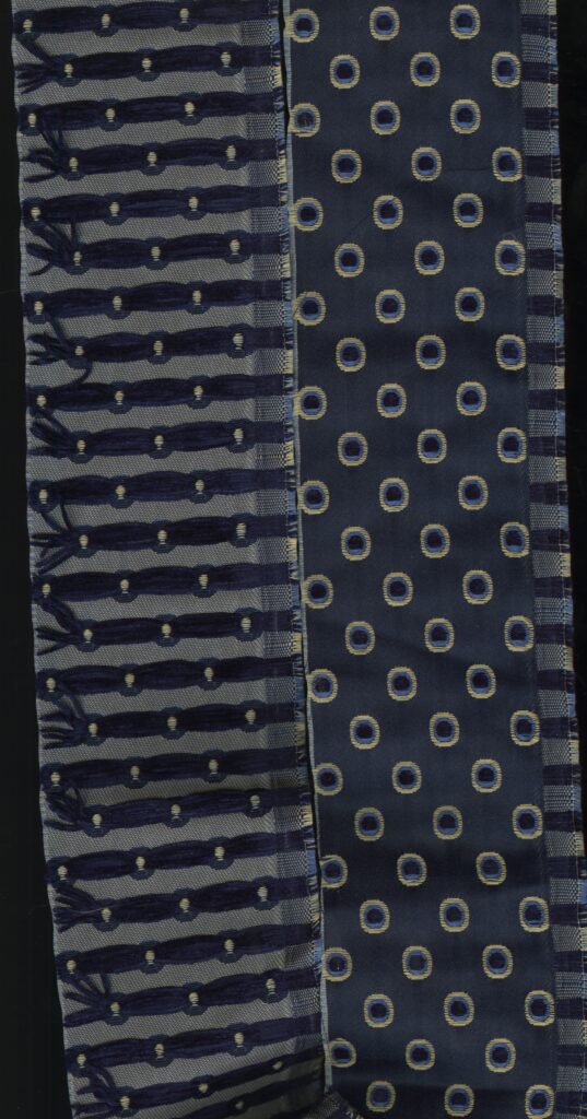
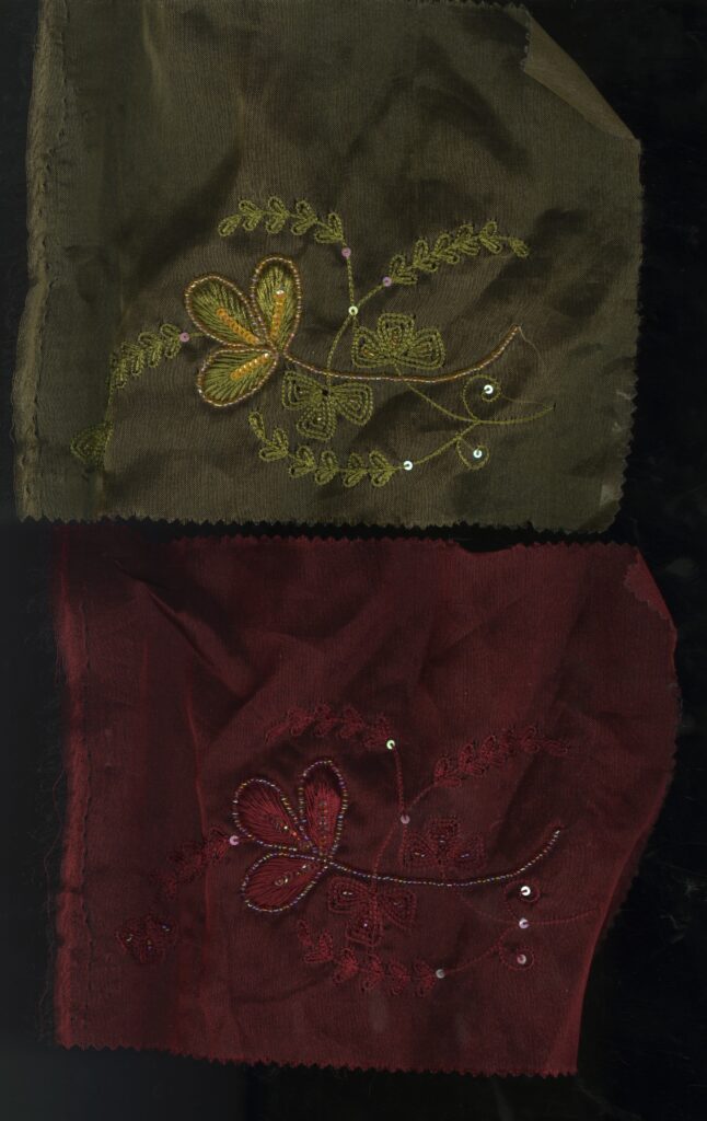
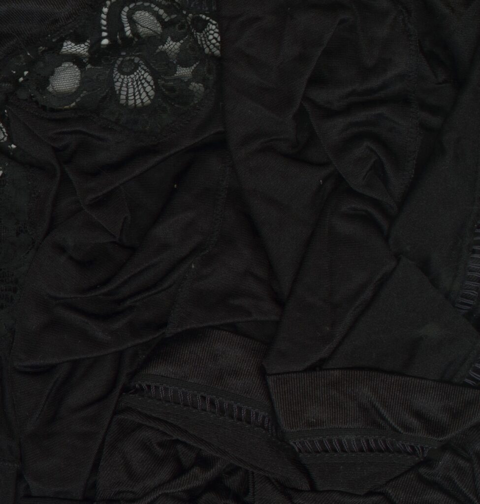
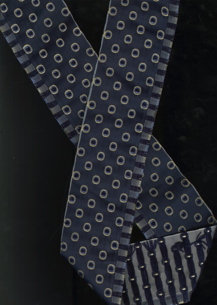
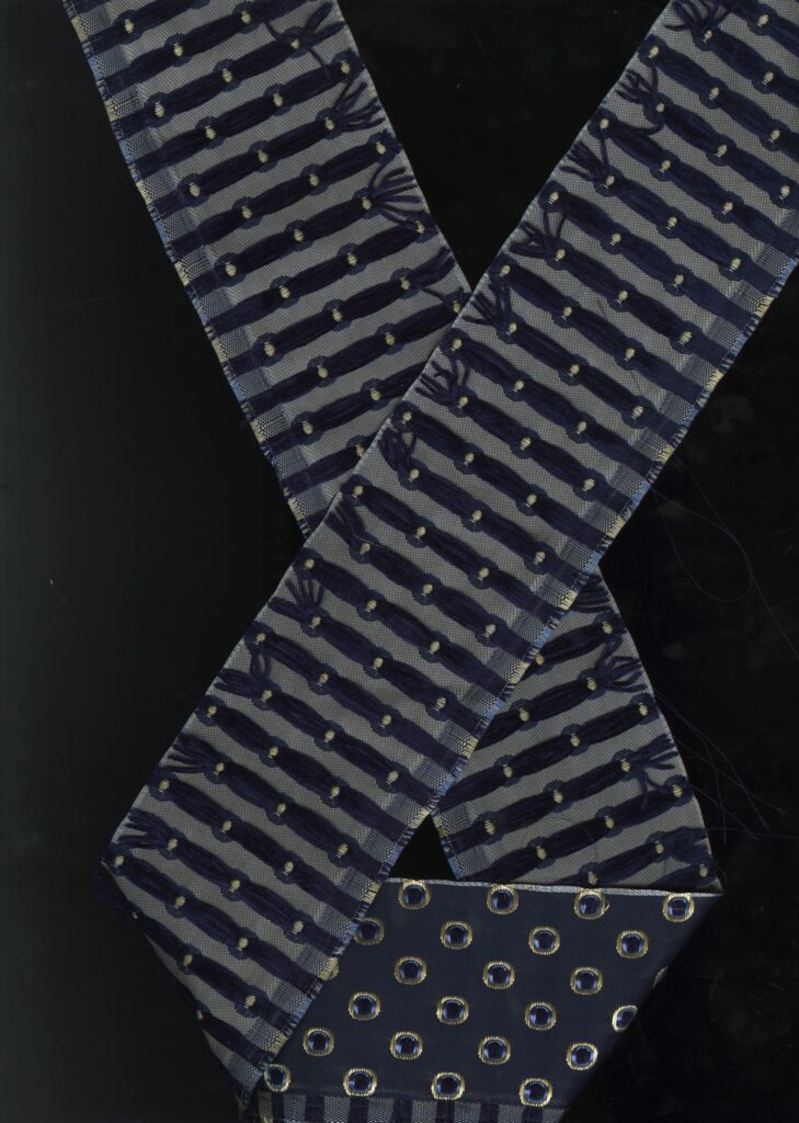
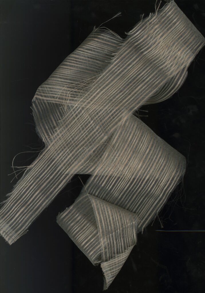
Photographs/ Found Material
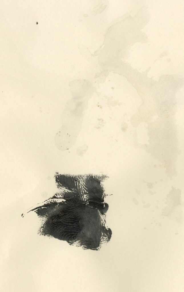
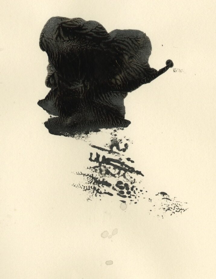
These are different things I found which i quite liked the look of and some of them were quite harsh and strong. I liked the oxidation of the graffiti on the wall
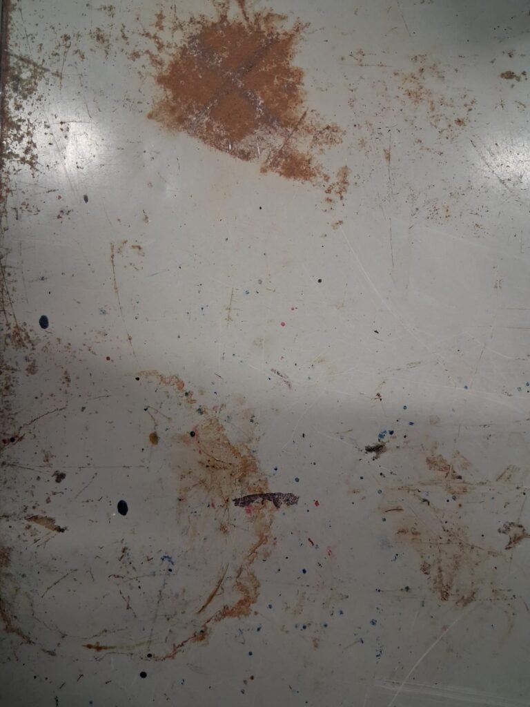
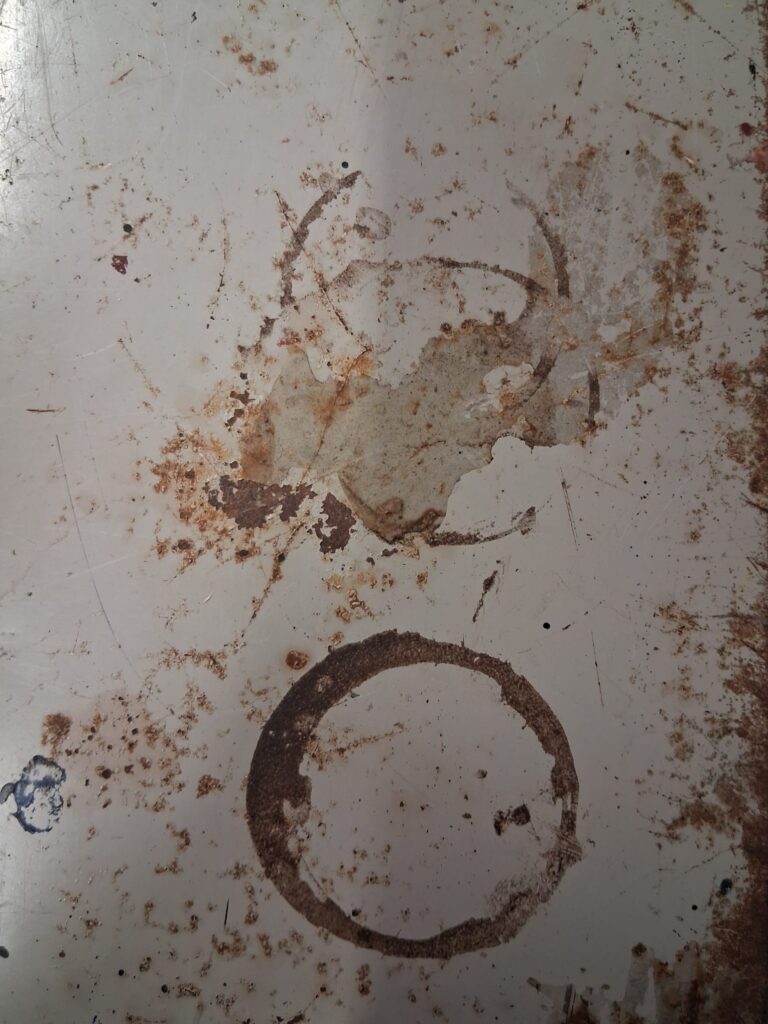
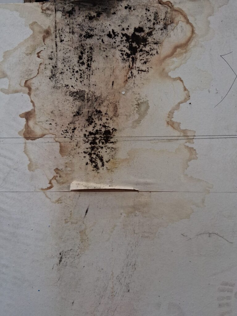
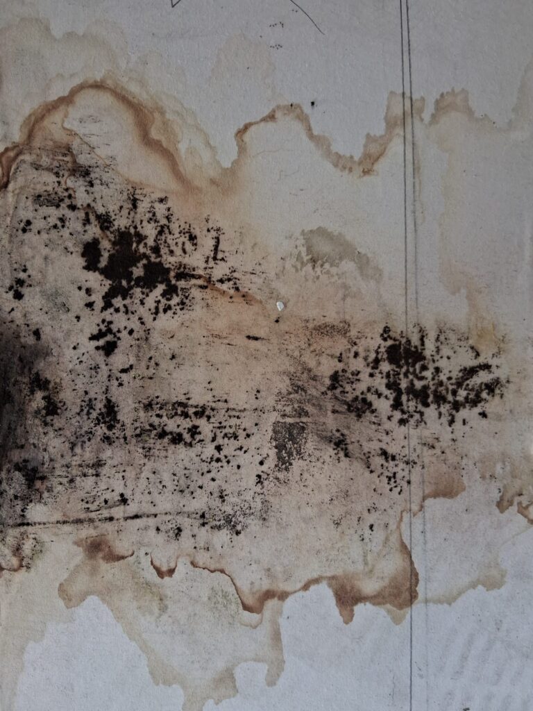
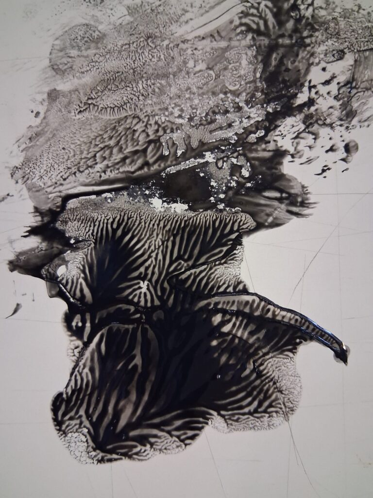
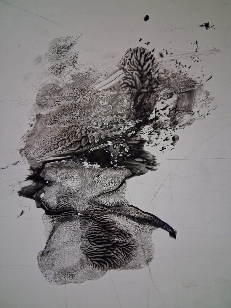
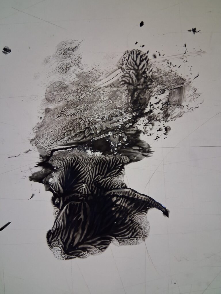
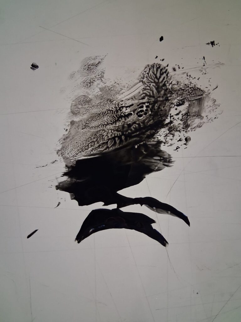
The ink texture was created after I spilt some paint and lifted it off the paper and created this interesting pattern.
Books
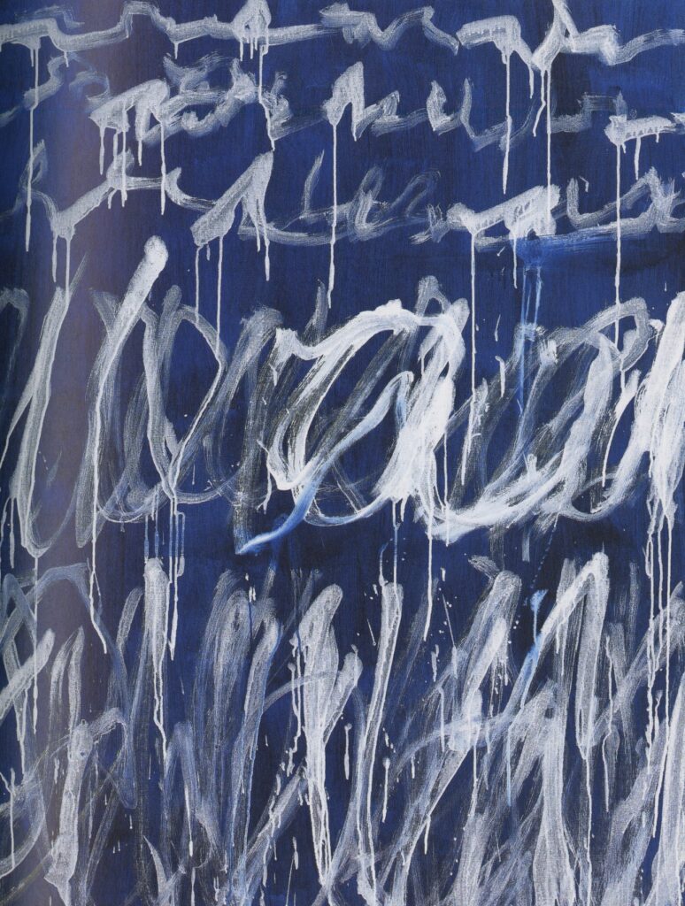
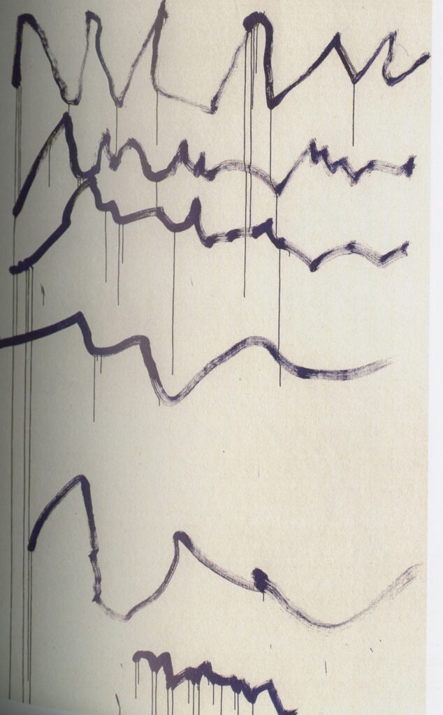
I went to the library and picked up few different book paintings, ceramics, and punk style to see where this would lead me and use different elements from them to push me into the experimentation phase. What I liked from these paintings are that they look carefree and don’t look neat or clean and the edges are rough, as that is what I want to achieve for my work.
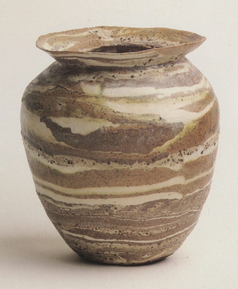
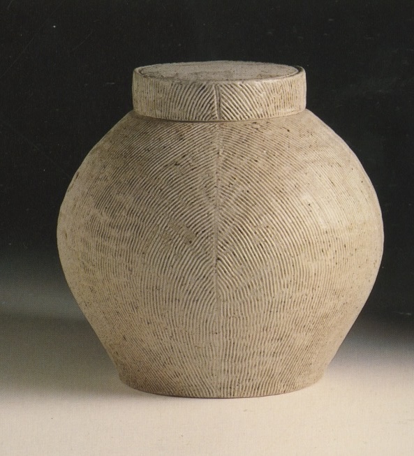
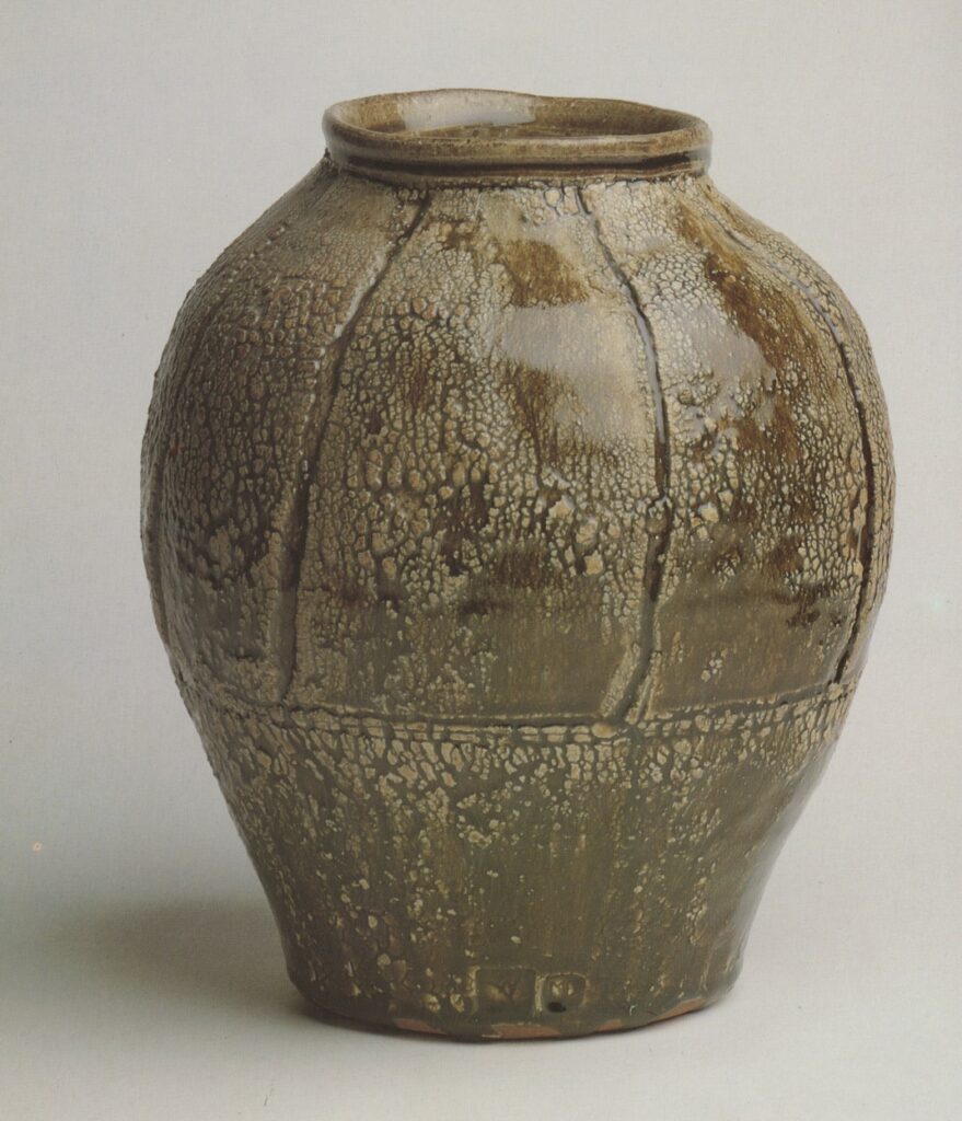
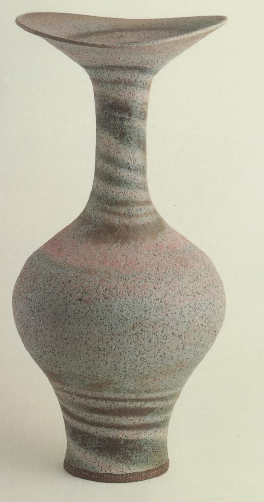
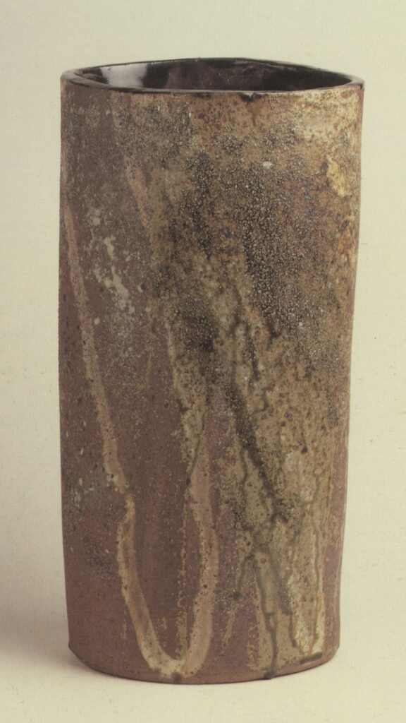
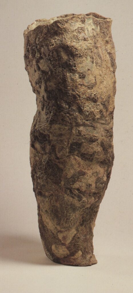
Ceramics
I really liked the different textures from the artifacts below with the rugged, natural look and I might use some of these for texture.
Punk
I really like the DIY aesthetic of punk so I got some books which I thought resonated well, including how to design, different halftones and techniques that would work well withing my work, I wanted to create something with the handmade collage type look, something different. I’m going to use some of these styles in my work to try create the handmade, collage punk look which will fit well with my band name Bagel Crisis.
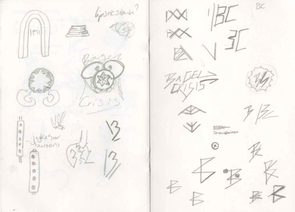
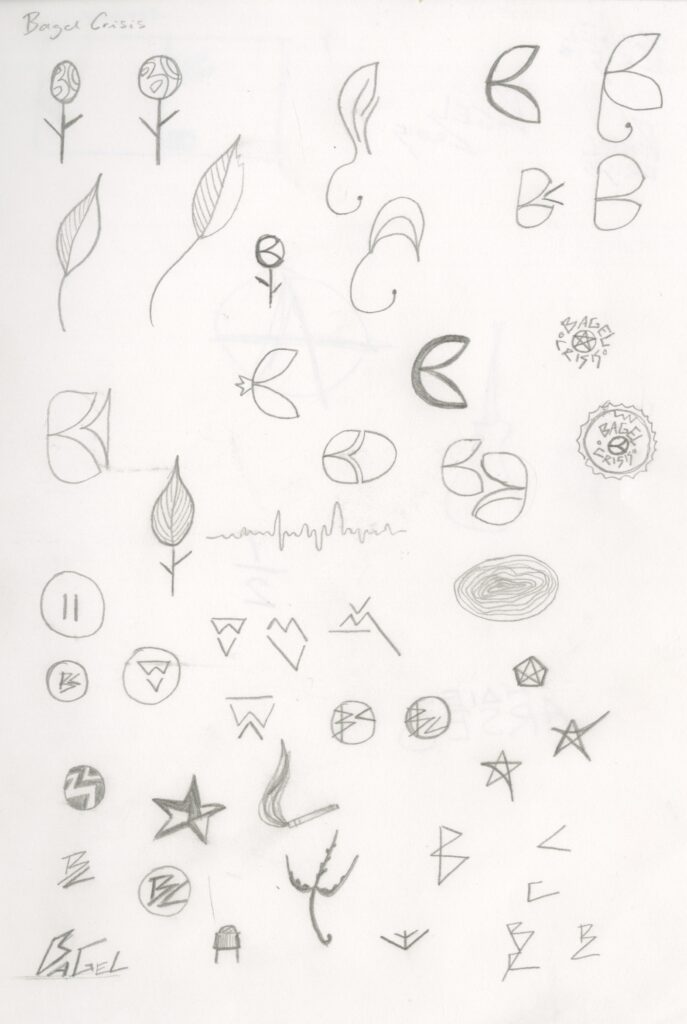
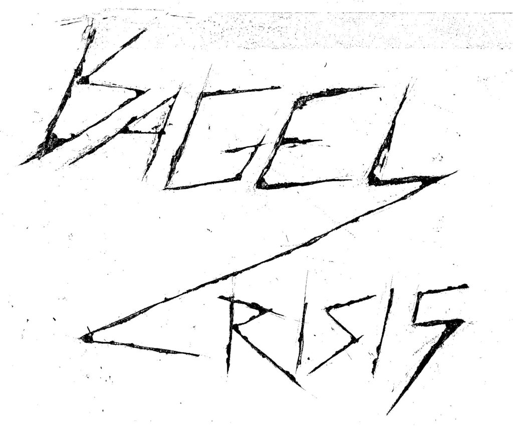
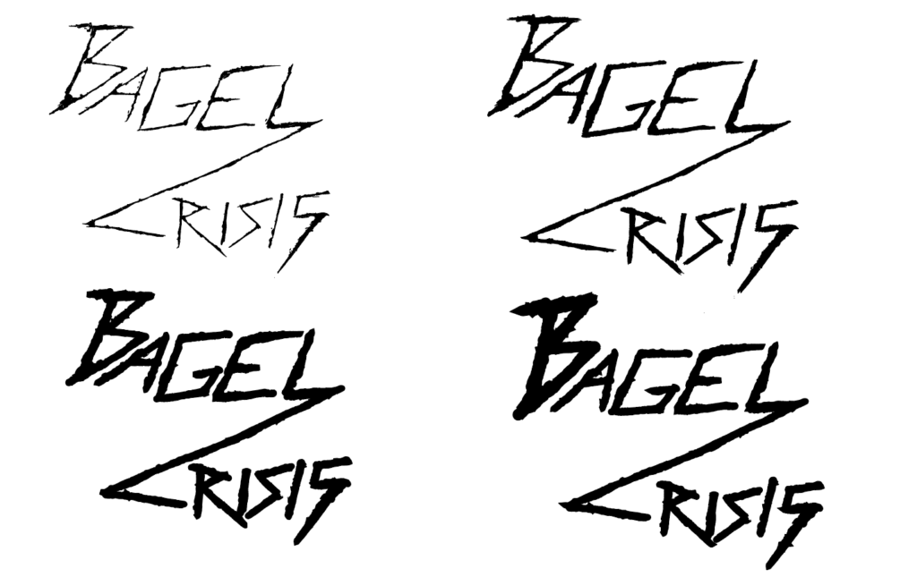
Logo experimentation
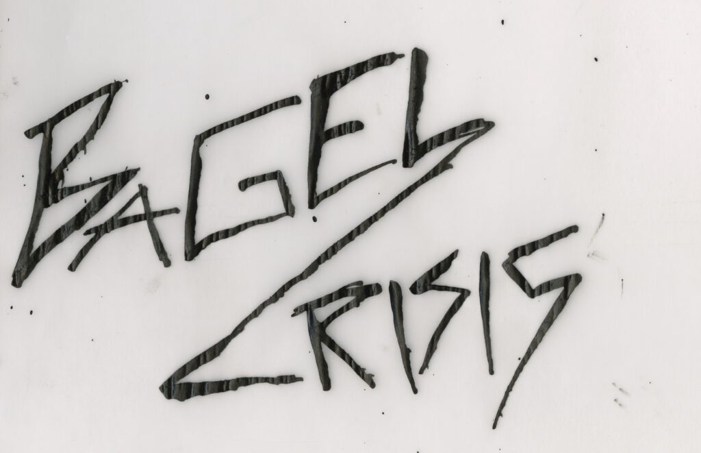
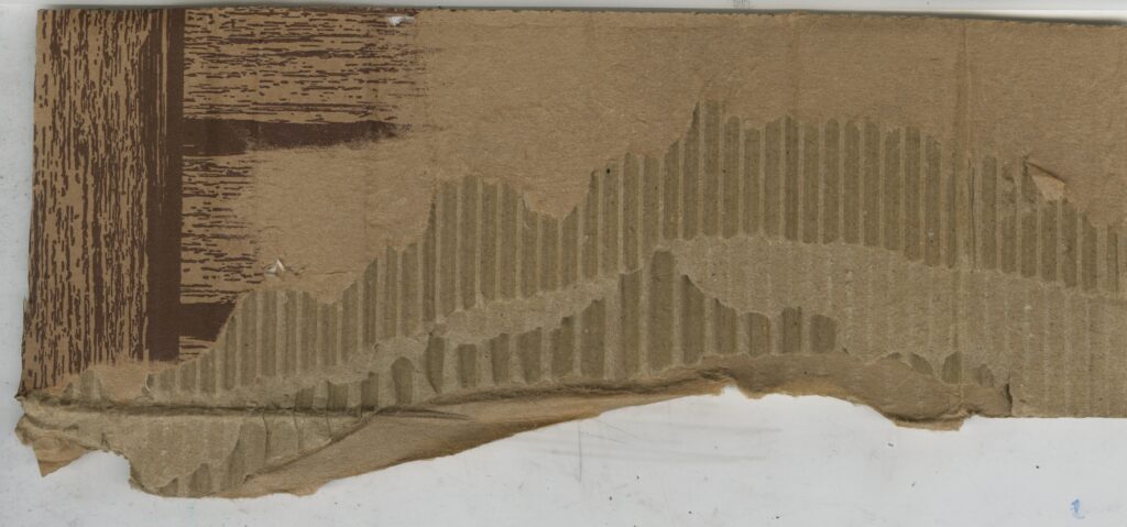
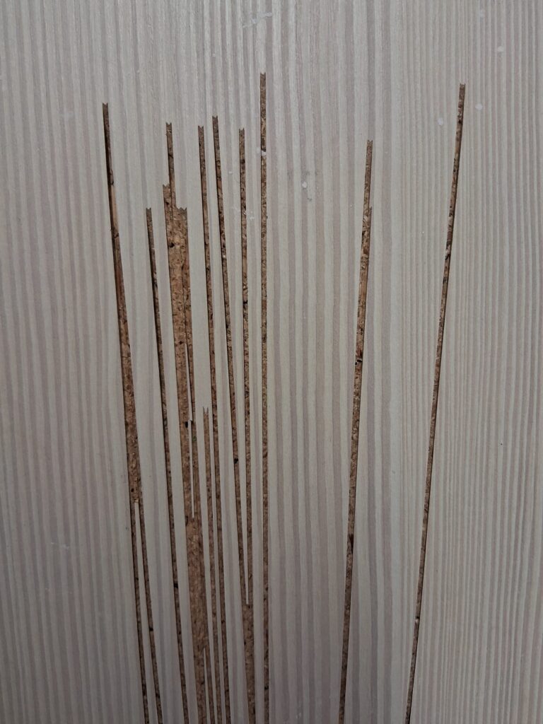
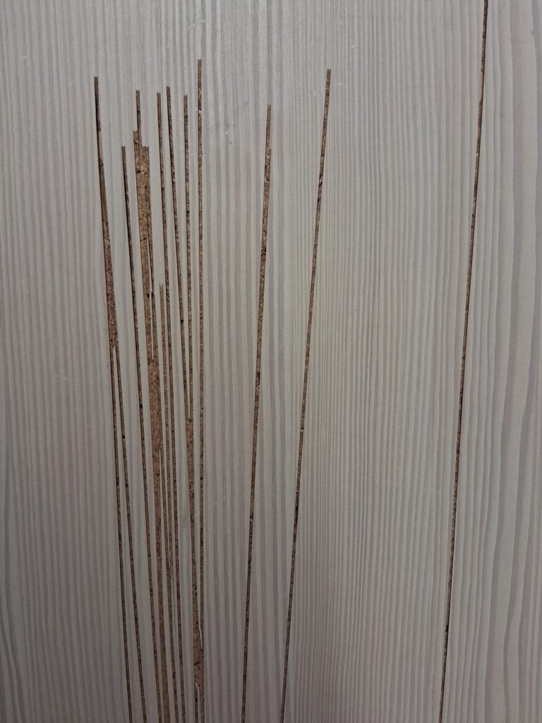
Mount board
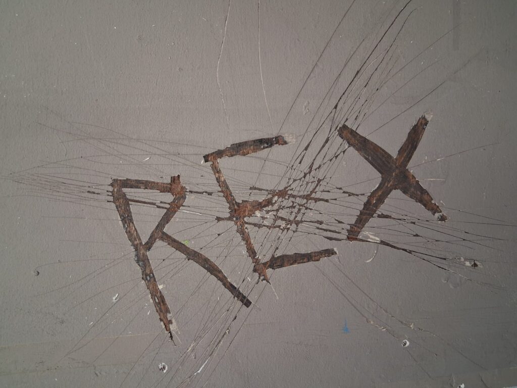
I was trying to create somethings as if something was scratched onto a desk at school and little things as that but at a bigger scale, using a screwdriver to scratch into the board to create a harsh
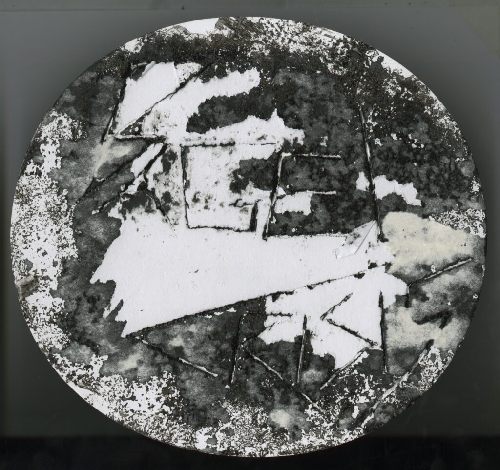
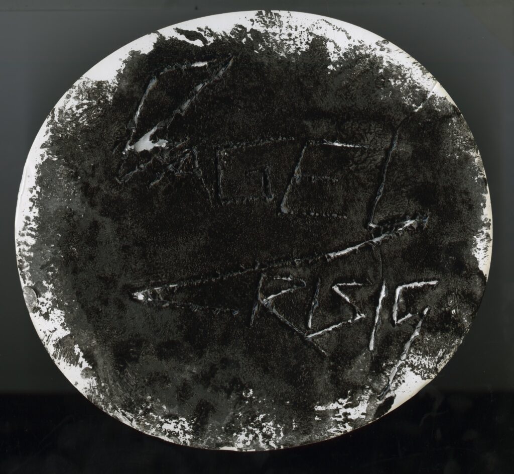
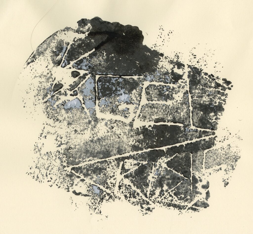
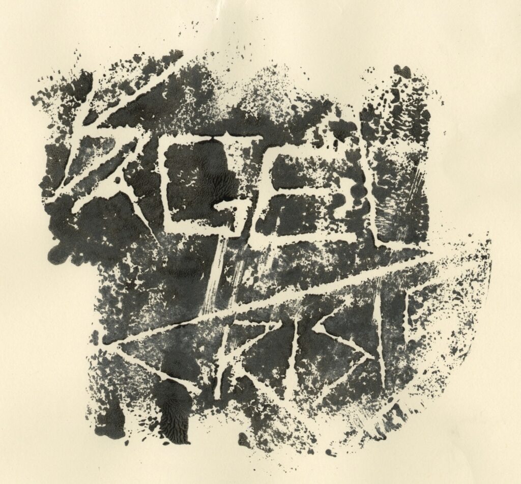
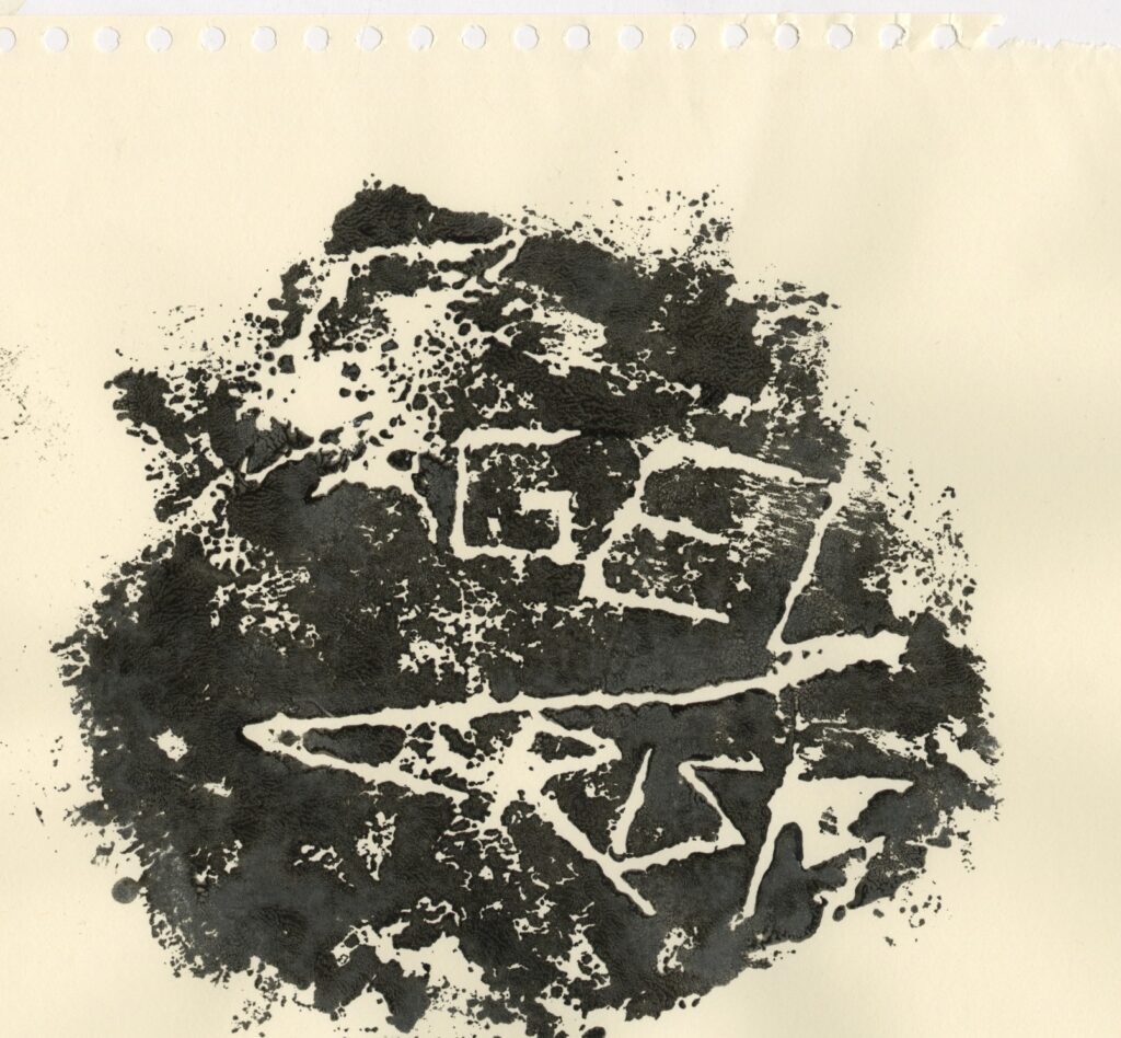
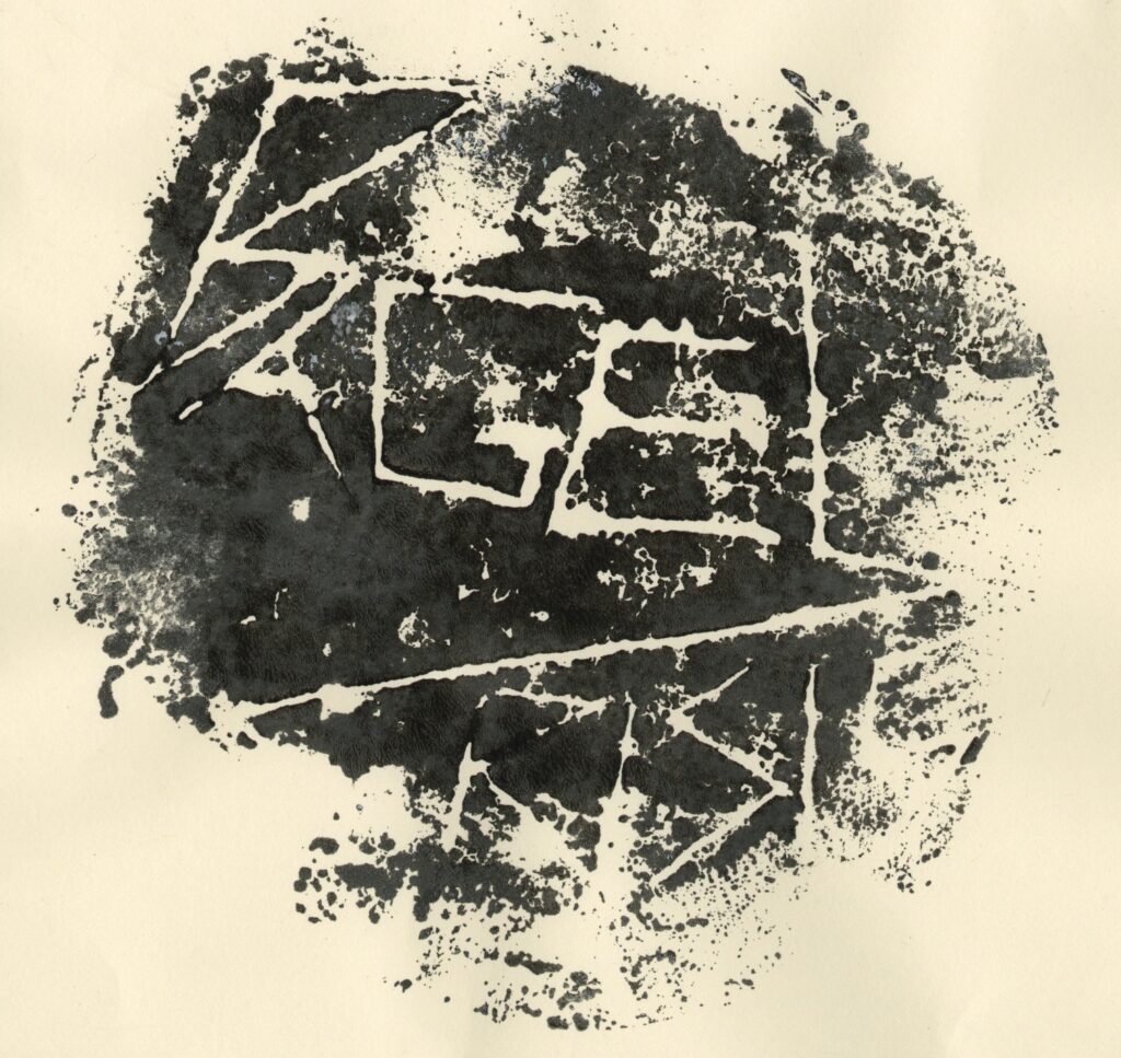
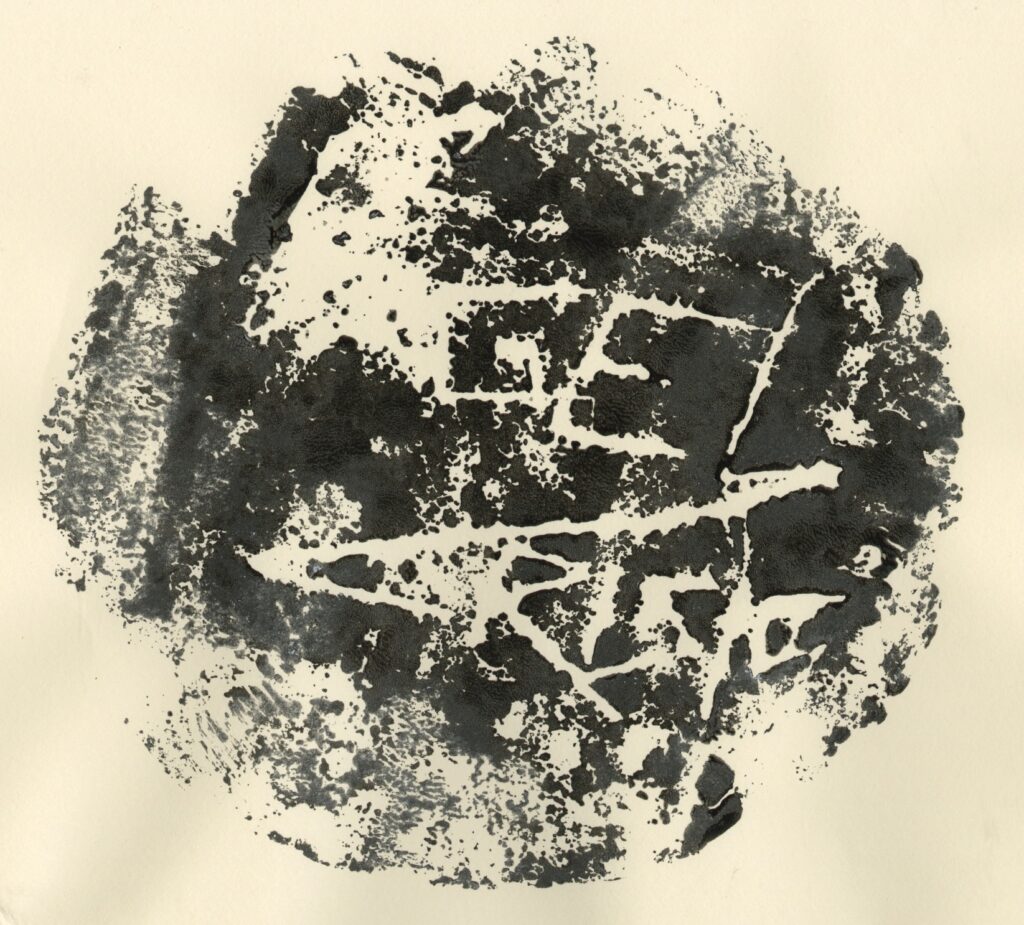
These are how they came out and some of them were hard to read but I quite like the texture
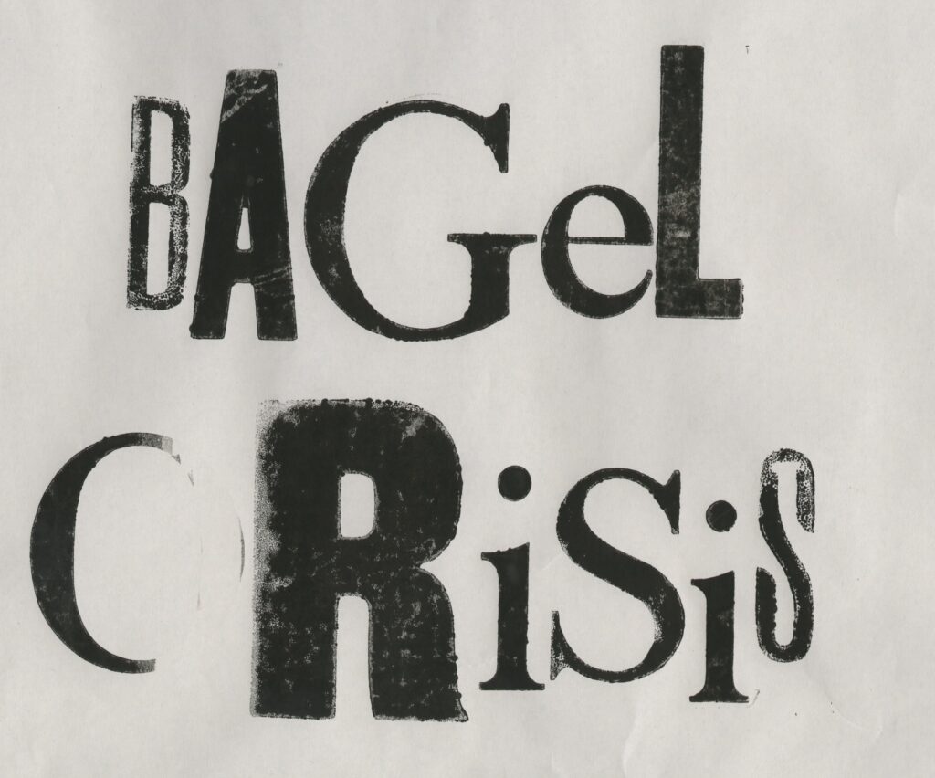
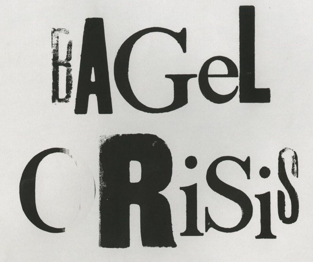
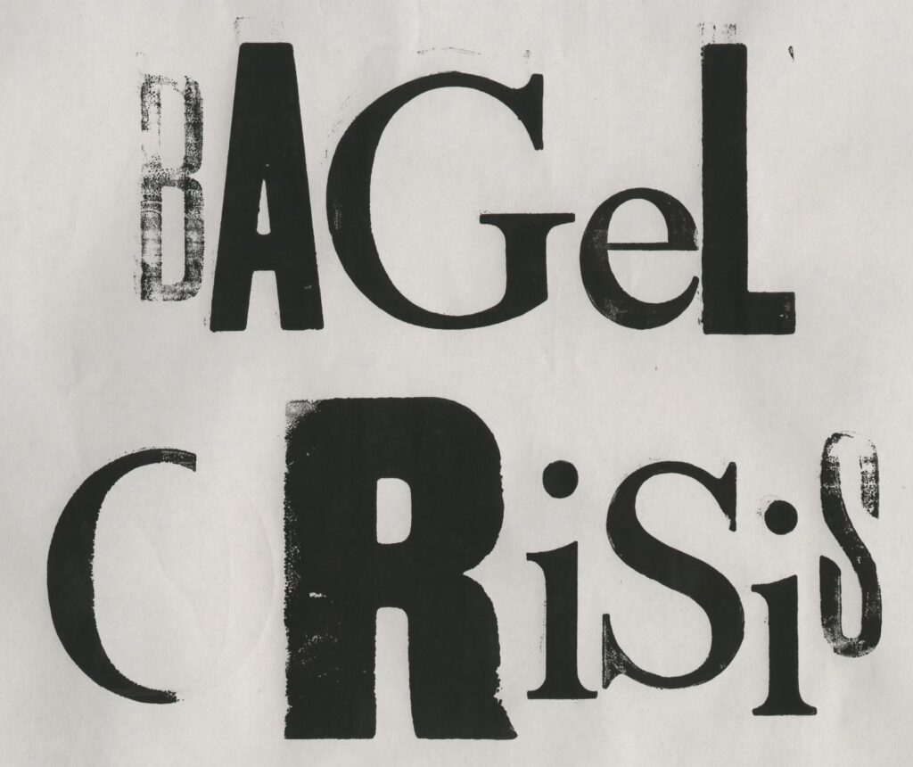
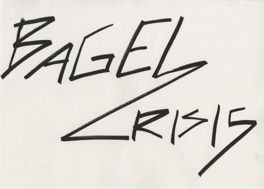
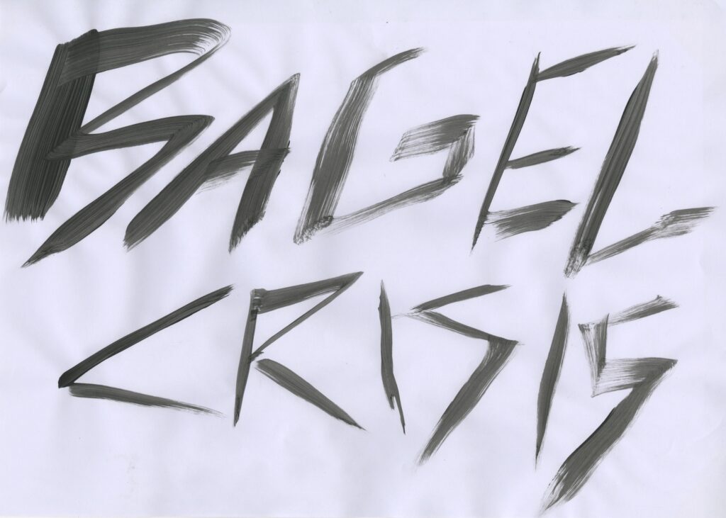
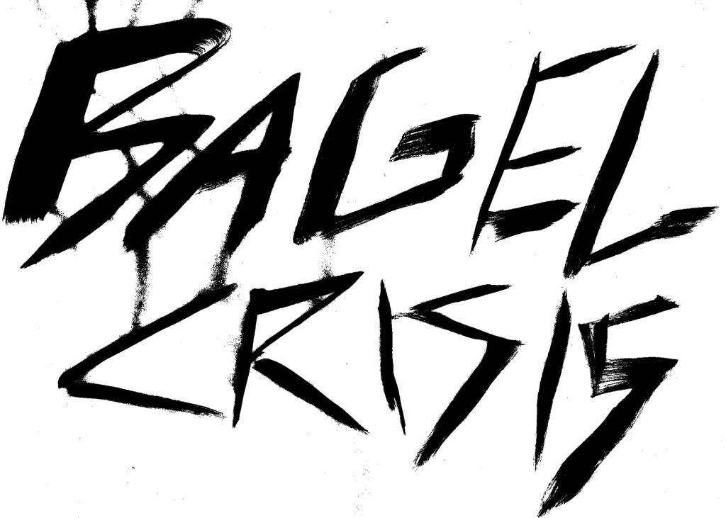
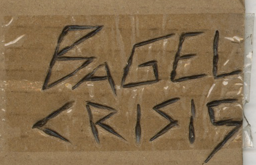
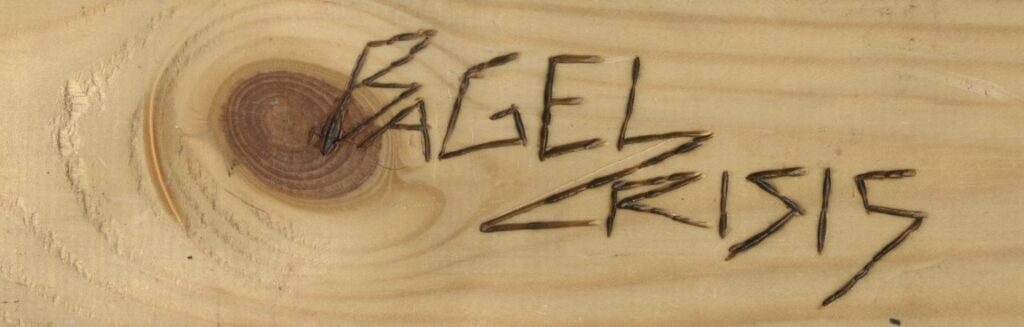
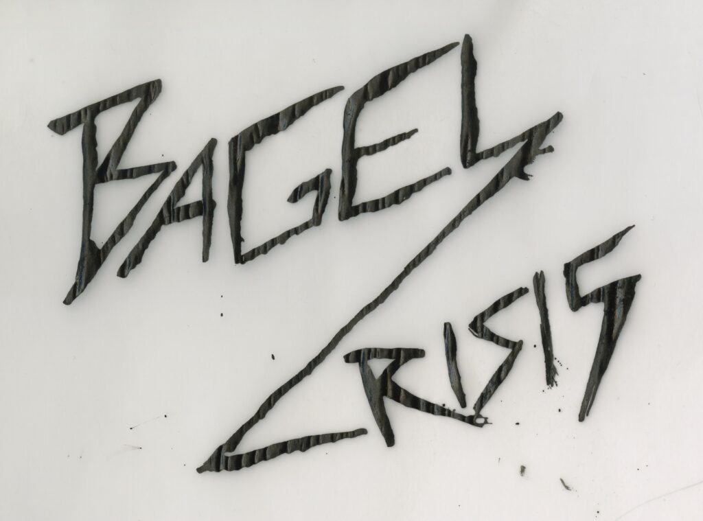
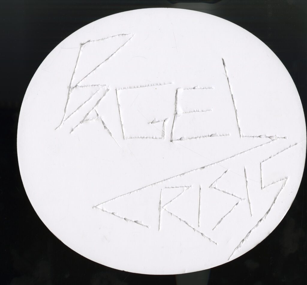
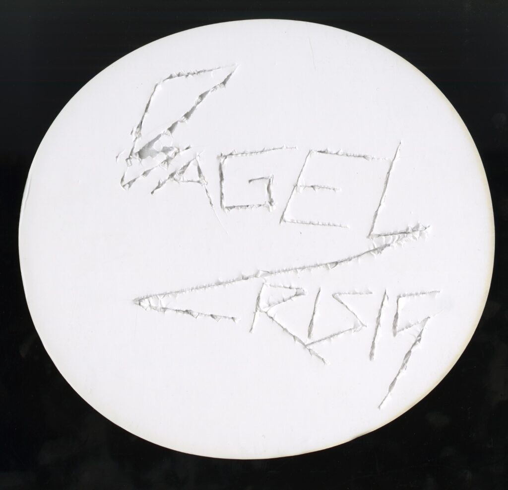
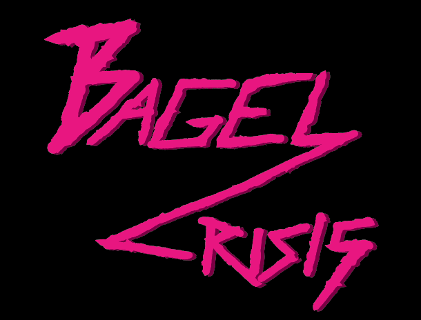
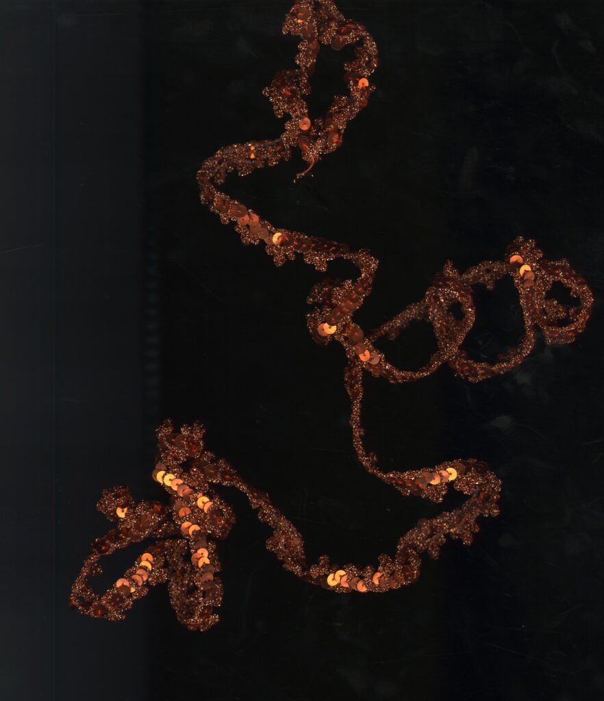
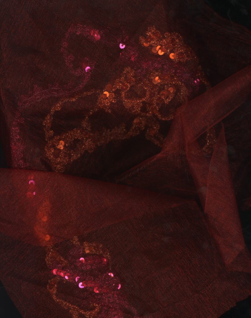
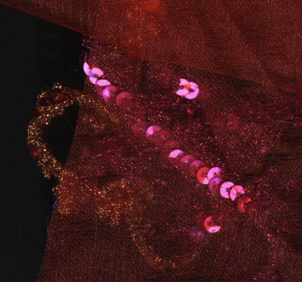
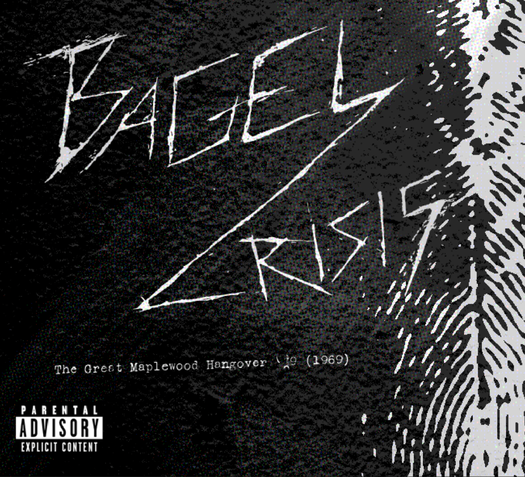
Final versions of logo
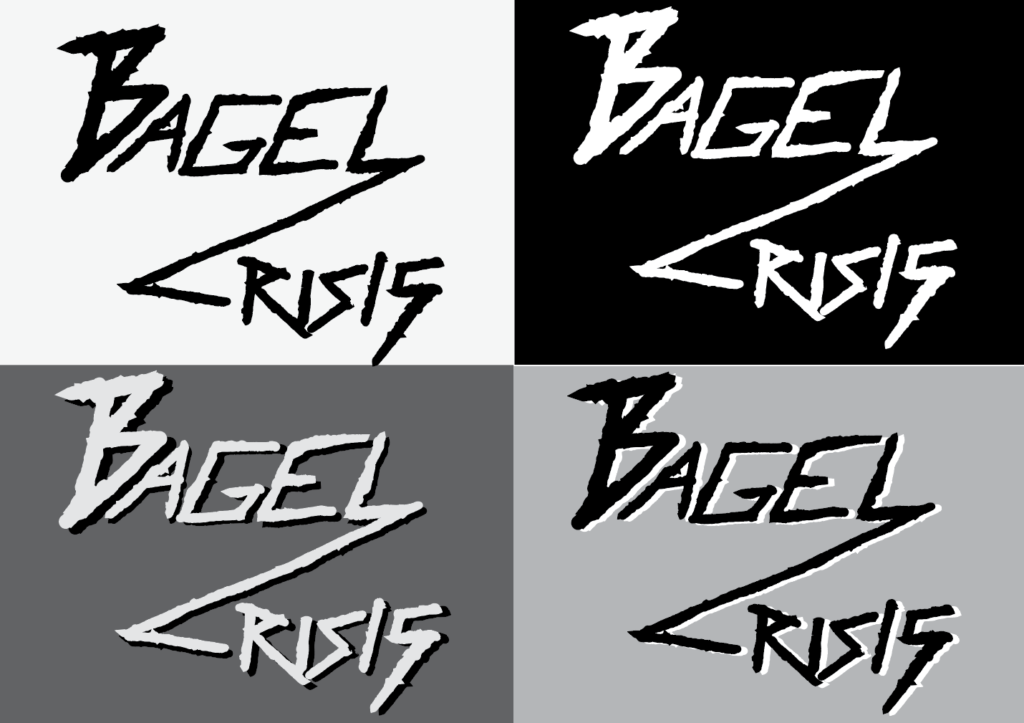
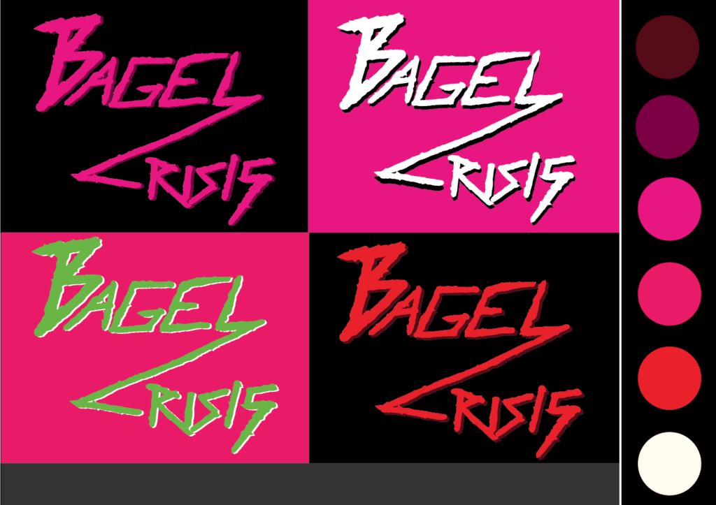
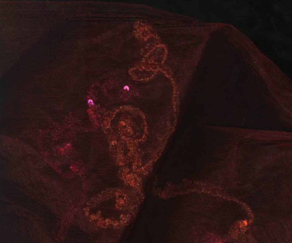
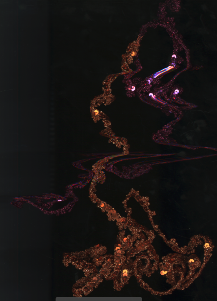
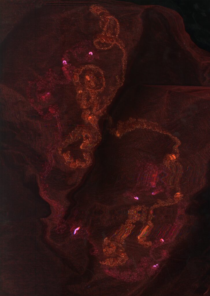
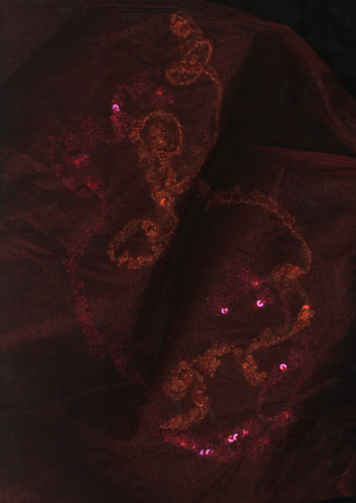
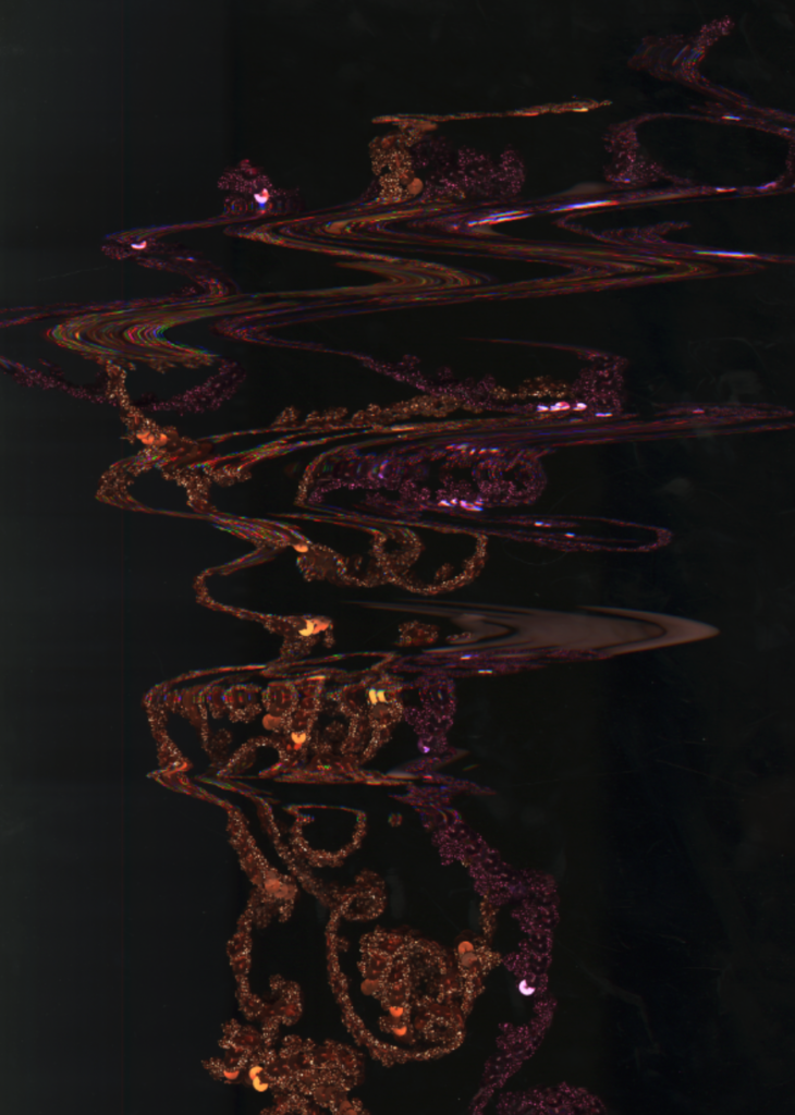
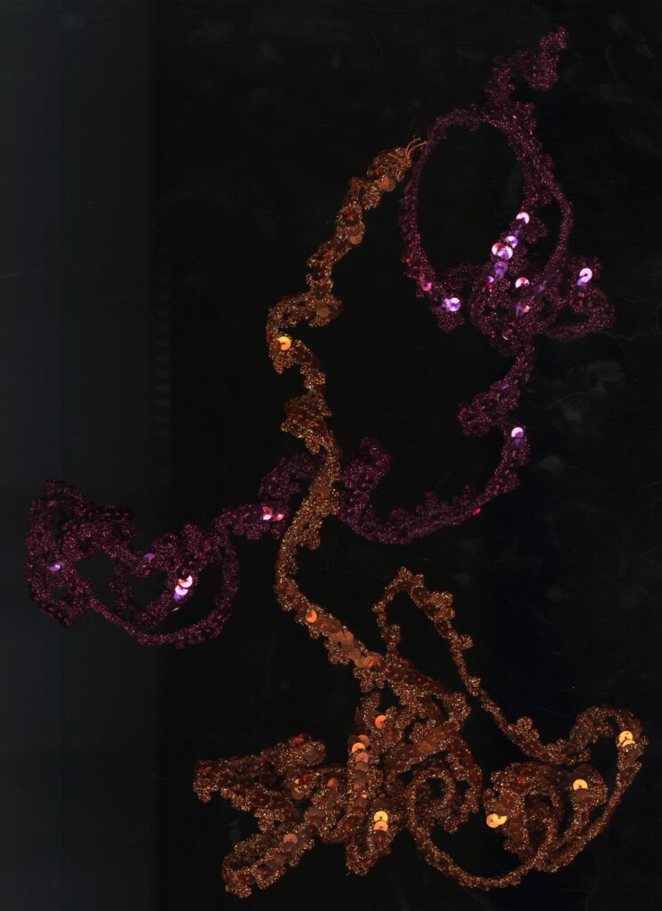
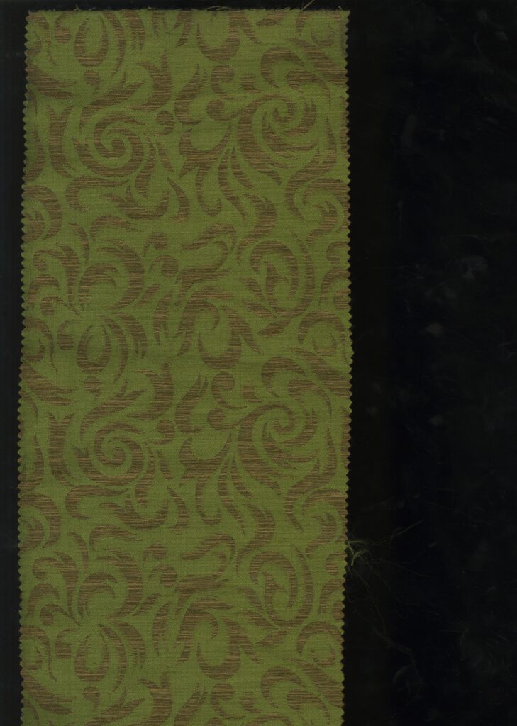
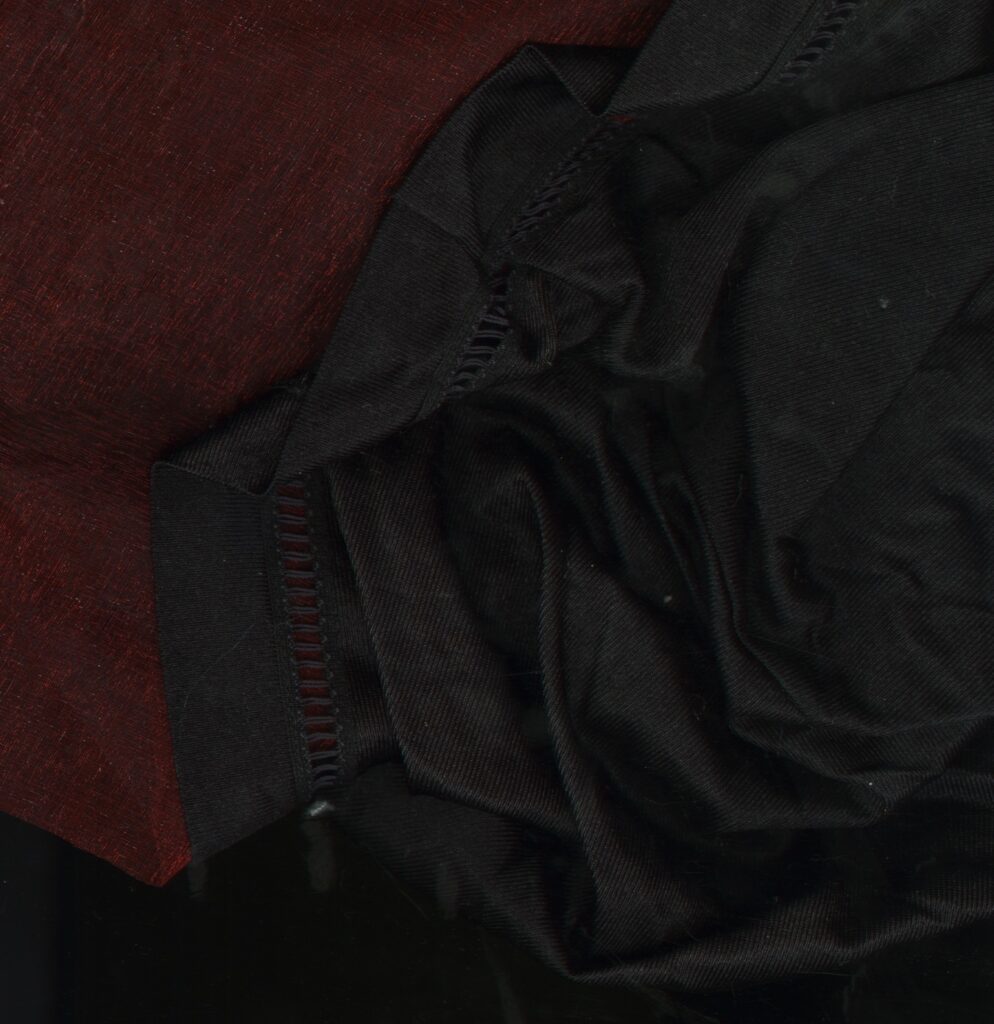
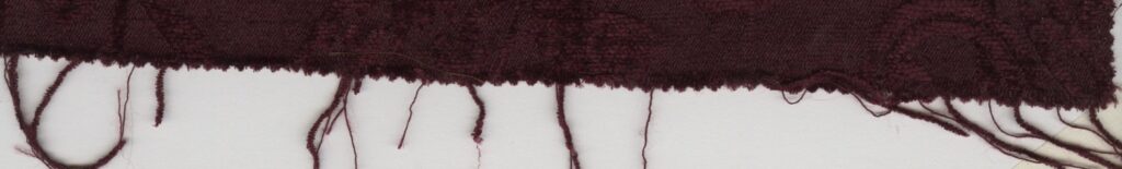
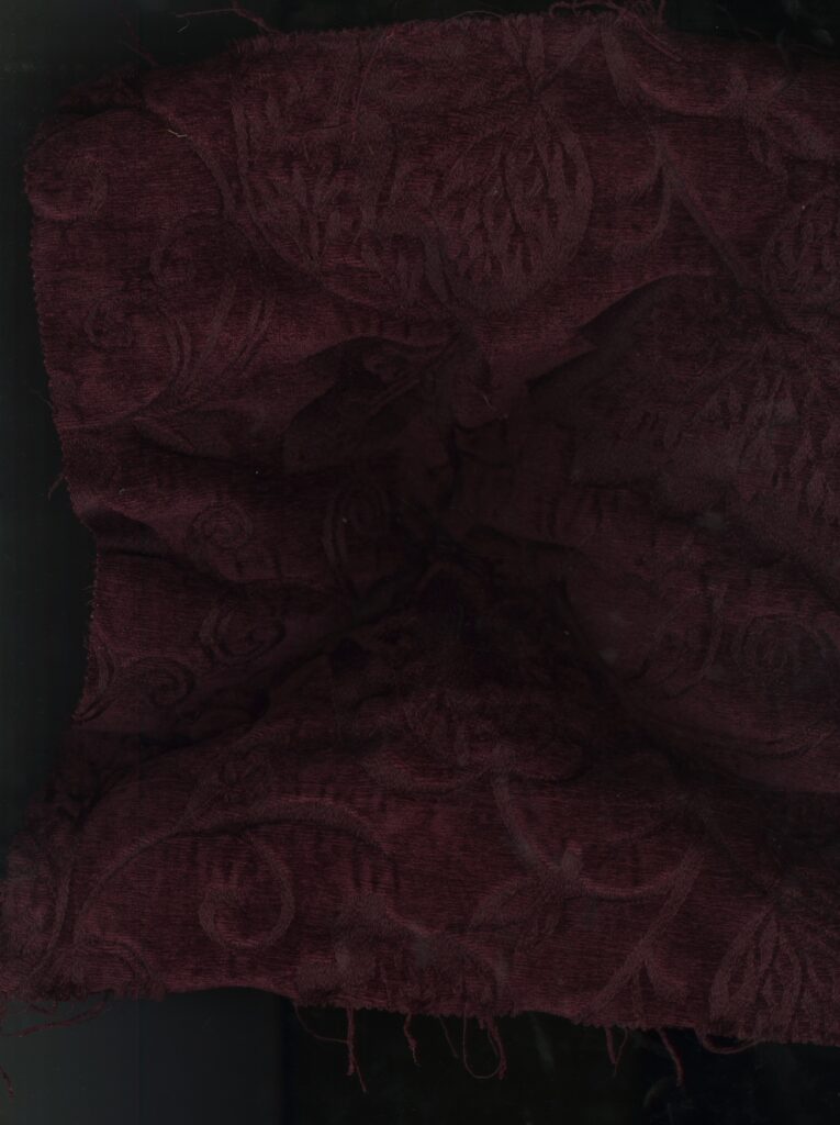
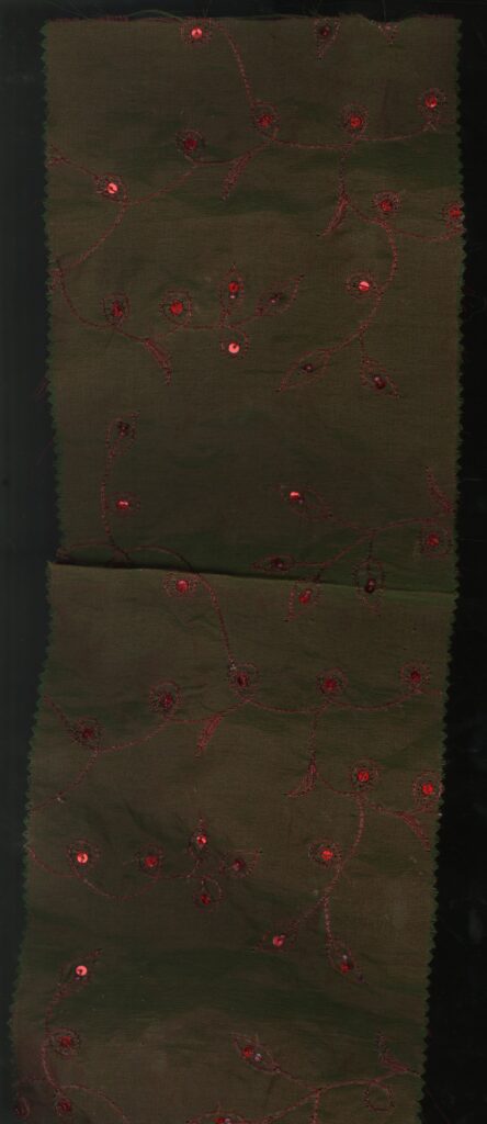
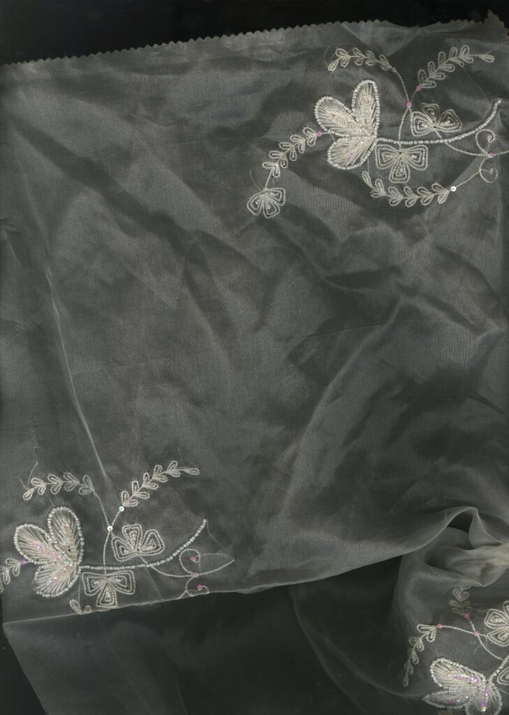
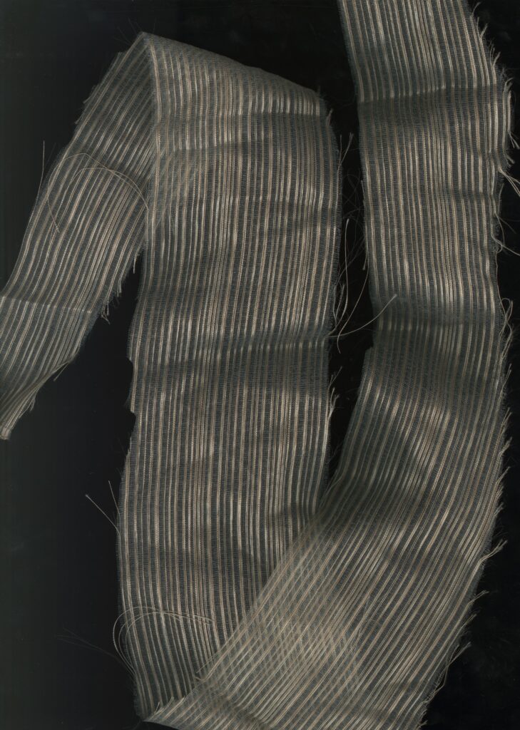
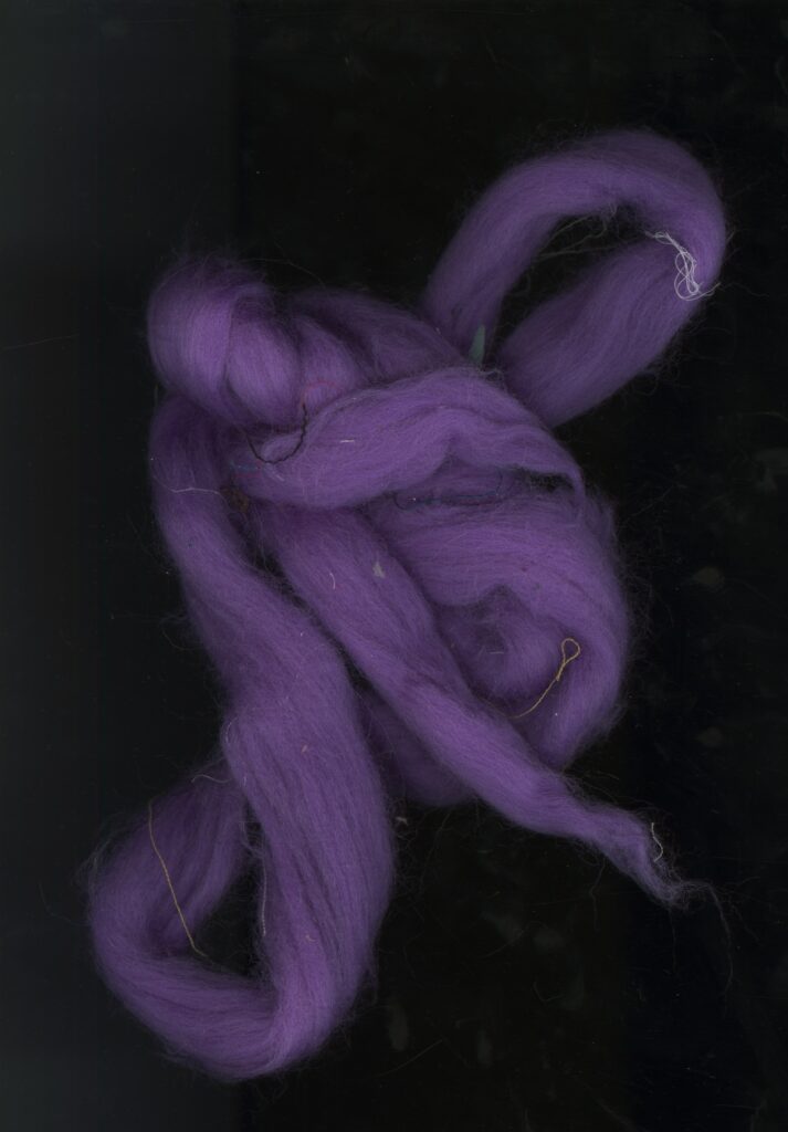
Experimentation with scans
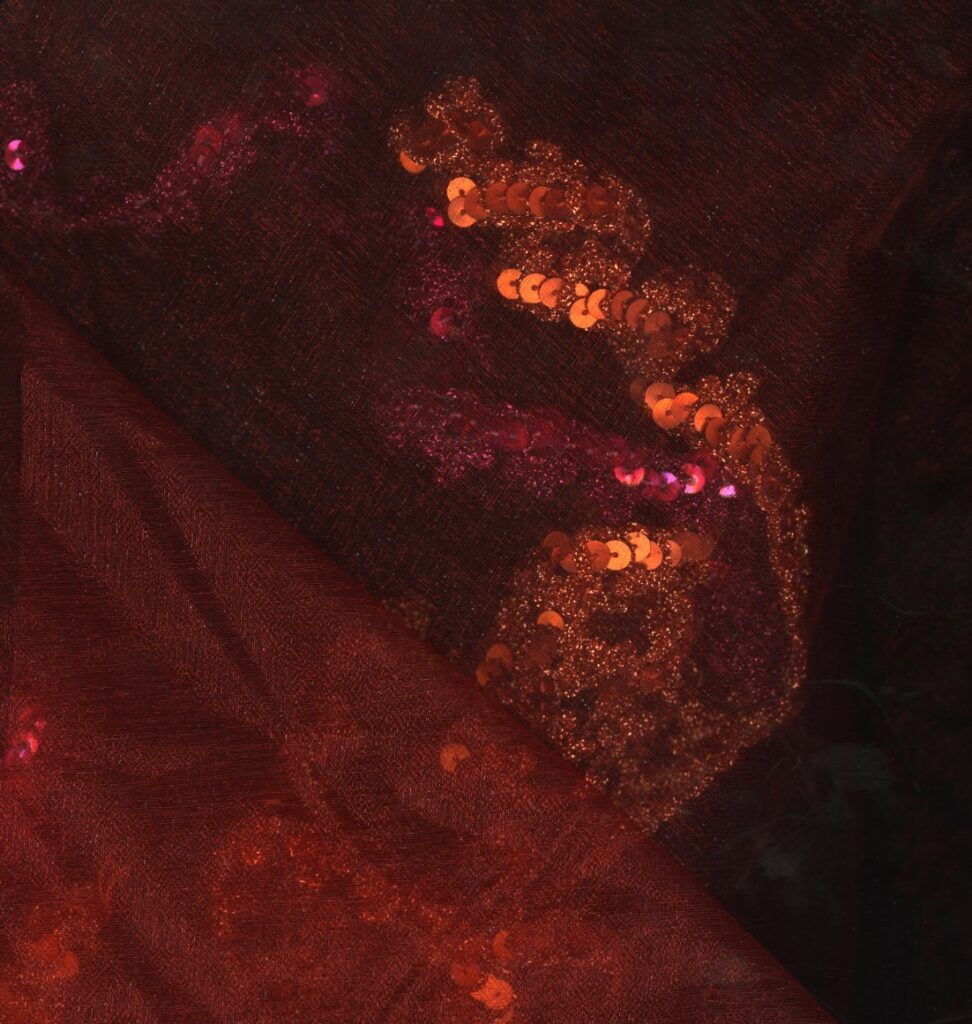
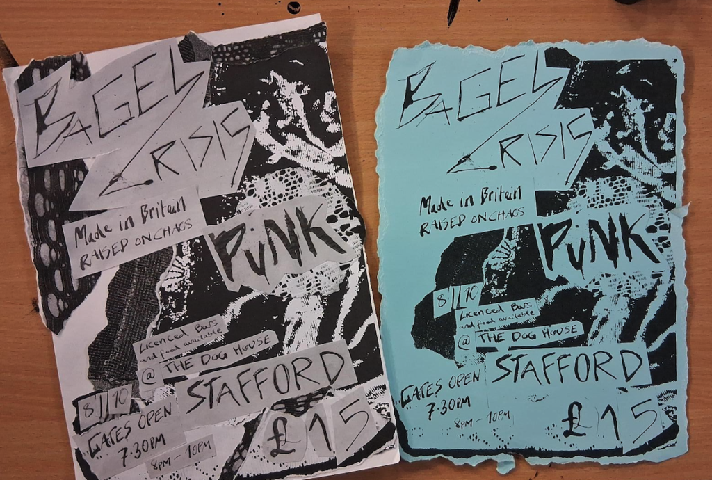
Few of my favourite scans due to the colour so I will possibly be experimenting further with them.
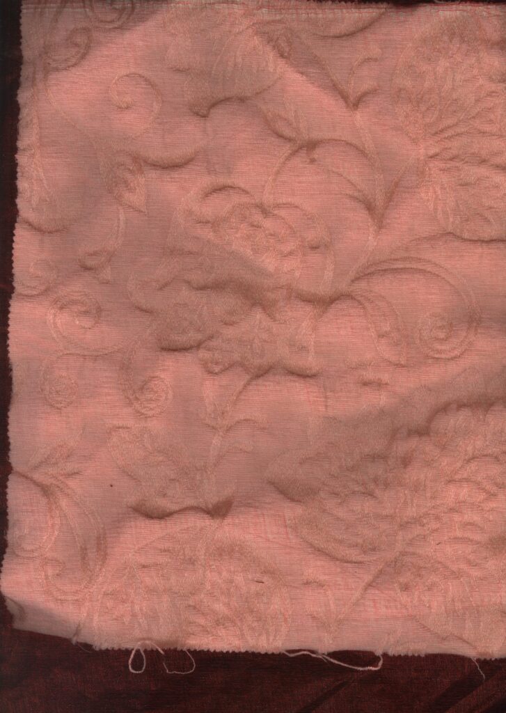
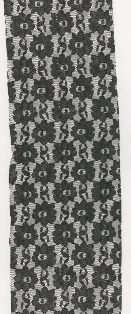
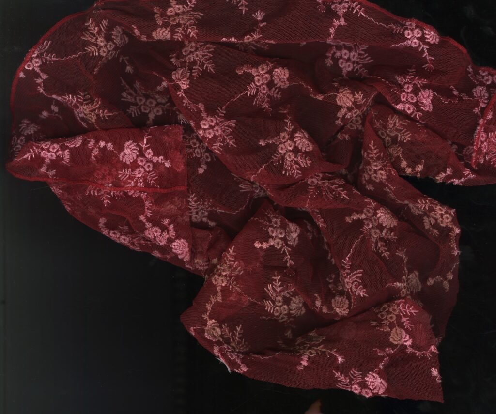
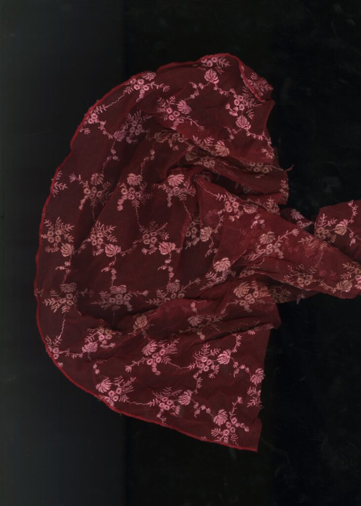
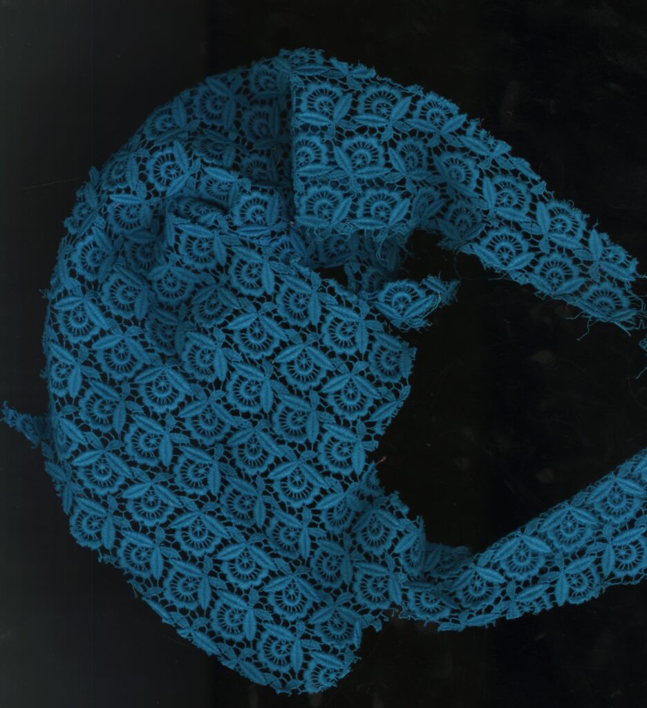
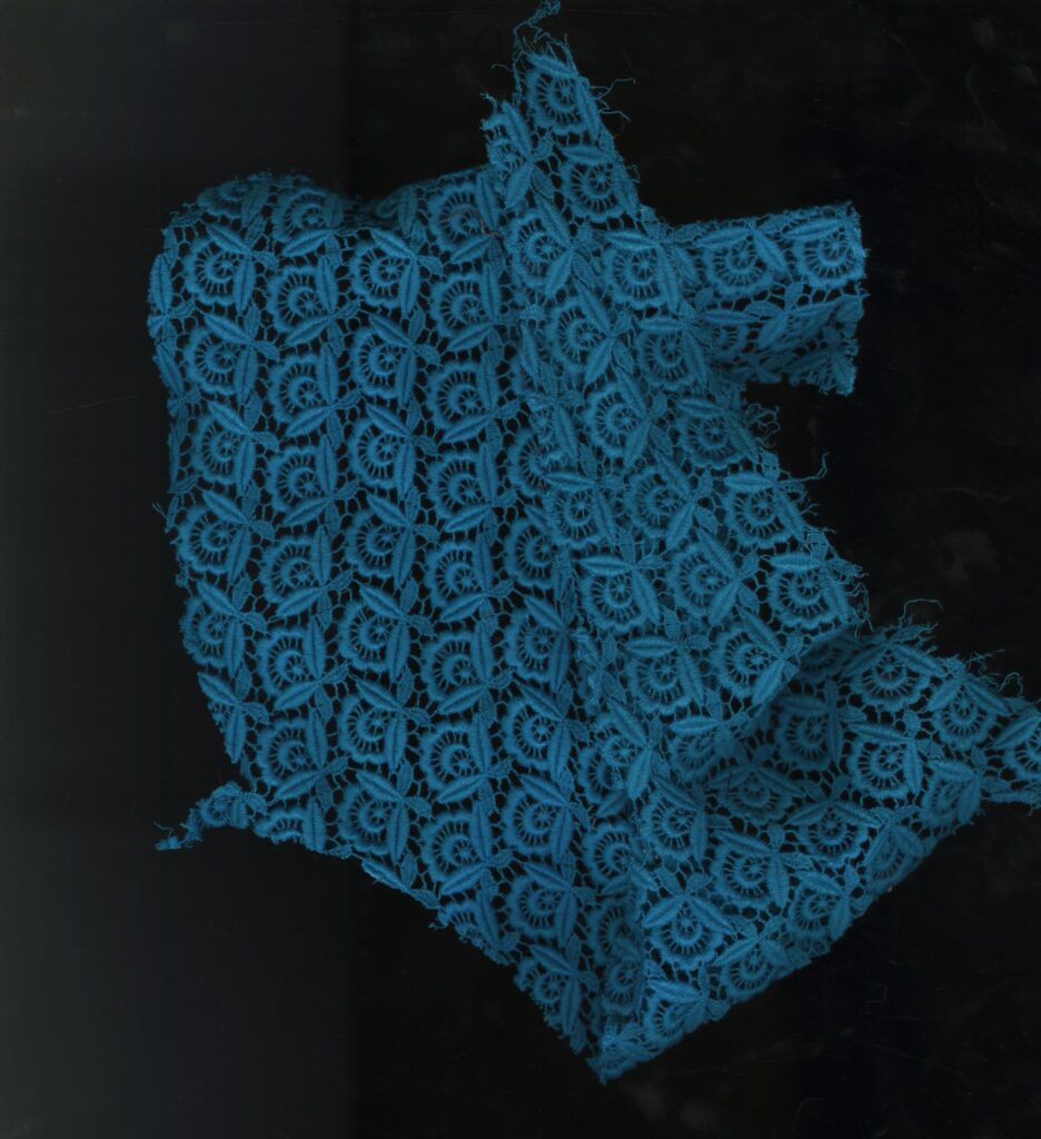
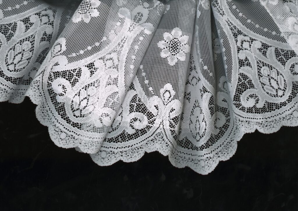
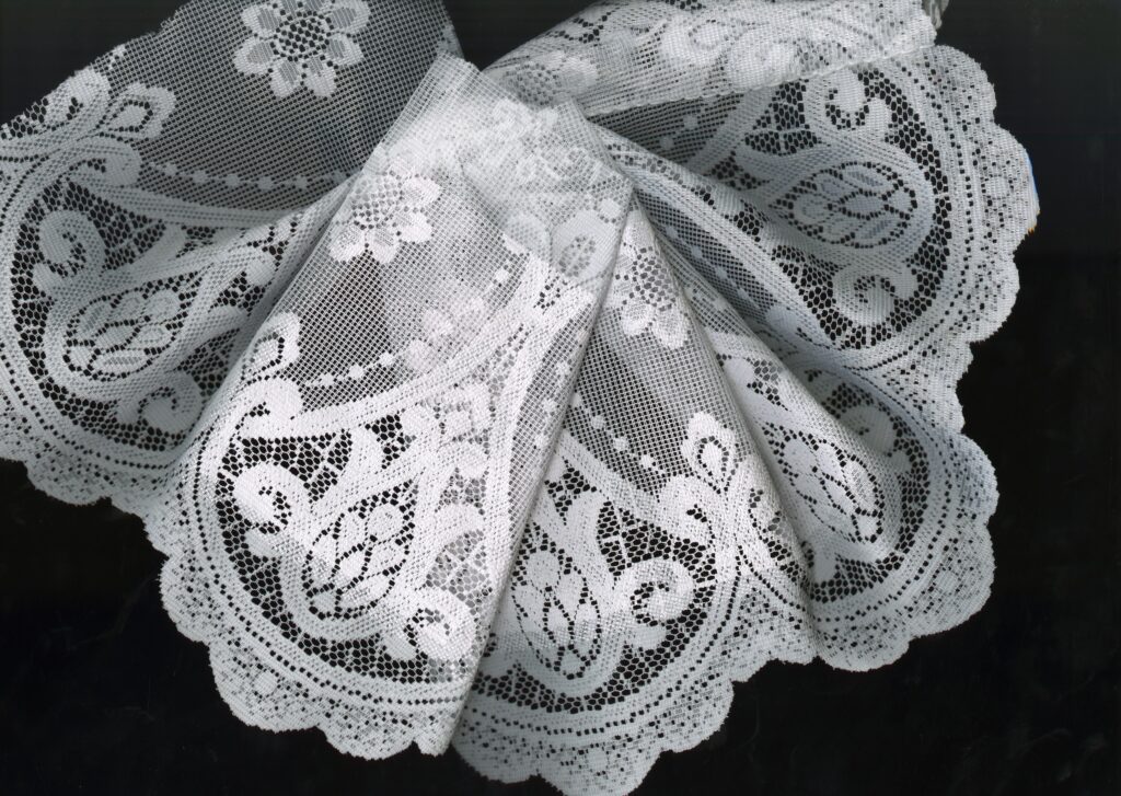
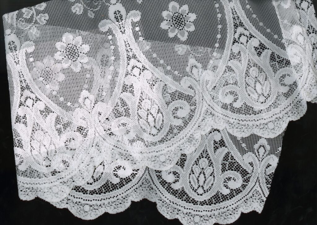
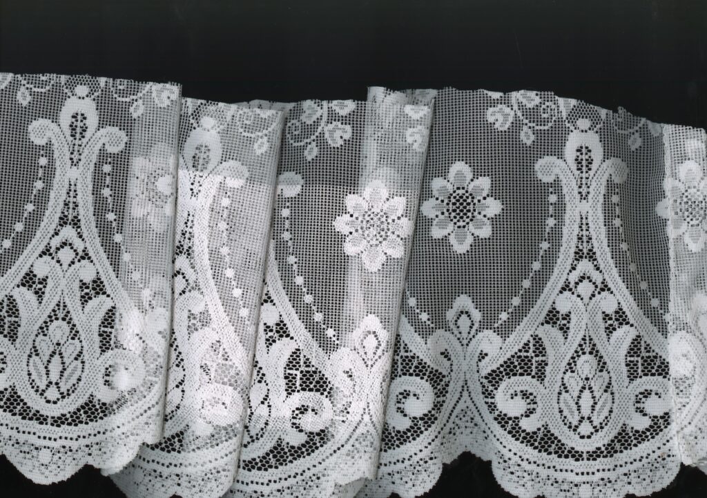
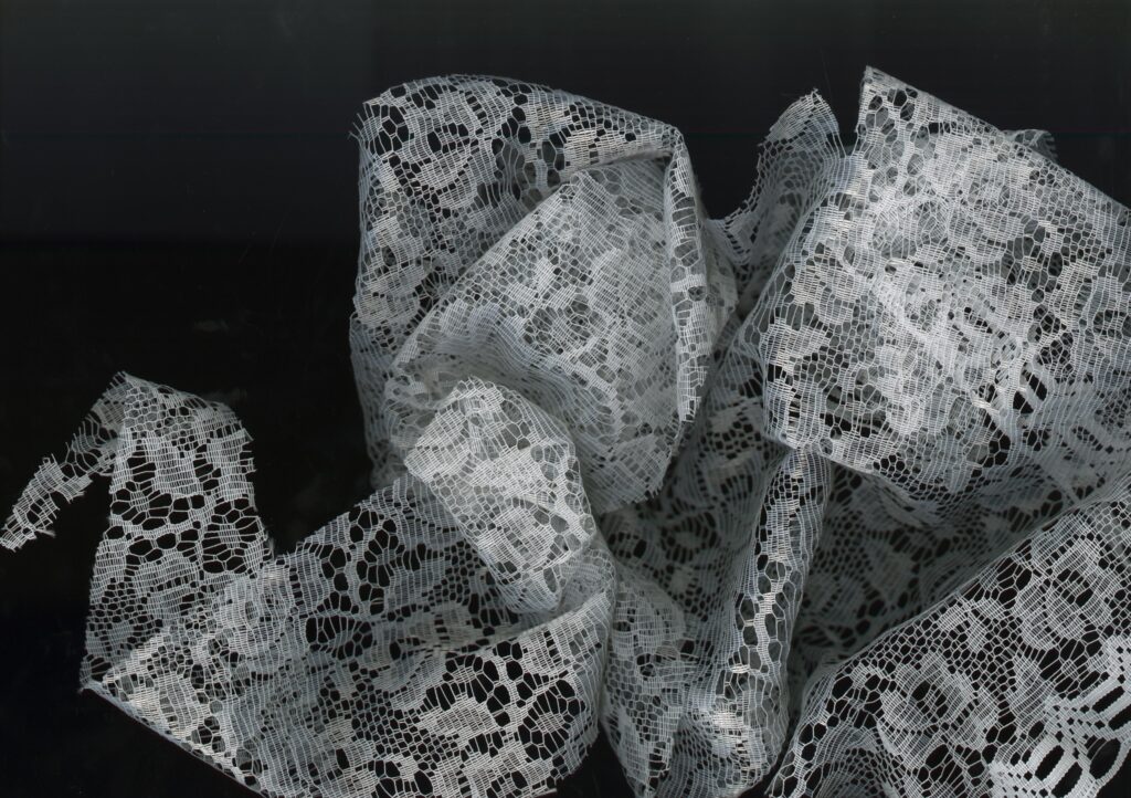
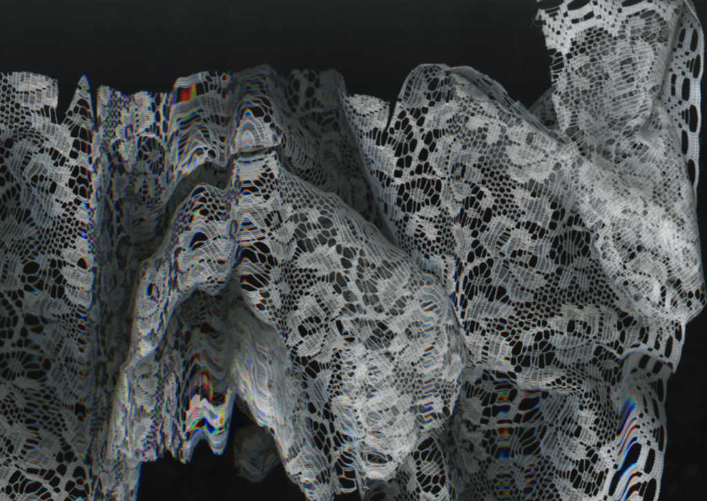
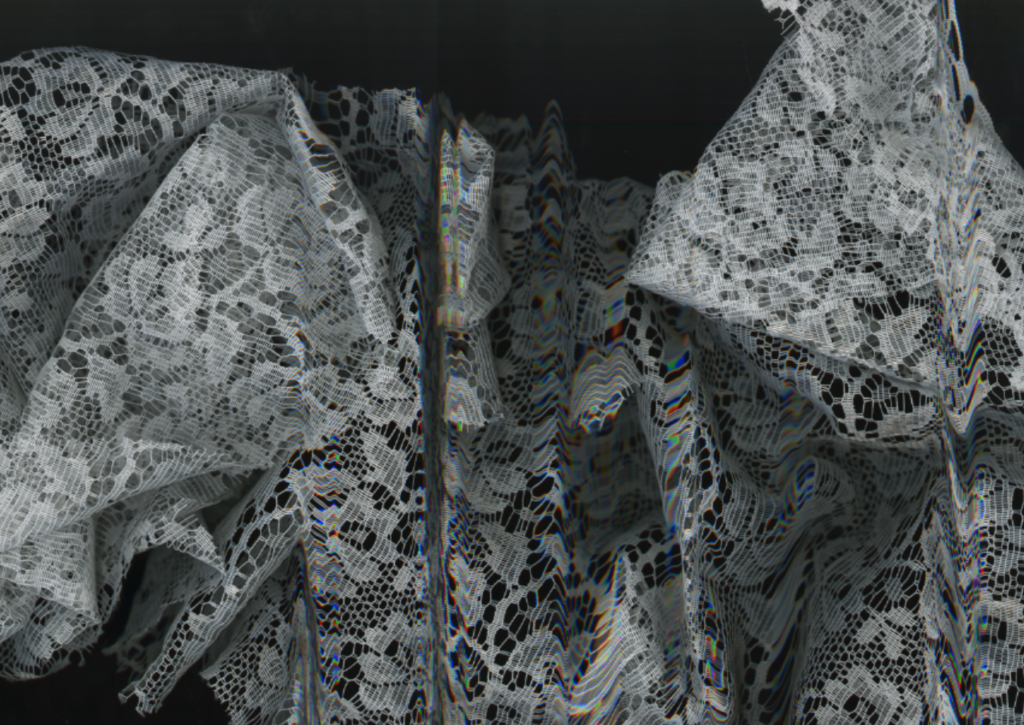
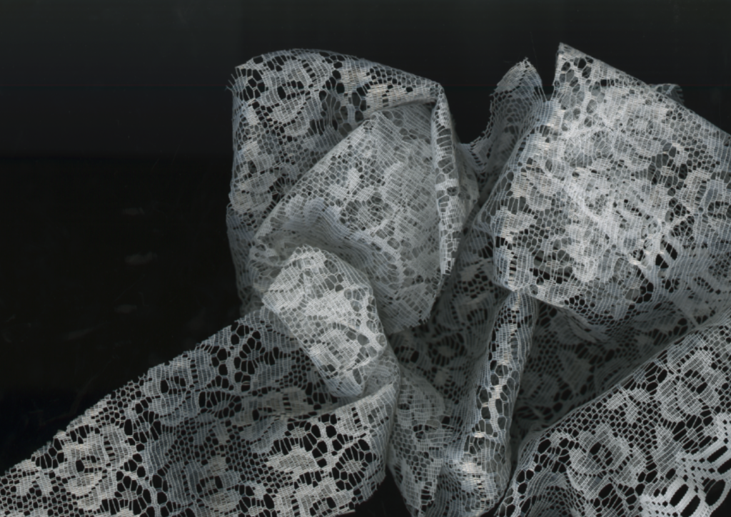
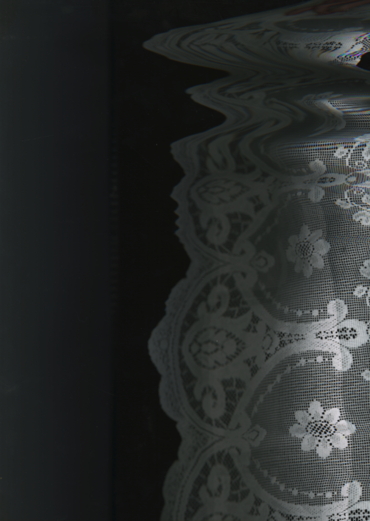
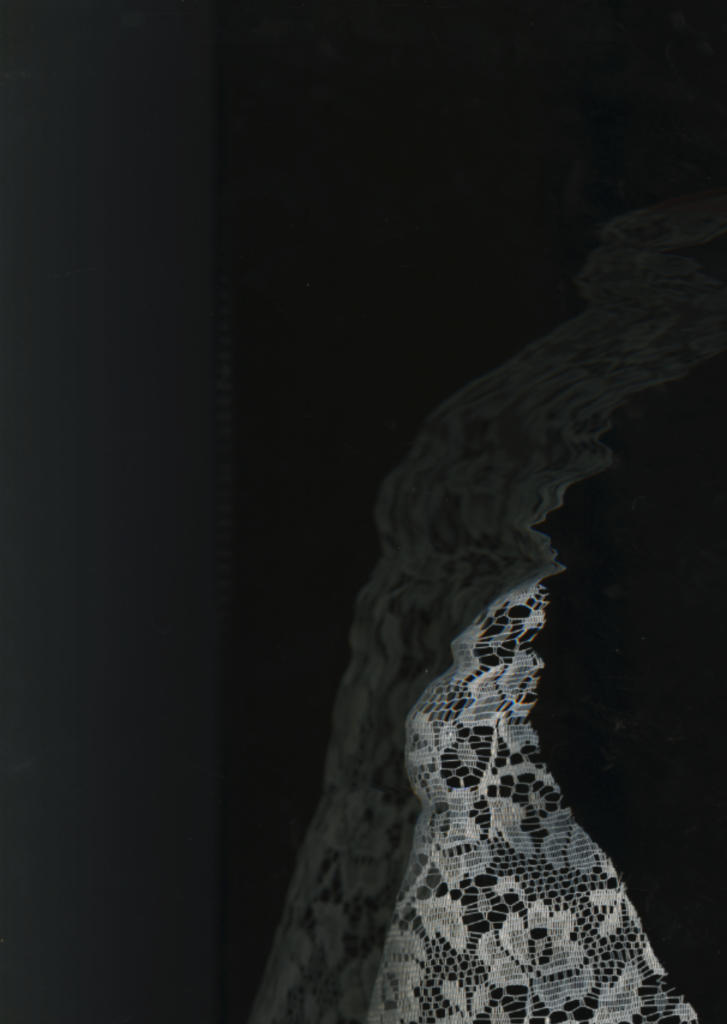
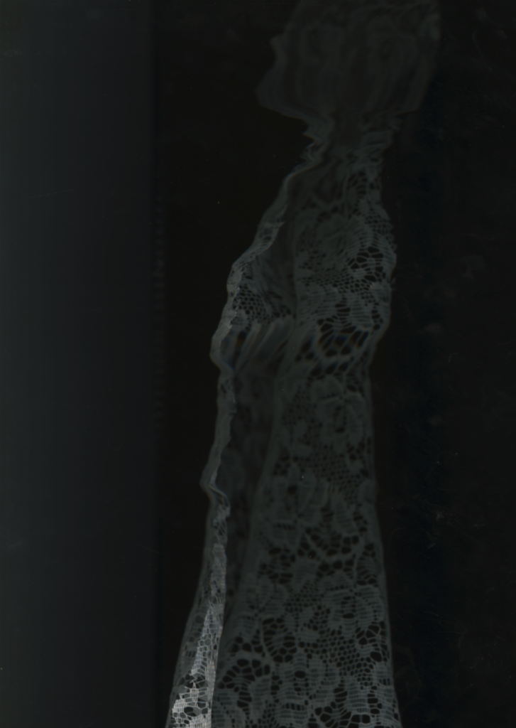
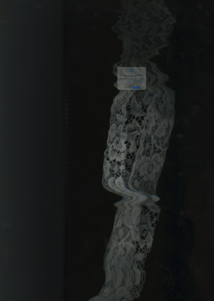
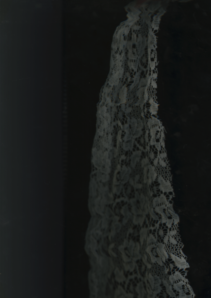
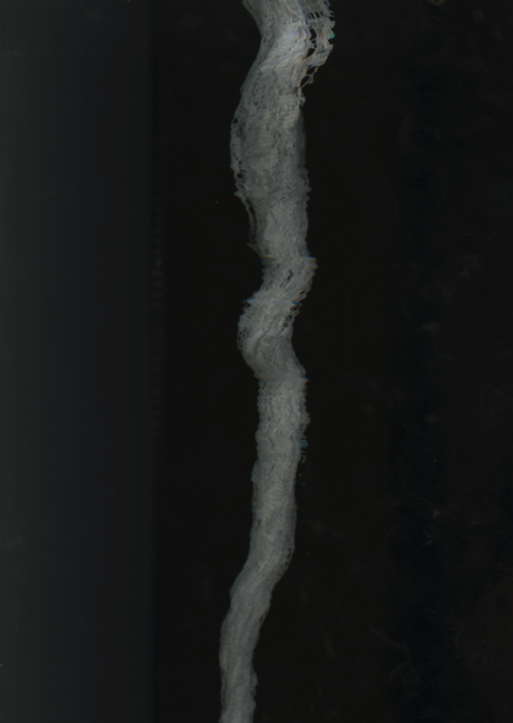
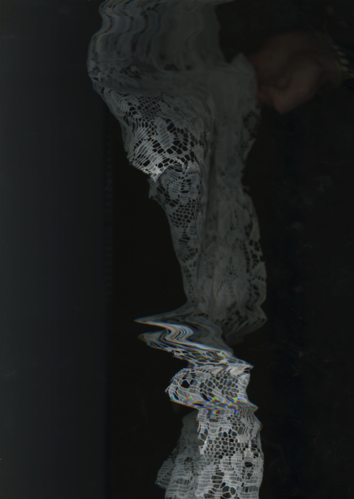
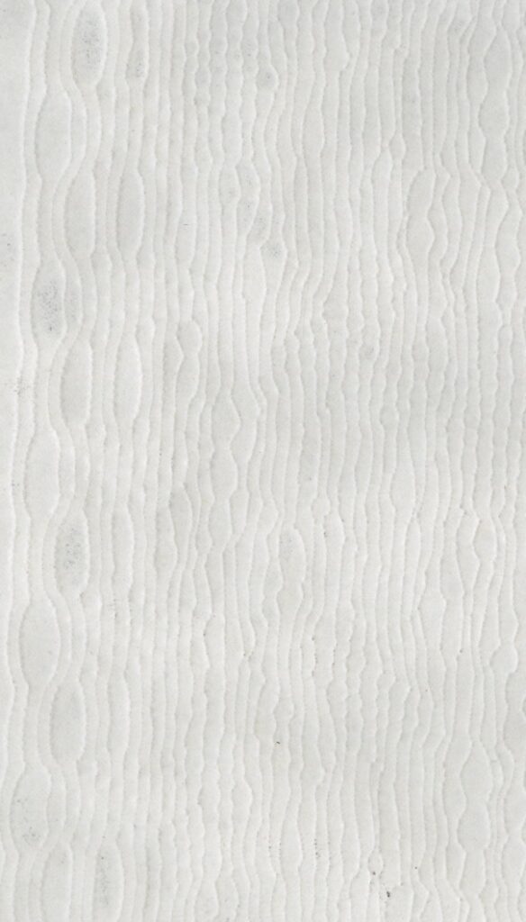
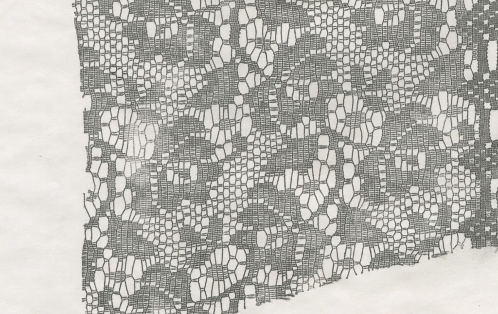
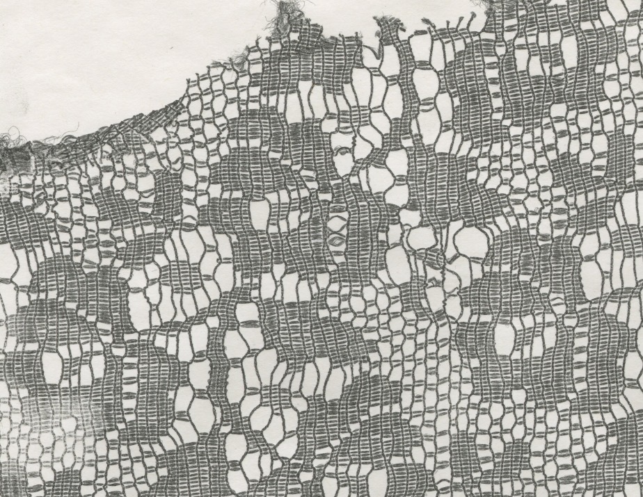
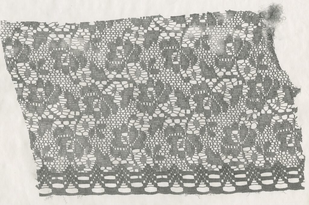
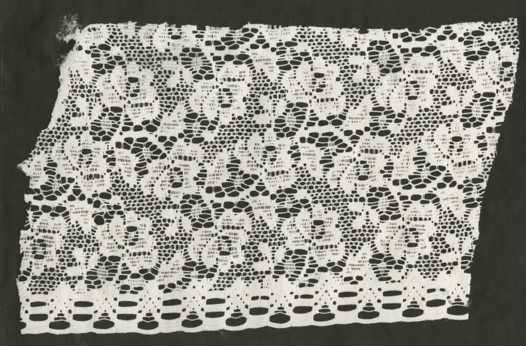
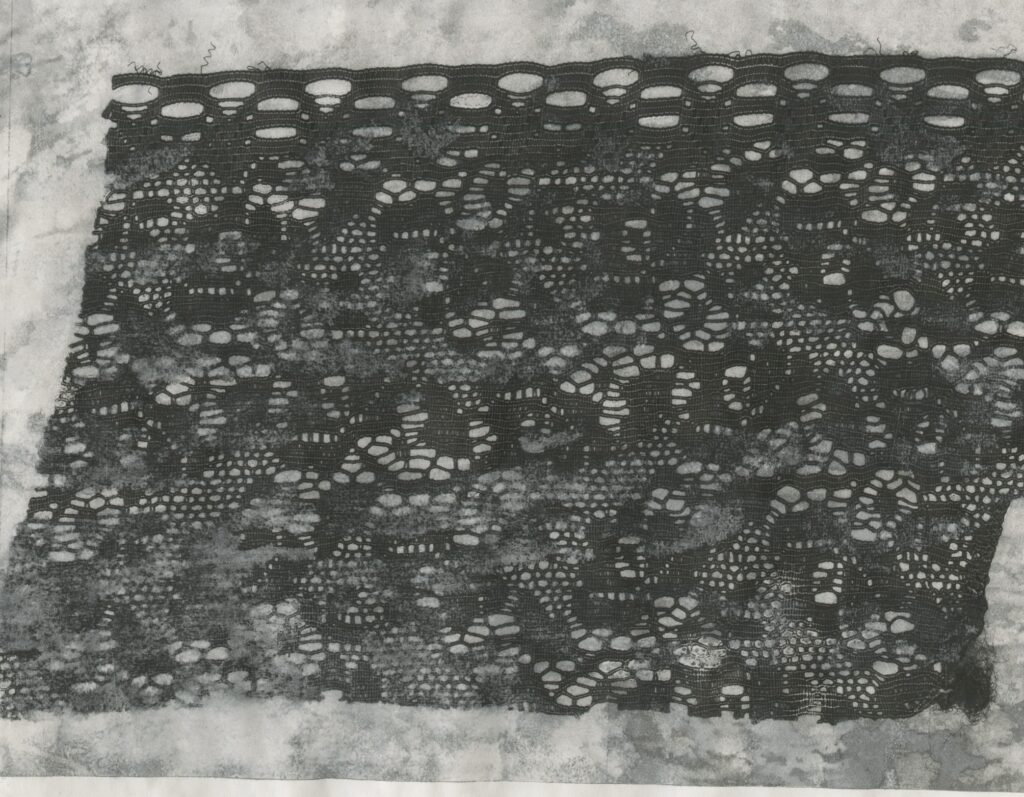
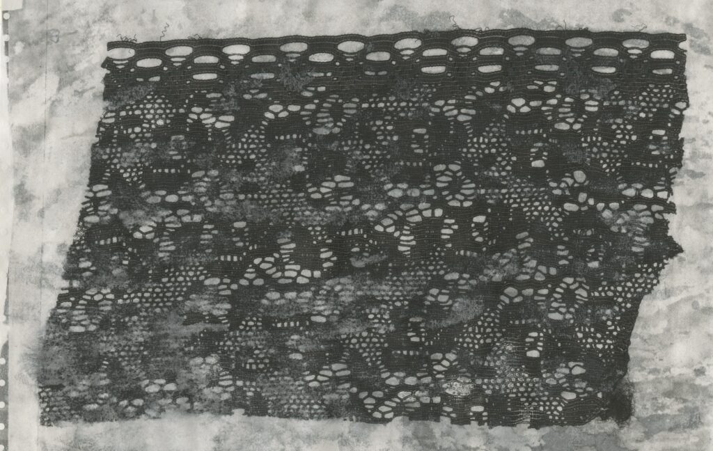
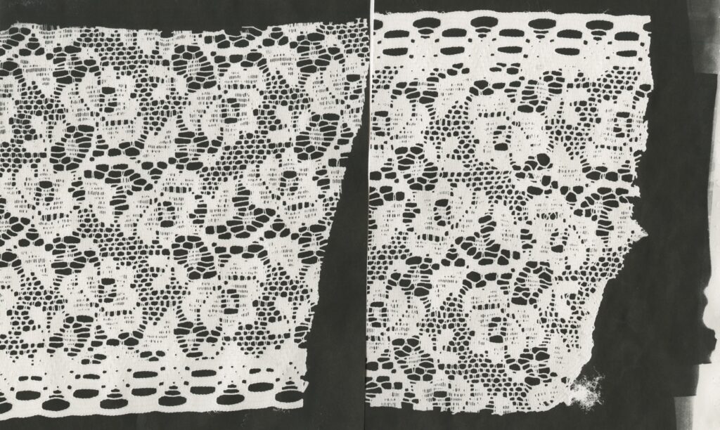
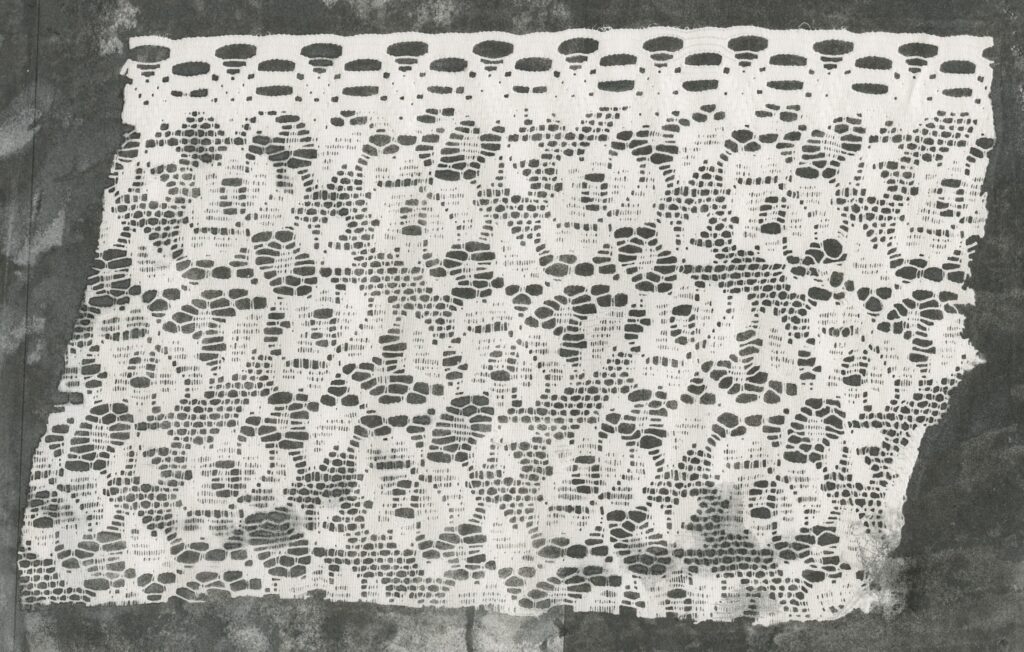
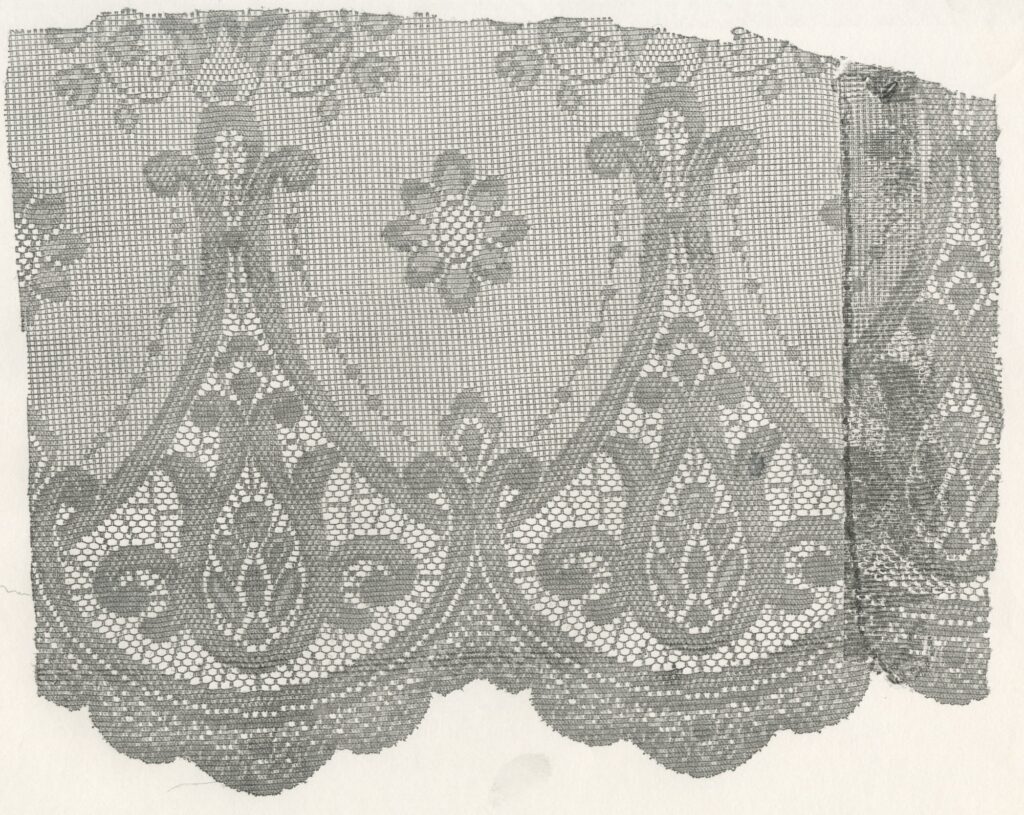
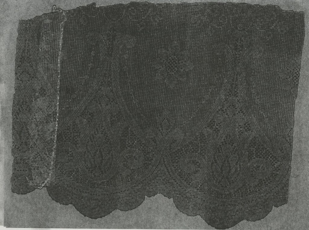
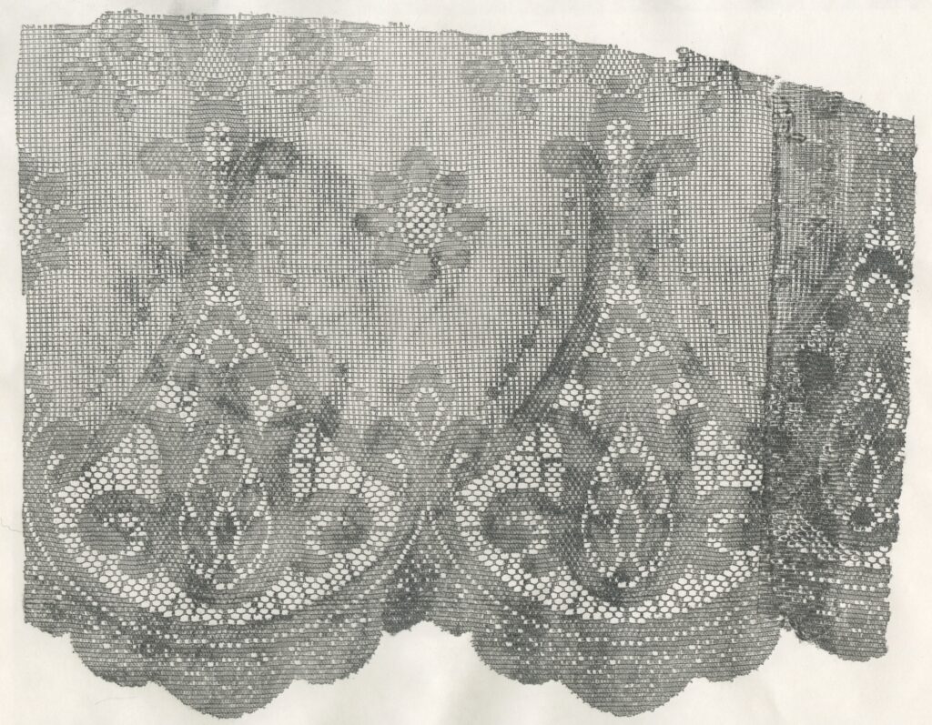
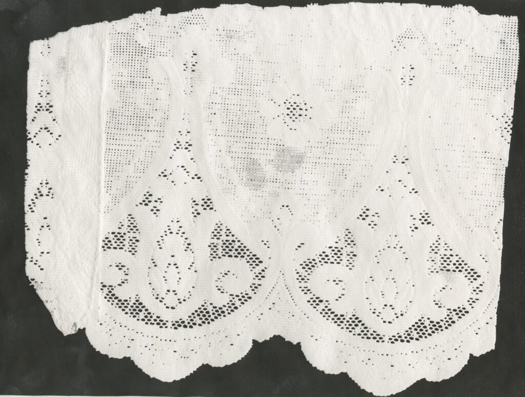
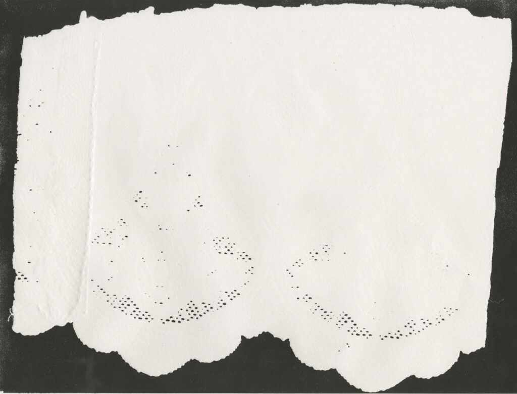
Lace Pressings
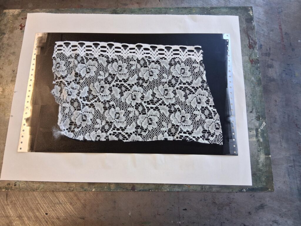
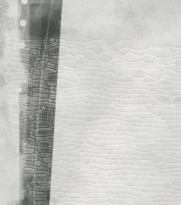
I made pressings of the lace as I wanted to see how well it would work out, using the silver plate I put lino and rolled it out till it was smooth and put the lace on top, using the etching press to transfer it onto the damp paper, so that it would more easily sink into the paper.
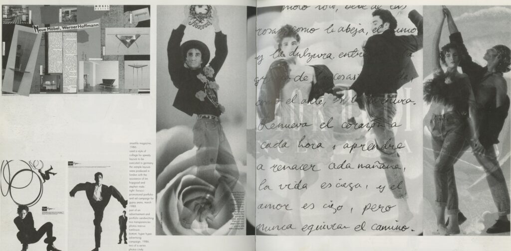
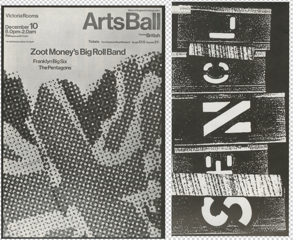
Bráulio Amado
Posters
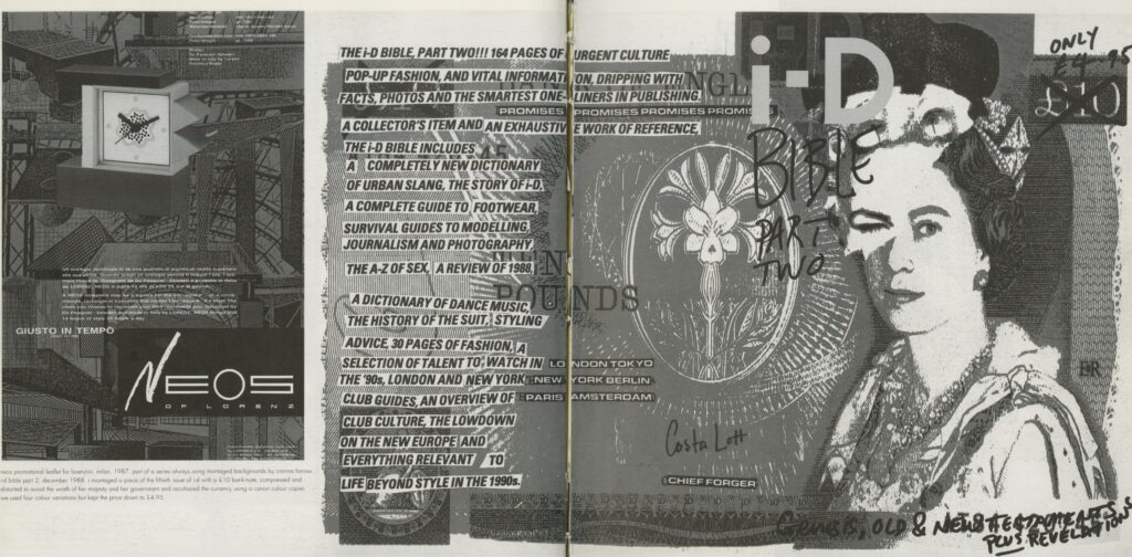
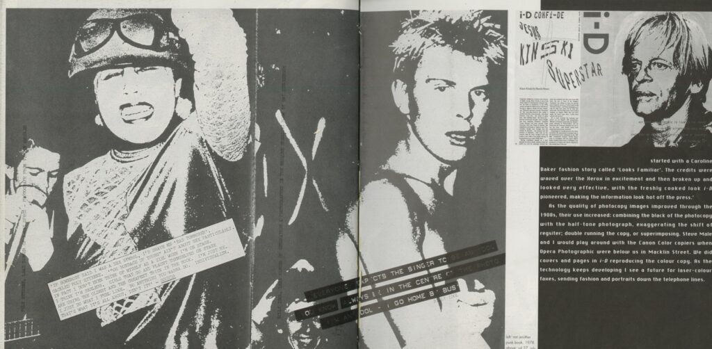
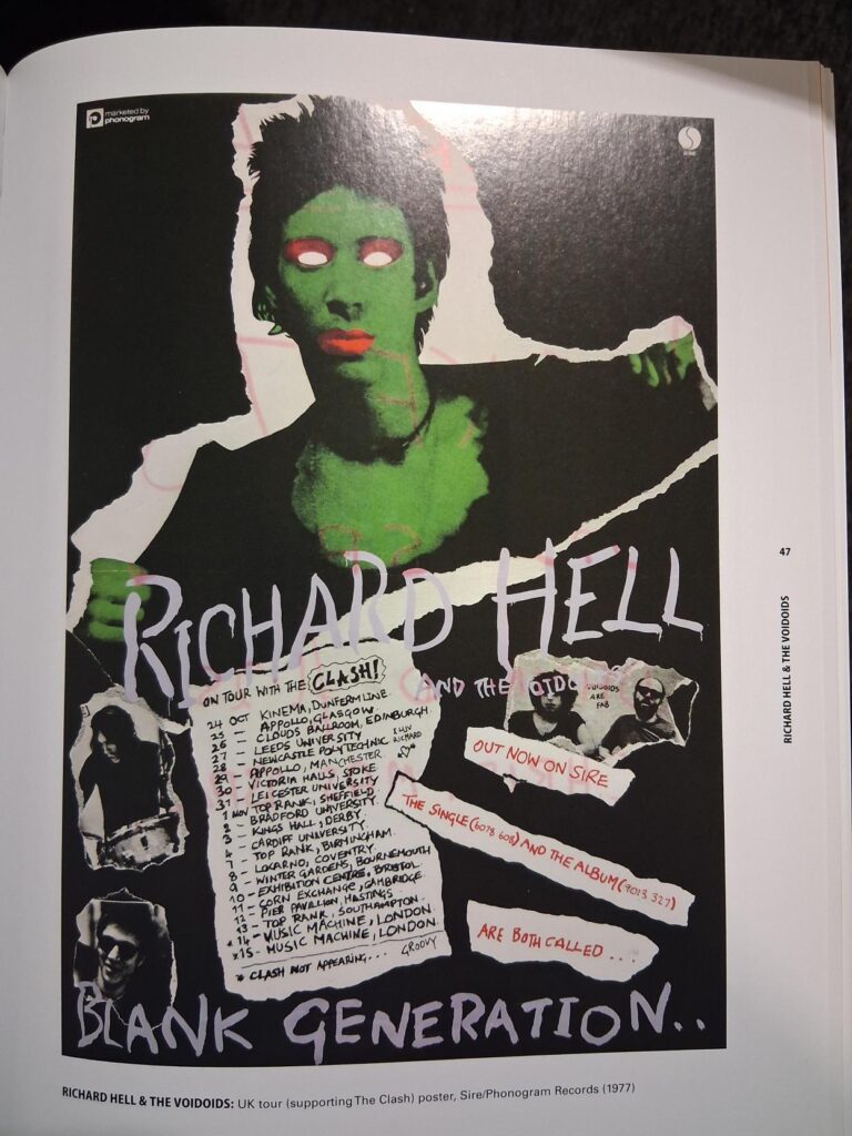
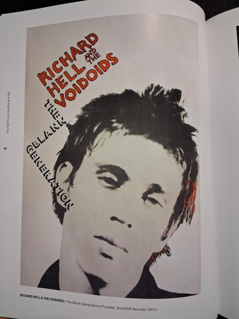
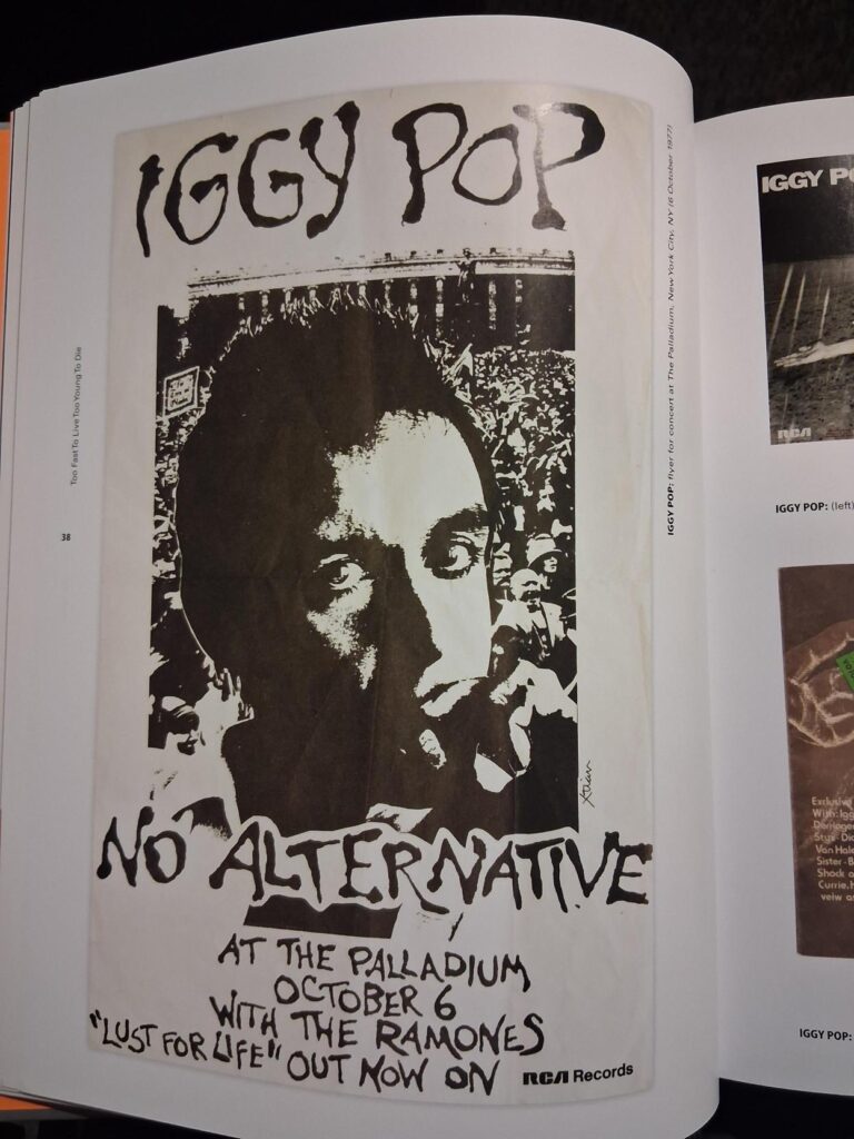
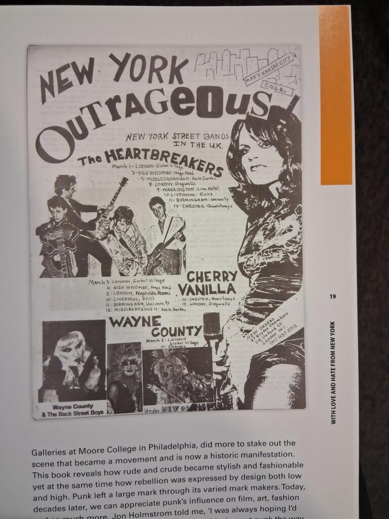
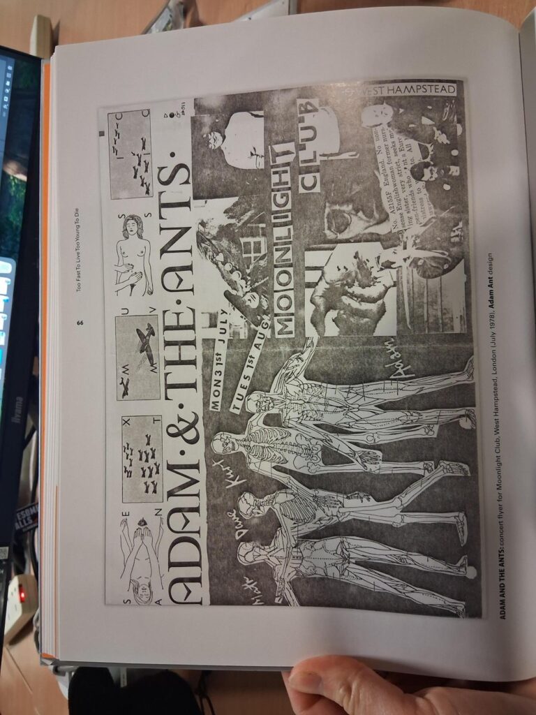
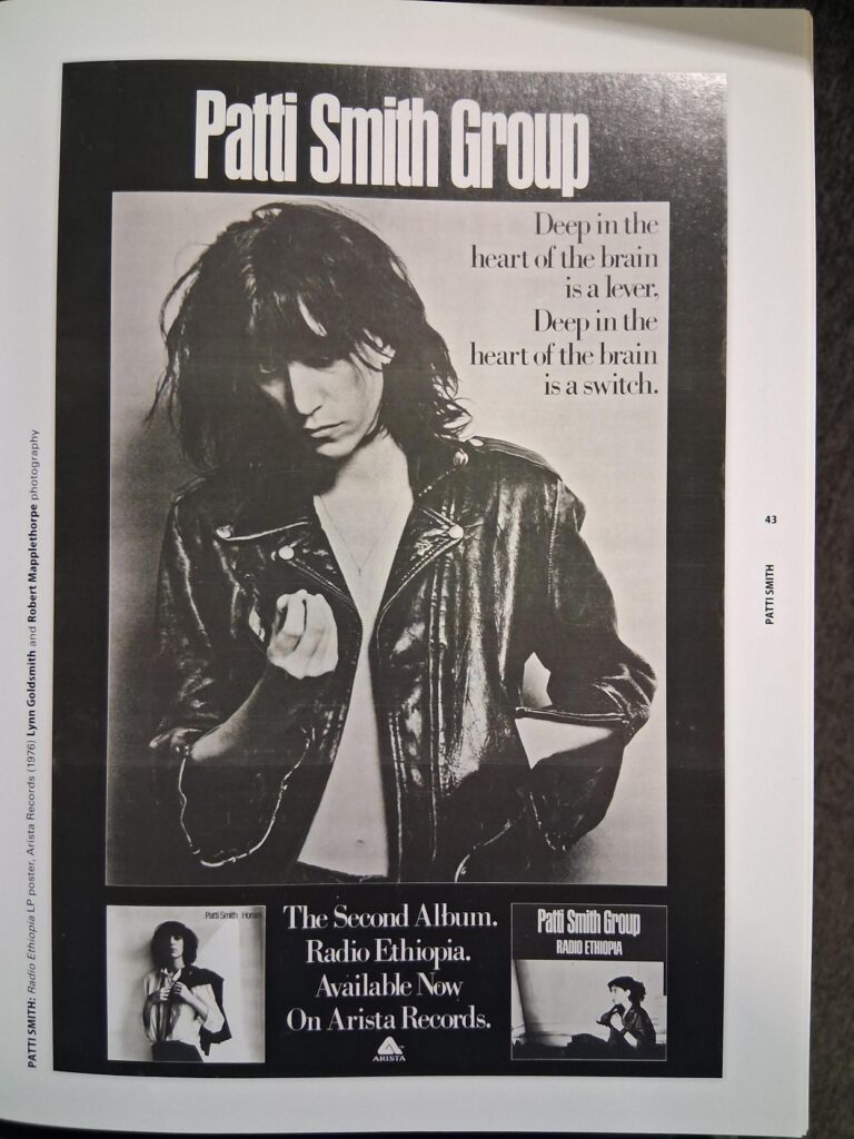
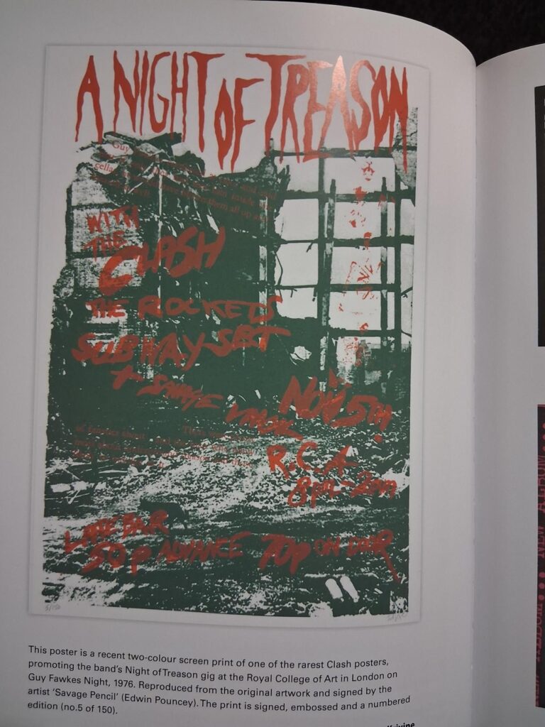
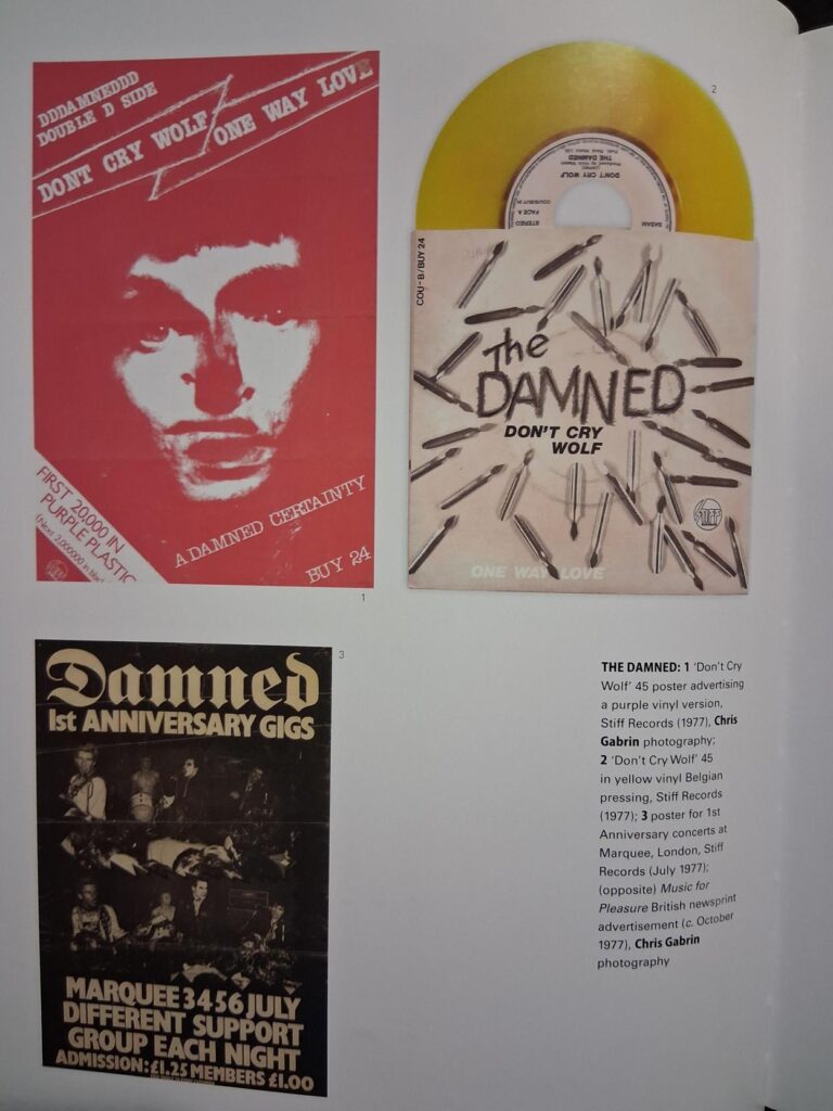
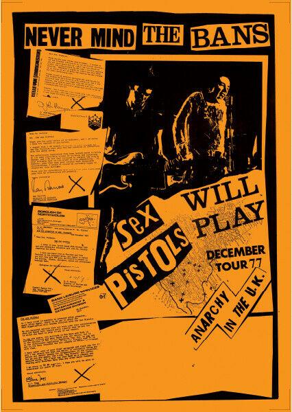
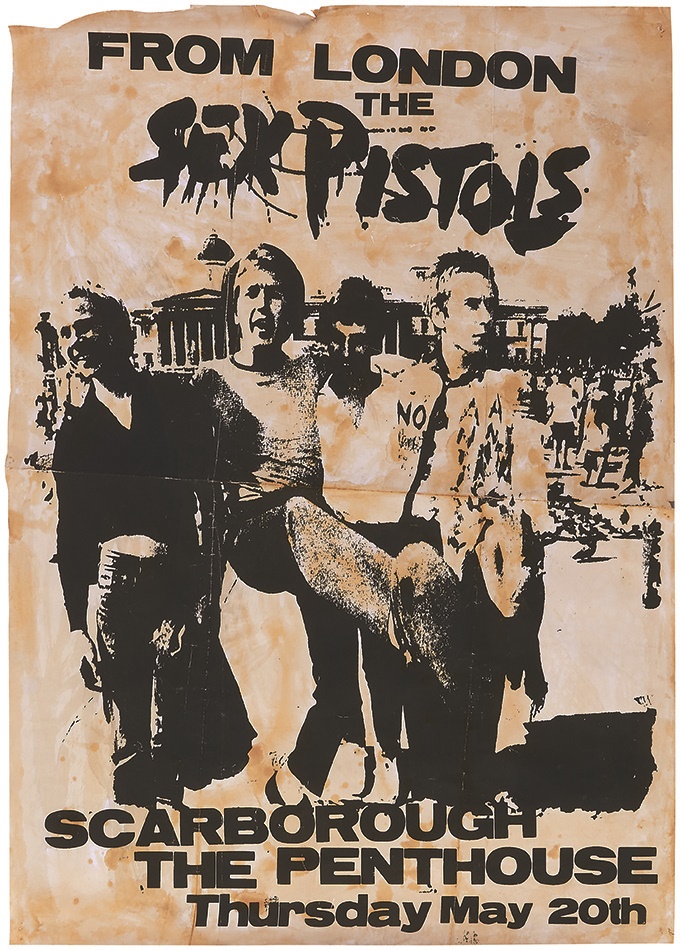
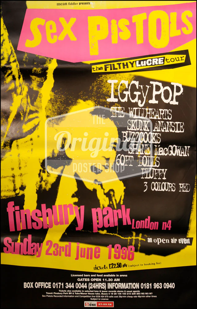
TOO FAST TO LIVE, TOO YOUNG TO DIE, Andrew Krivine
I was looking at different inspiration, looking at the punk and post punk in graphics as to how the composition and layout was and different techniques they used, and use of colour
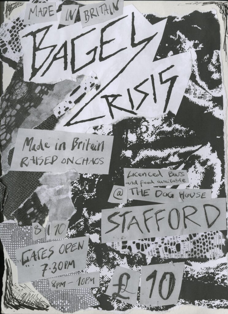
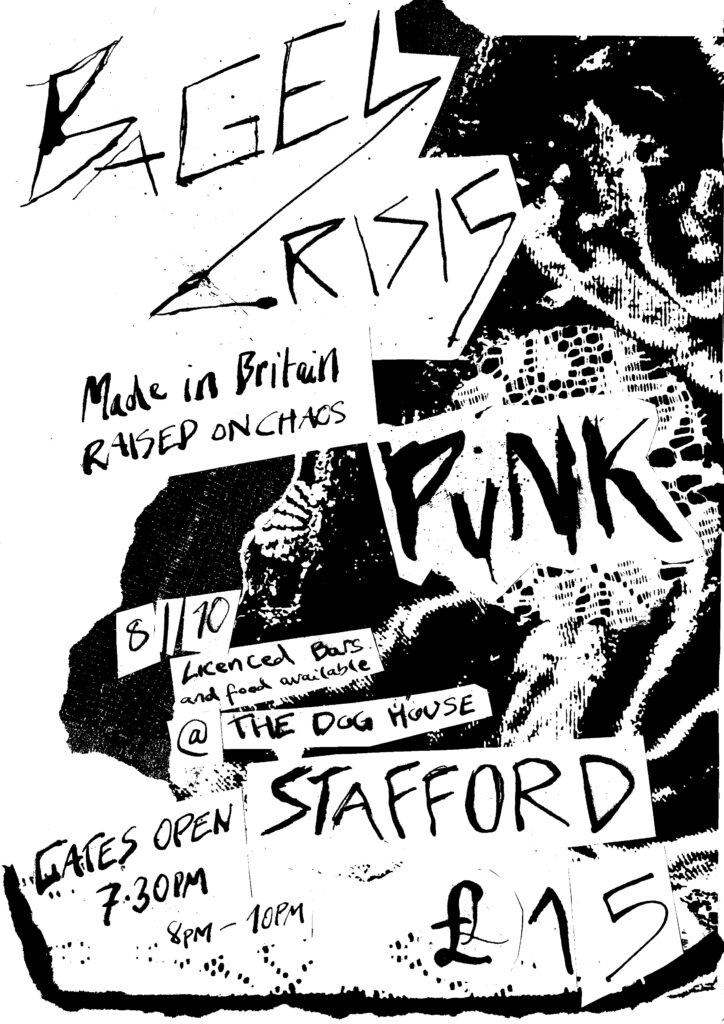
Cutting and Collaging
Using photocopies from my lace pressings, I ripped them up and layered them behind the text, I wanted to make a collage poster as i felt that resonated more with punk rather than something digital as it wouldn’t have given it a proper punk look/feel, which is what I was aiming for and captured it better with DIY.
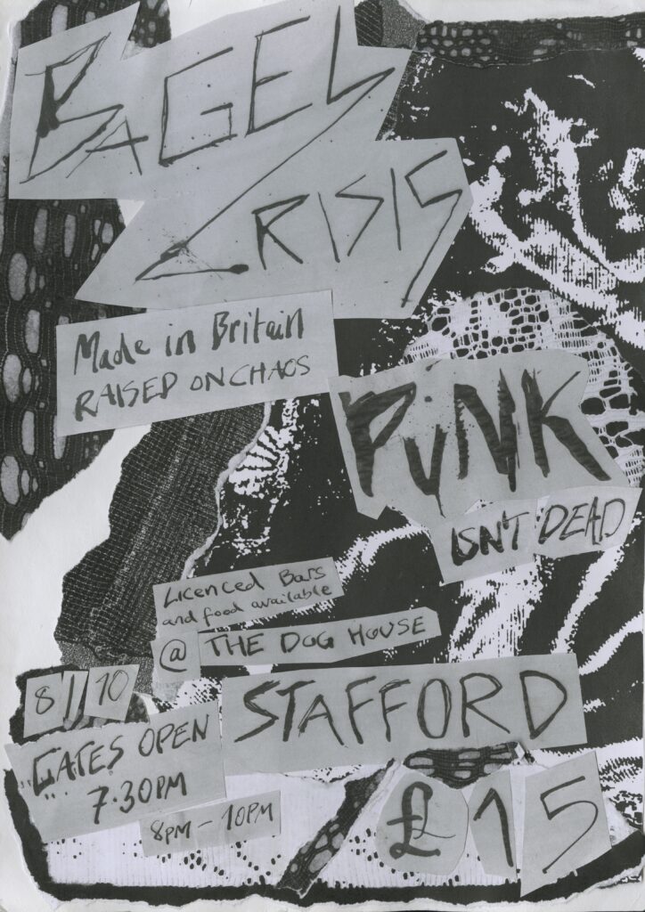
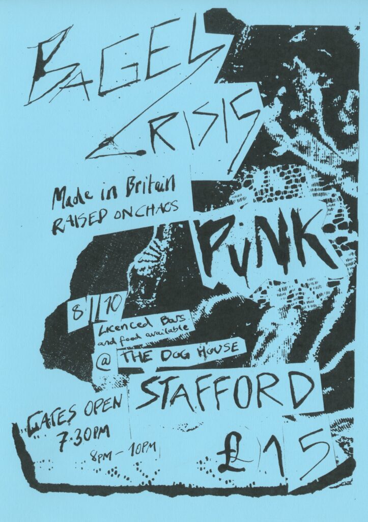
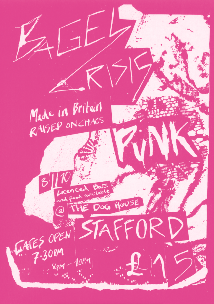
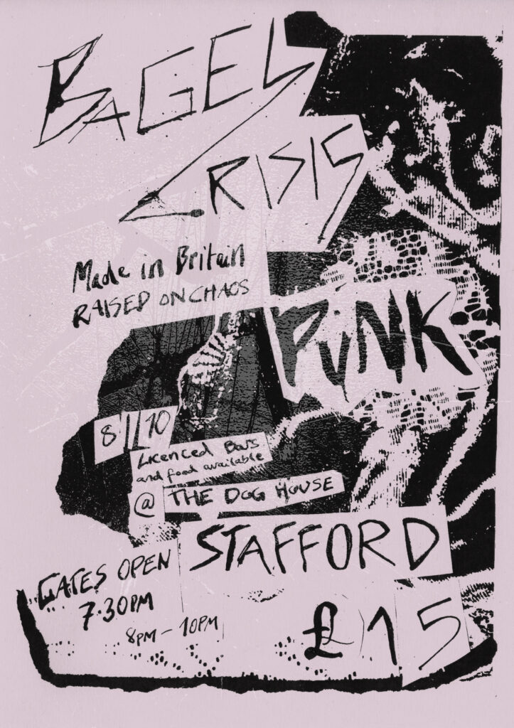
Experimentation with scans
Trialing with my different versions and adding more to them
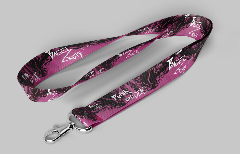
Merch
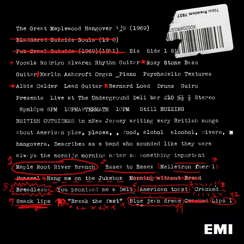
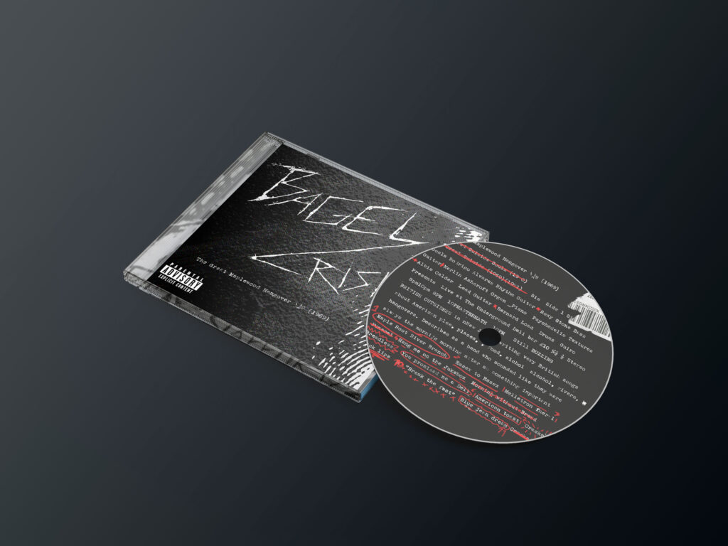
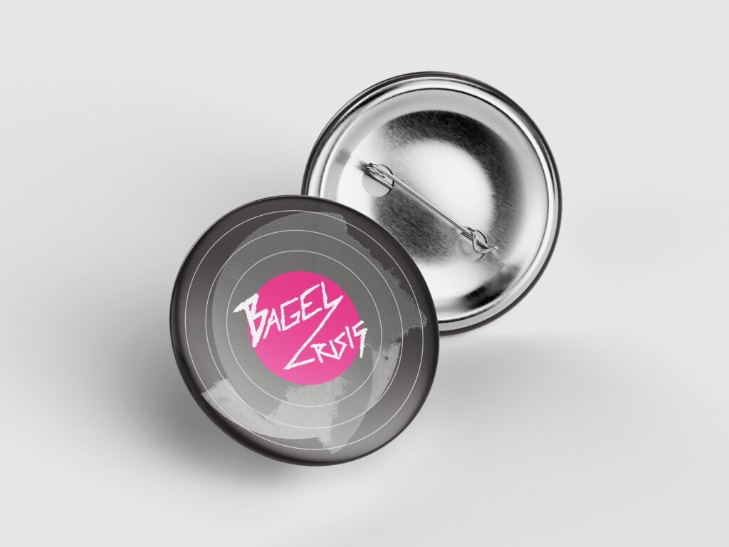
Images (CDs/examples/ideas)
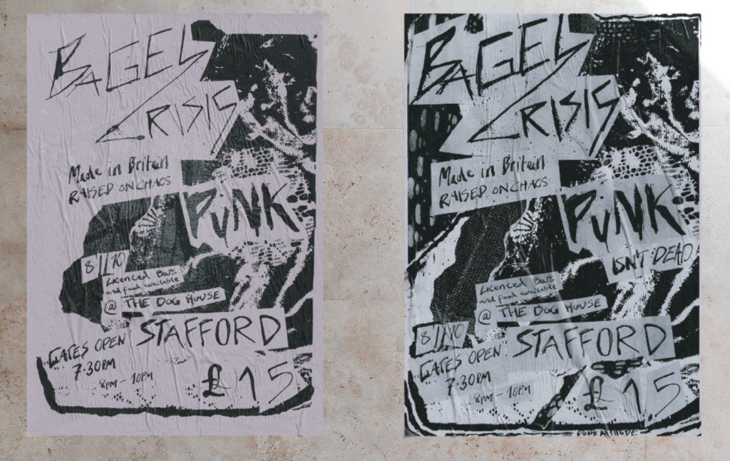
Experimentation/development