Week 5
Perspective
Developing drawing and visualising skills. Using perspective knowledge to sketch
simple geometric shapes (cubes, cylinders etc.). Then apply knowledge to graphic design applications e.g. packaging design, exhibition design, 3D typography etc.
Basic Perspective
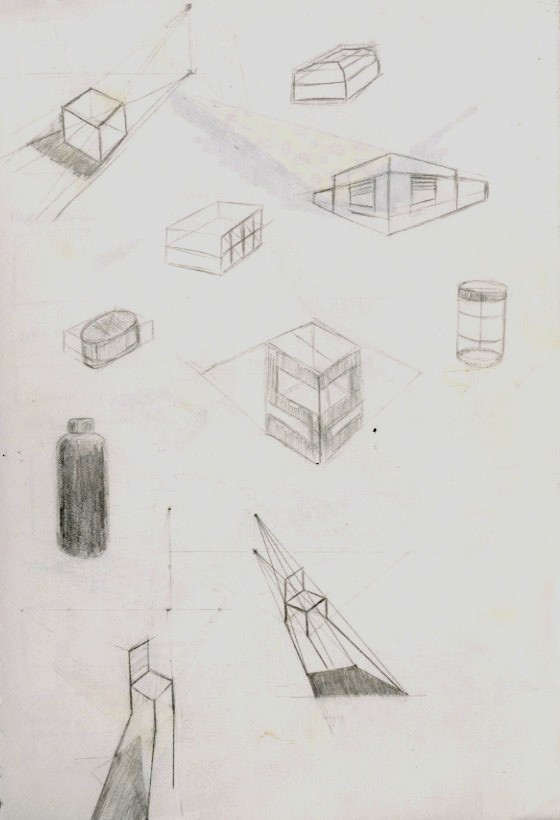
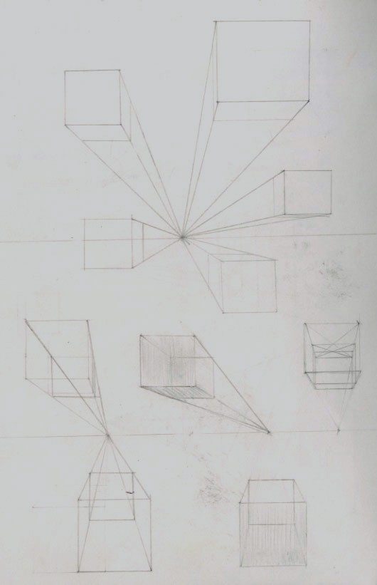
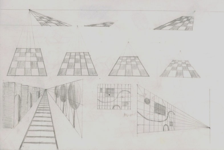
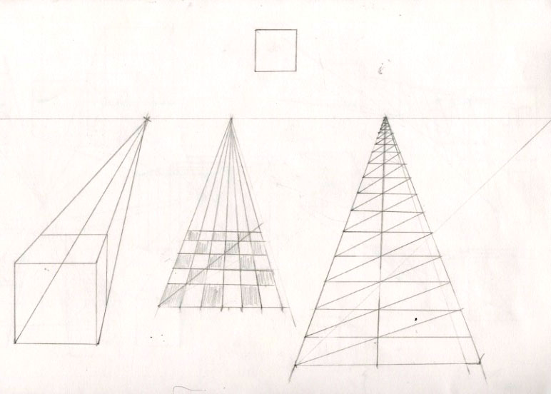
Part 1: One point perspective
Task 1: Play with eye-level/horizon within the frame and move cubes and boxes around
Freehand sketch a cube that is:
Below you, above you, bigger than you
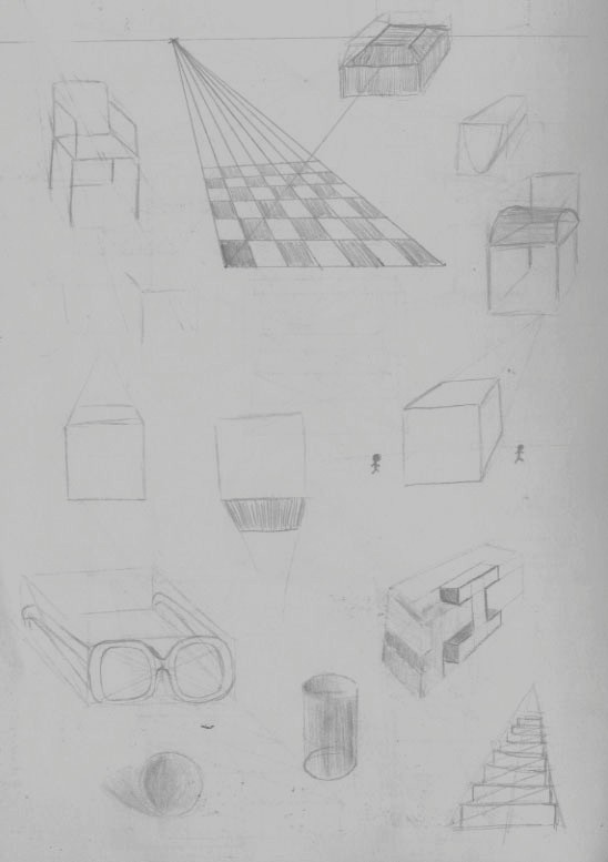
Task 2: Play with ‘fences’. How can they be used?
Task 3: Show off with grids/chess boards!
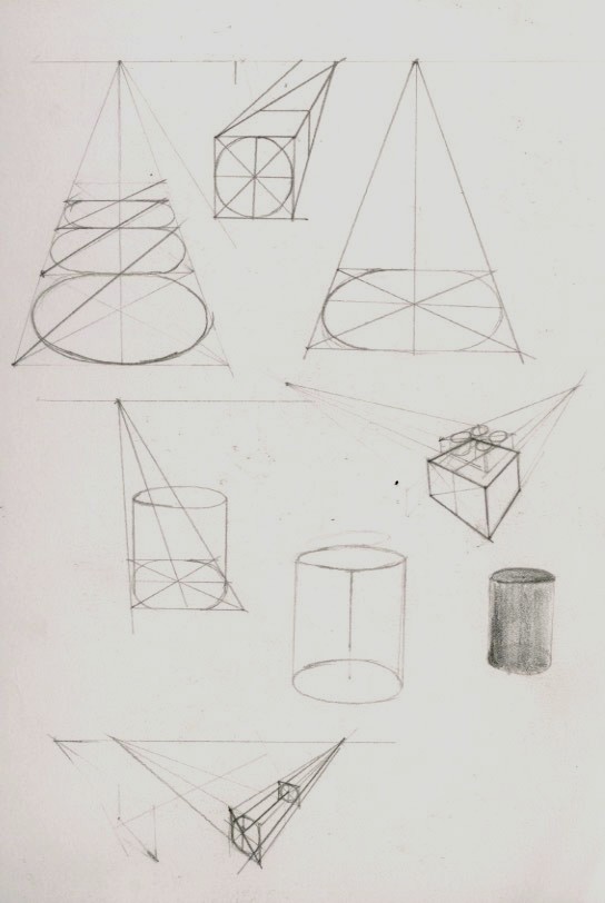
Task 4: Draw ellipses/cylinders in at different positions within
the picture plane using shadows and lights.
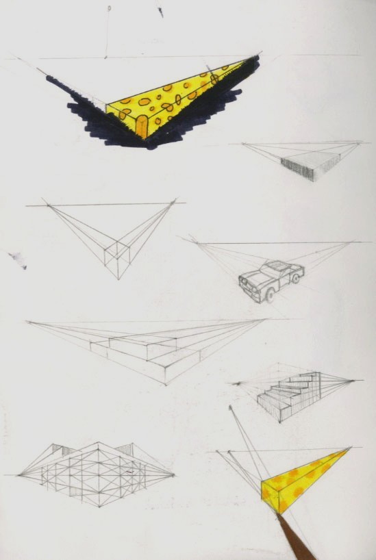
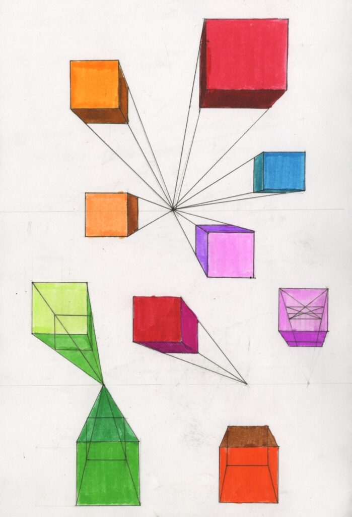
Part 2: Two point perspective
Task 5: Play with eye-level/horizon within the frame and move cubes and boxes around
- What happens when you move the vanishing points?
- Use shadow and light Freehand sketch a cube that is:
- below you
- above you
- bigger than you
- Use a wide range of materials including paint/colour
- Experiment with strength/width of line
- Dispense with construction lines once you understand
- the theory and freehand sketch
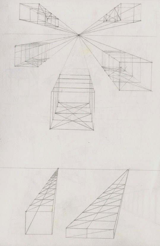
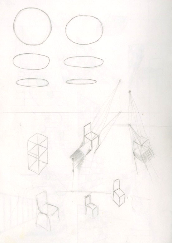
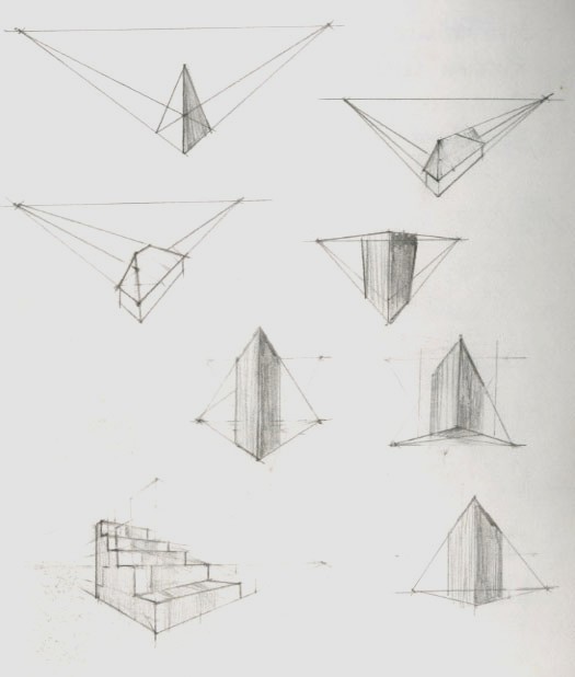
Part 3: Three point perspective
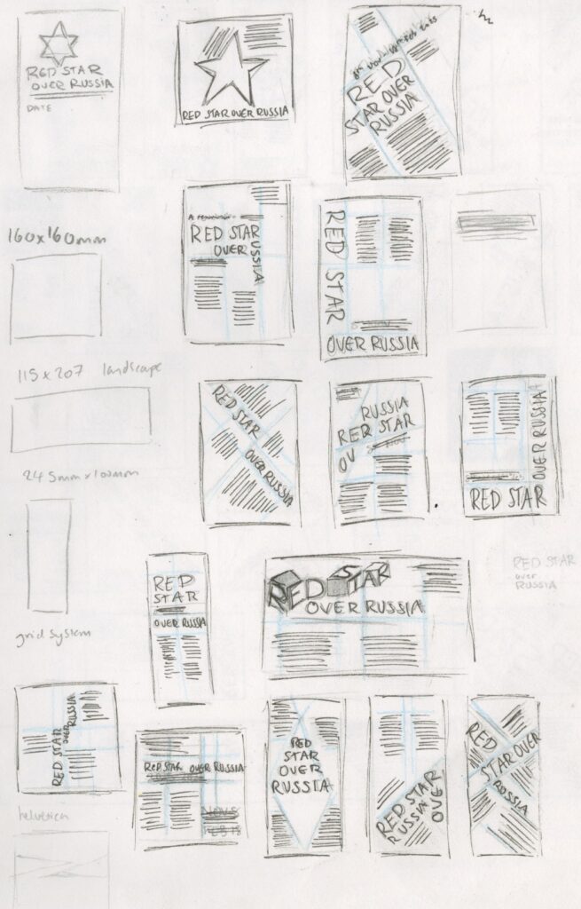
Introduction to typography
Task: Using the copy of the text, Produce three black and white typographic designs which present the text in a visually stimulating and attractive way and help the reader to understand the information.
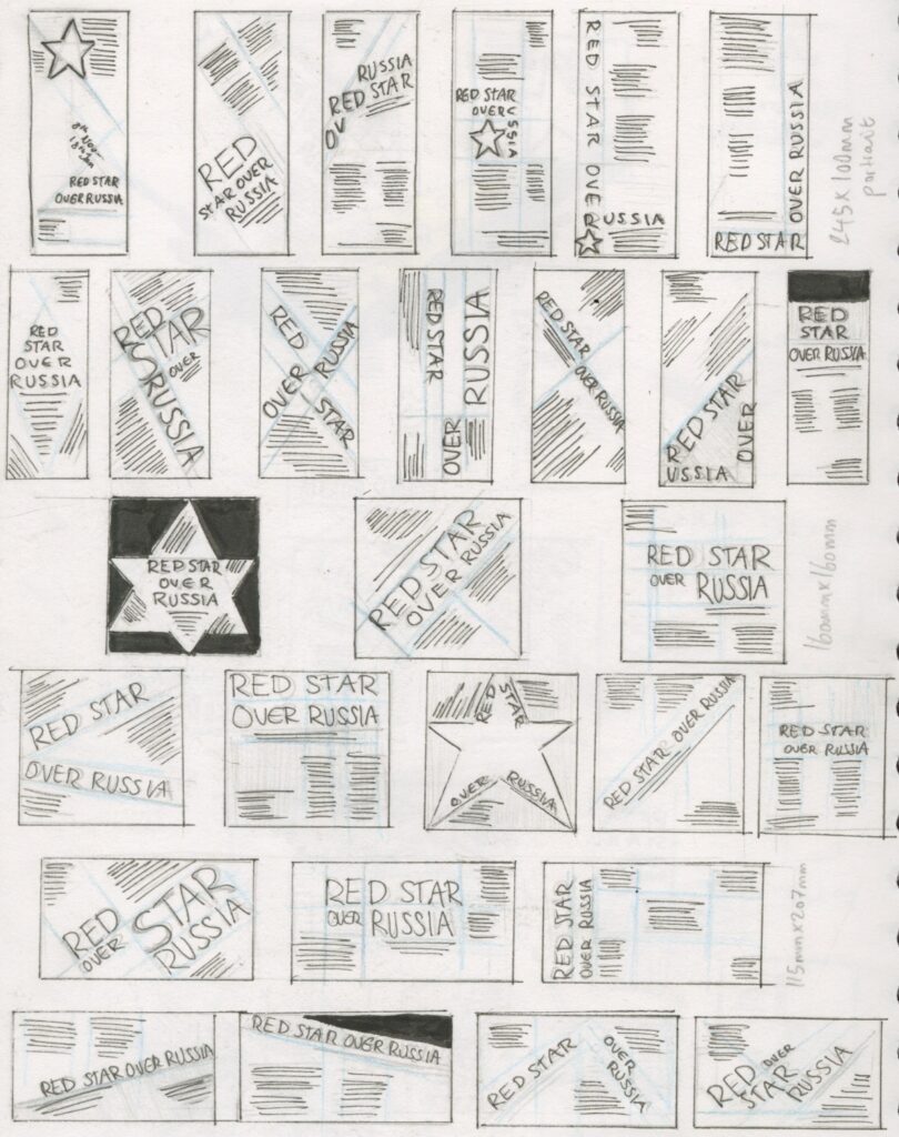
- format 1: 160mm x 160mm
- format 2: 115mm x 207mm landscape
- format 3: 245mm x 100mm portrait
Restrictions:
- One type family, as many variants and sizes
- Two typefaces and Two sizes
- One typeface in one size, but as many weights
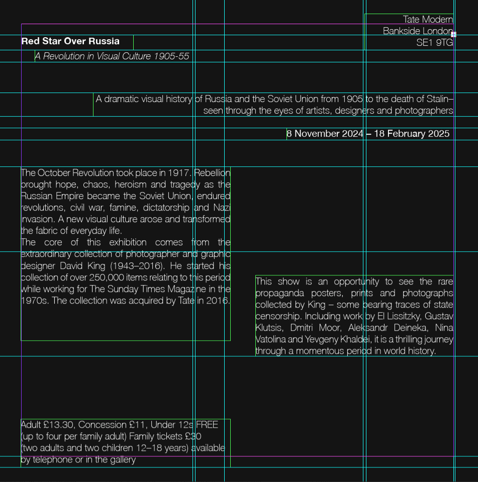
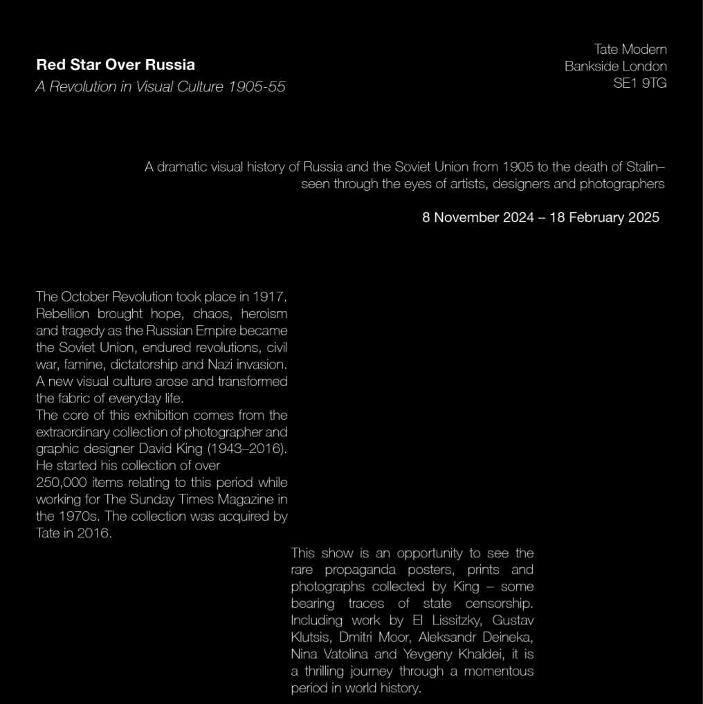
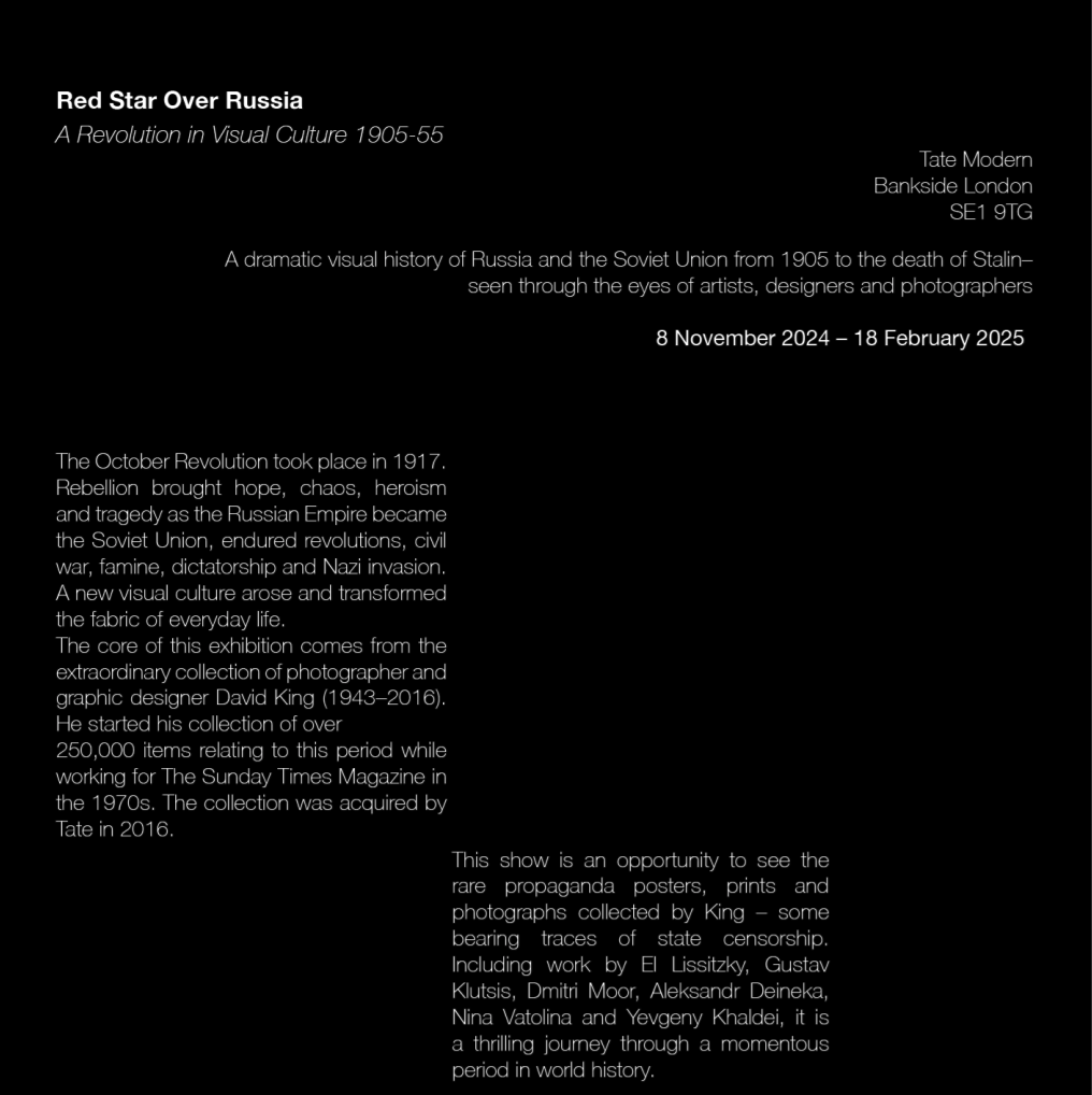
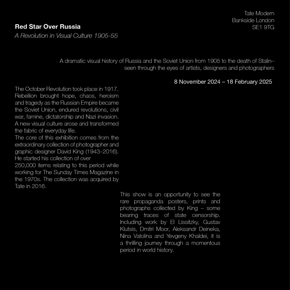
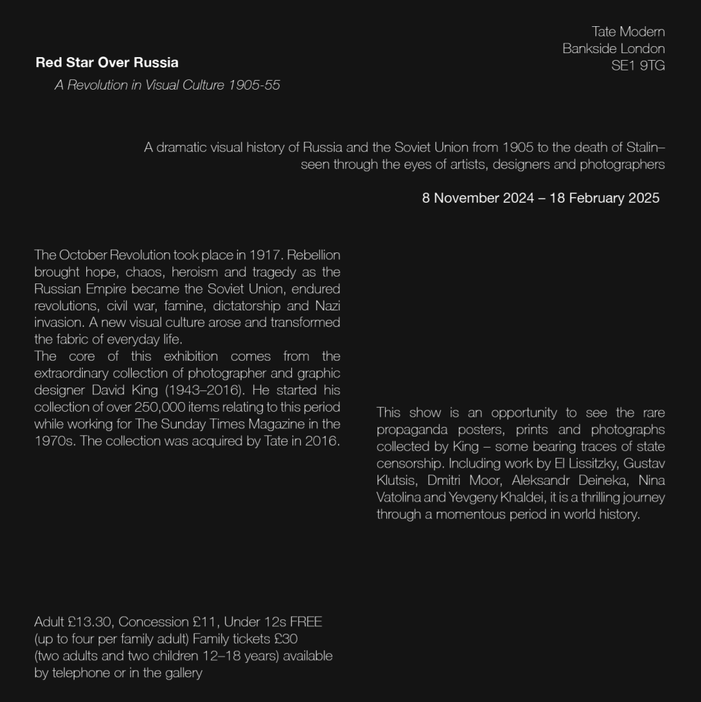
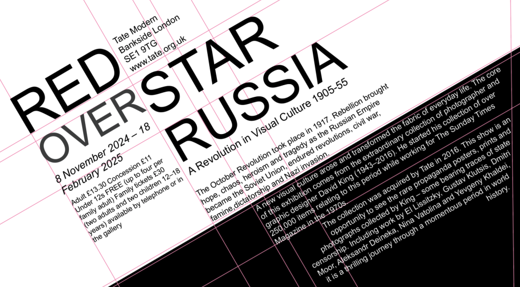
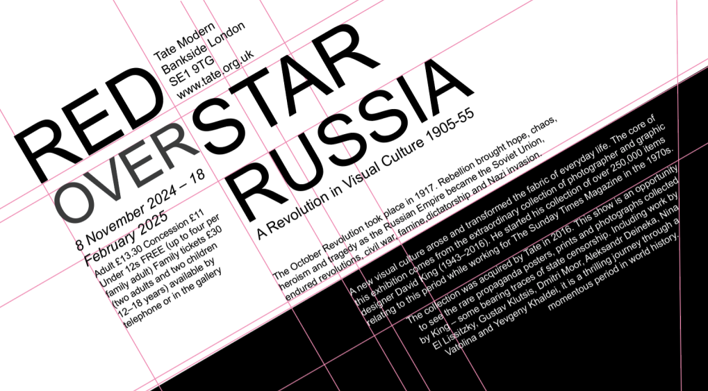
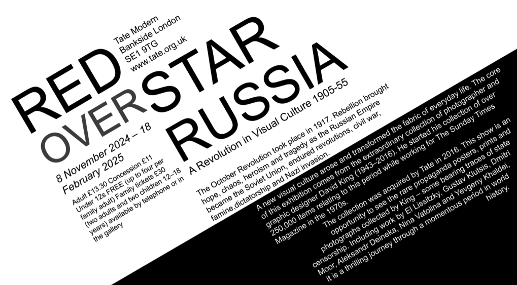
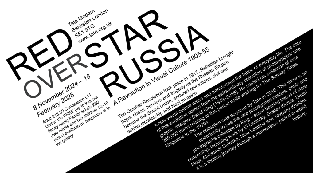
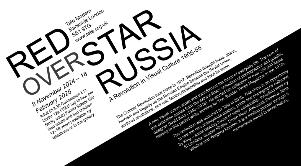
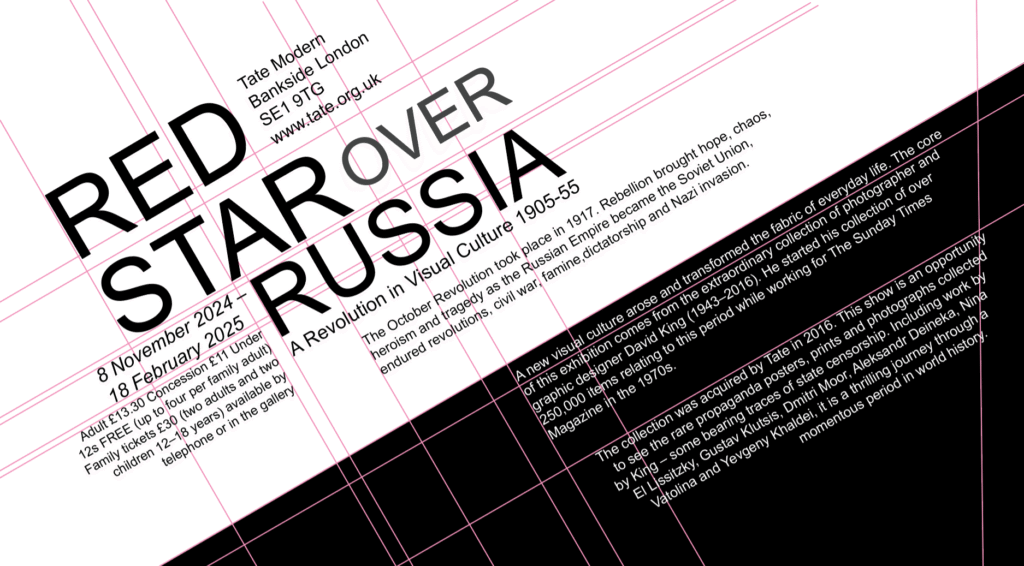
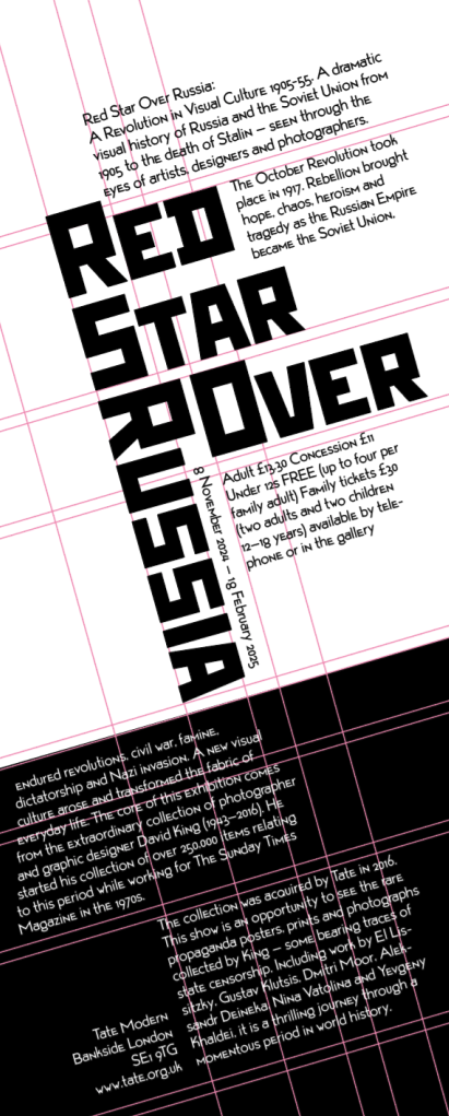
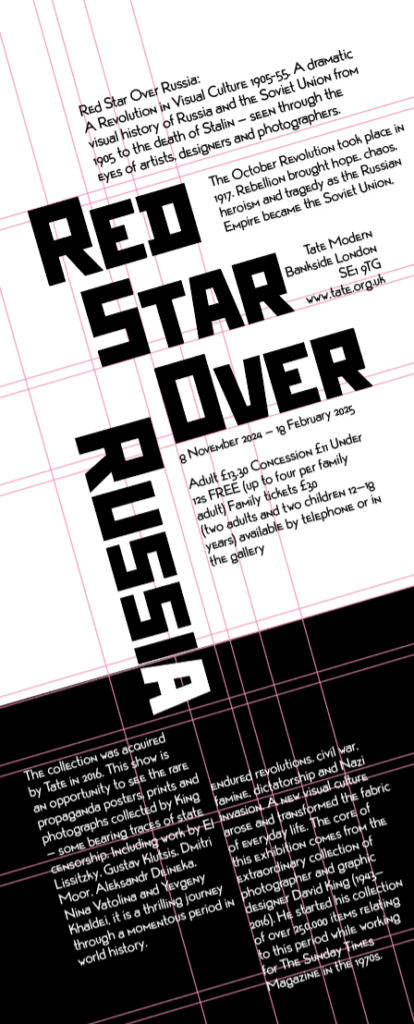
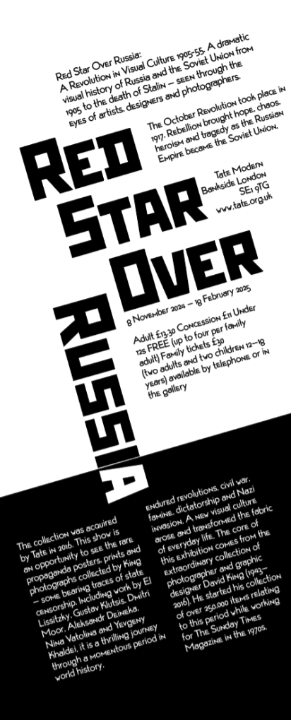
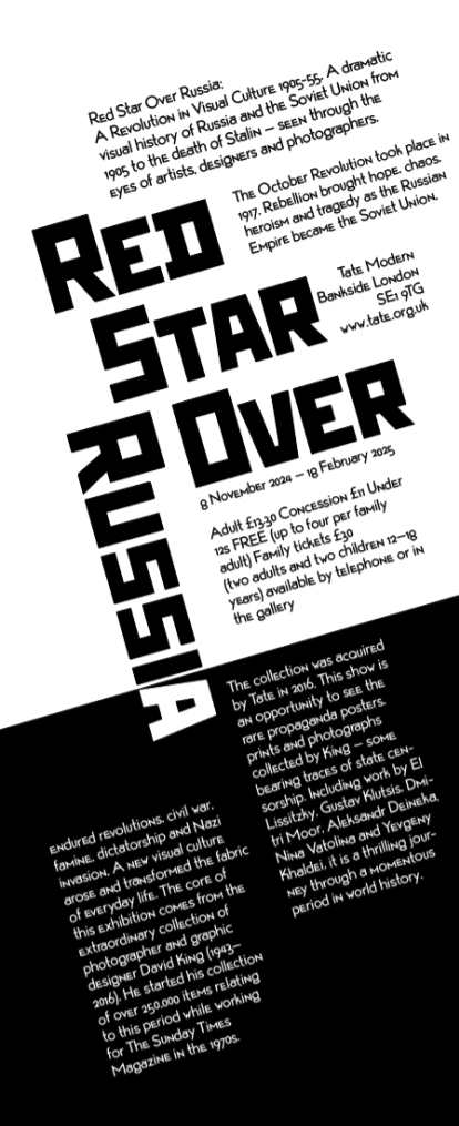
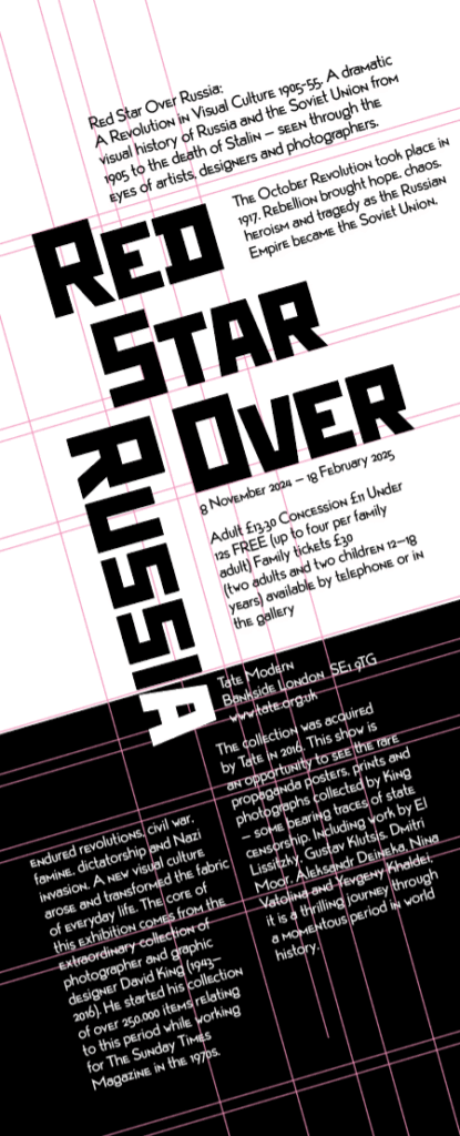
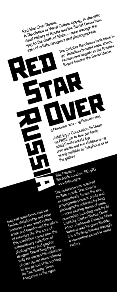
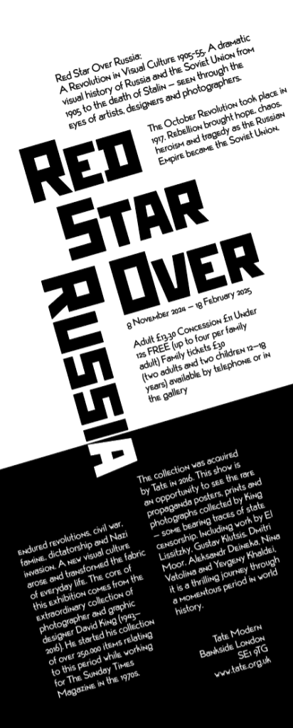
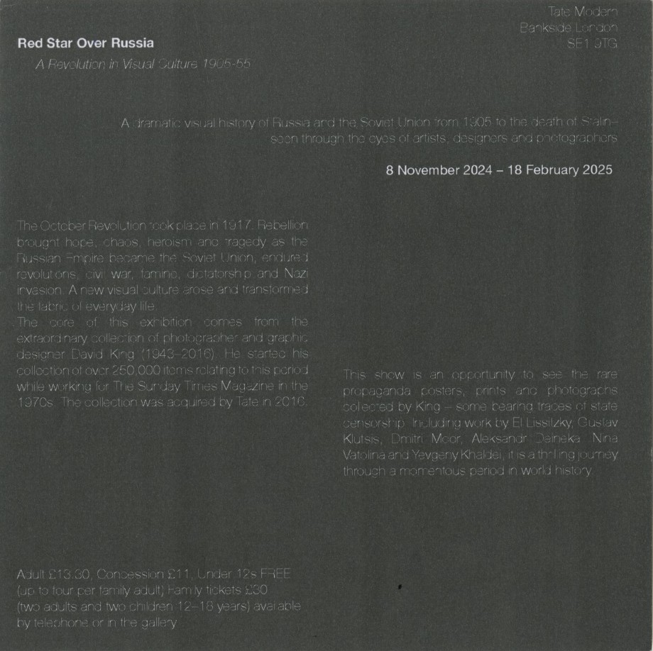
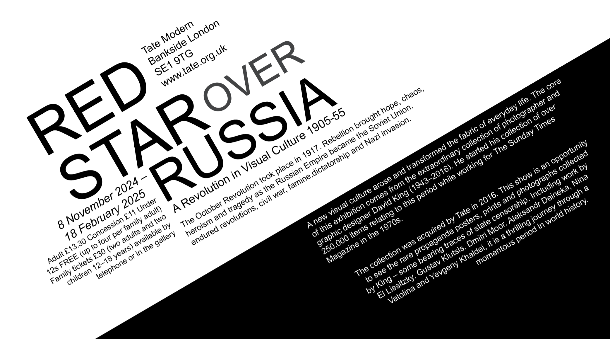
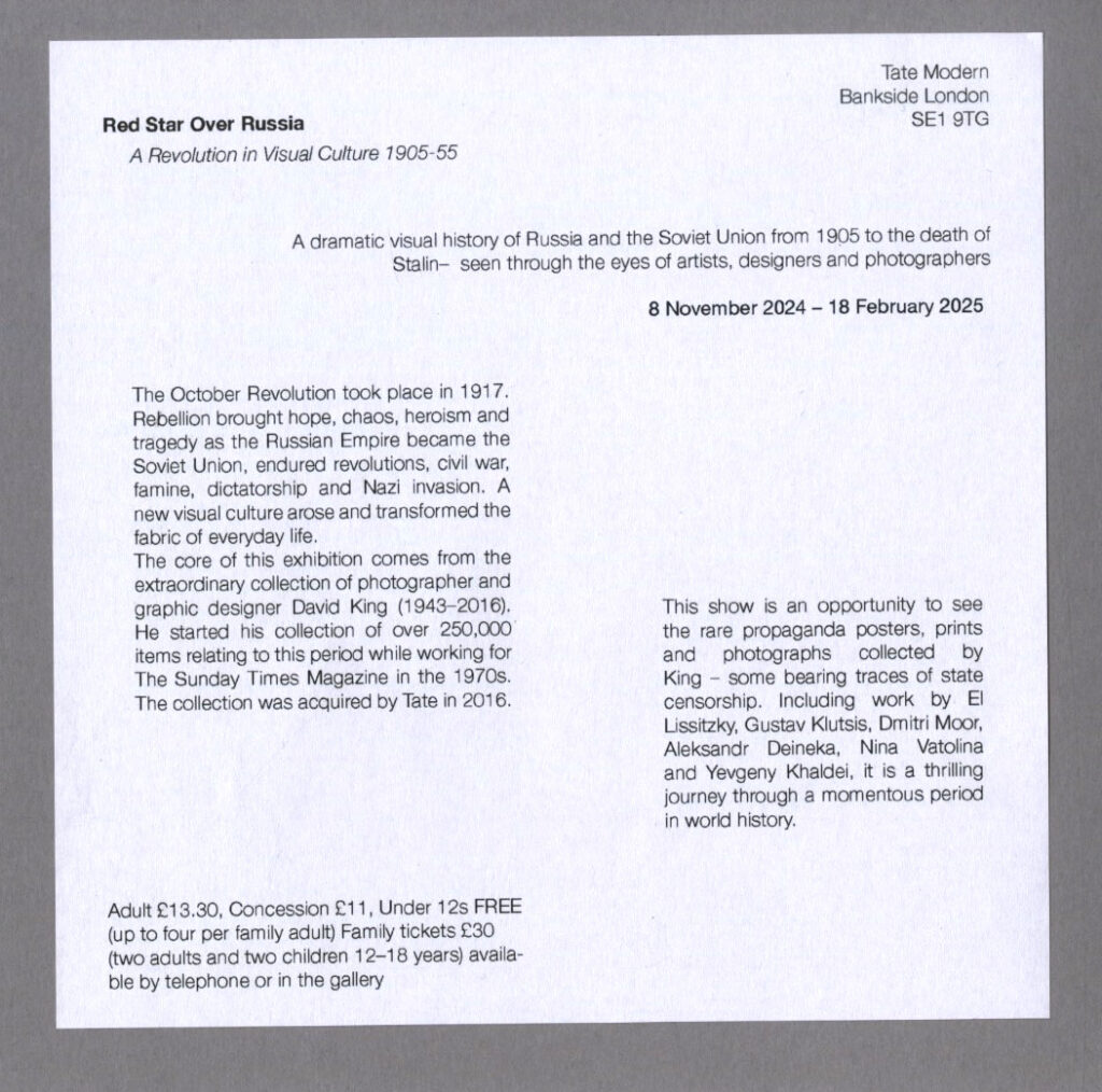
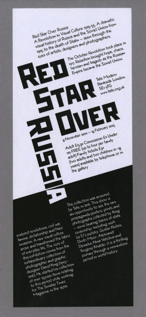
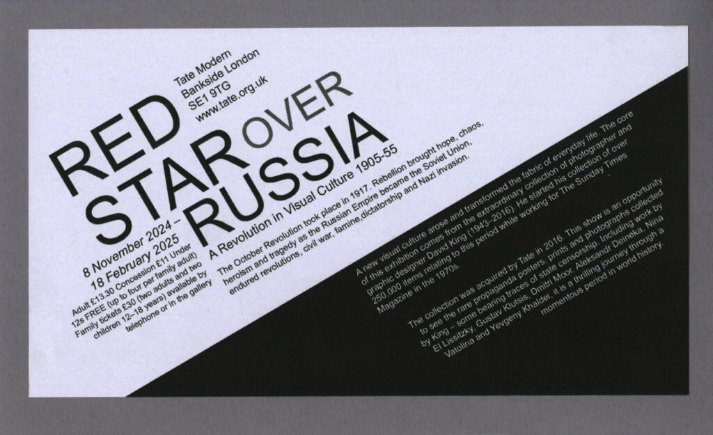
Tate Modern
Bankside London SE1 9TG
www.tate.org.uk
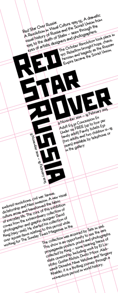
8 November 2024 – 18 February 2025
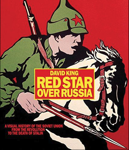
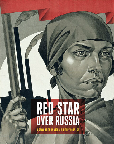
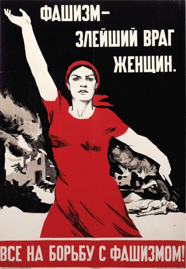
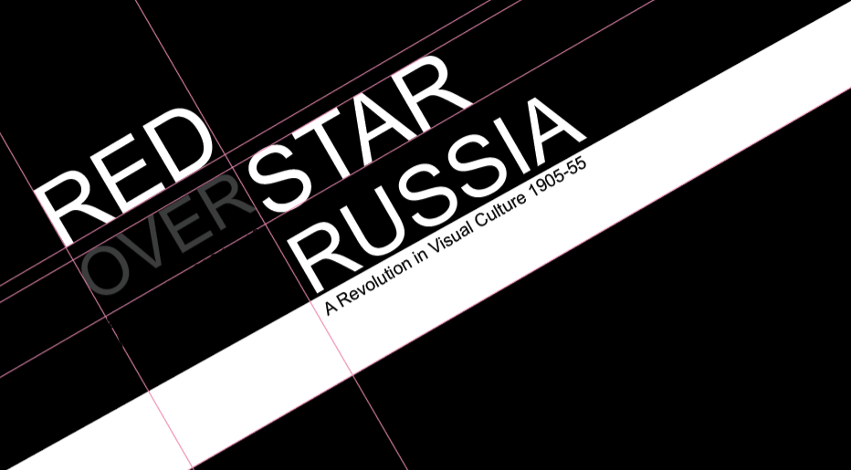
Red Star Over Russia: A Revolution in Visual Culture 1905-55
A dramatic visual history of Russia and the Soviet Union from 1905 to the death of Stalin – seen
through the eyes of artists, designers and photographers
The October Revolution took place in 1917. Rebellion brought hope, chaos, heroism and tragedy
as the Russian Empire became the Soviet Union, endured revolutions, civil war, famine,
dictatorship and Nazi invasion. A new visual culture arose and transformed the fabric of
everyday life. The core of this exhibition comes from the extraordinary collection of
photographer and graphic designer David King (1943–2016). He started his collection of over
250,000 items relating to this period while working for The Sunday Times Magazine in the 1970s.
The collection was acquired by Tate in 2016. This show is an opportunity to see the rare
propaganda posters, prints and photographs collected by King – some bearing traces of state
censorship. Including work by El Lissitzky, Gustav Klutsis, Dmitri Moor, Aleksandr Deineka, Nina
Vatolina and Yevgeny Khaldei, it is a thrilling journey through a momentous period in world
history.
Adult £13.30 Concession £11 Under 12s FREE (up to four per family adult) Family tickets £30
(two adults and two children 12–18 years) available by telephone or in the gallery
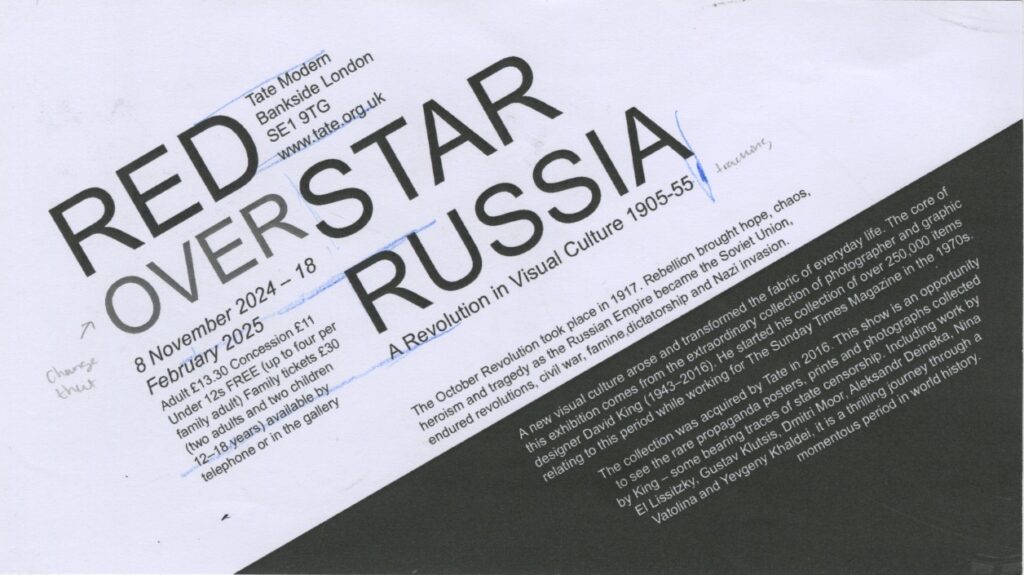
Restrictions I used for each:
- 160mm x 160mm – One typeface in one size, but as many weights
- 115mm x 207mm – One type family, as many variants and sizes
- 245mm x 100mm – Two typefaces and Two sizes
Thumbnails
I did a few for each sized poster, trying to make it as close to the poster as I could so that I could match the thumbnail to my final posters when I come to make them.
Poster 1:
160mm x 160mm – One typeface in one size, but as many weights
Feedback:
When printed out the print didn’t come through properly as it is an inverse print so
When printed out the print didn’t come through properly as it is an inverse print so change it from black to white background, inversing the colours, as when I sent it to print with the white text on black background, it was quite unreadable, then still ended up making the text a light instead of thin so that it was even more readable.
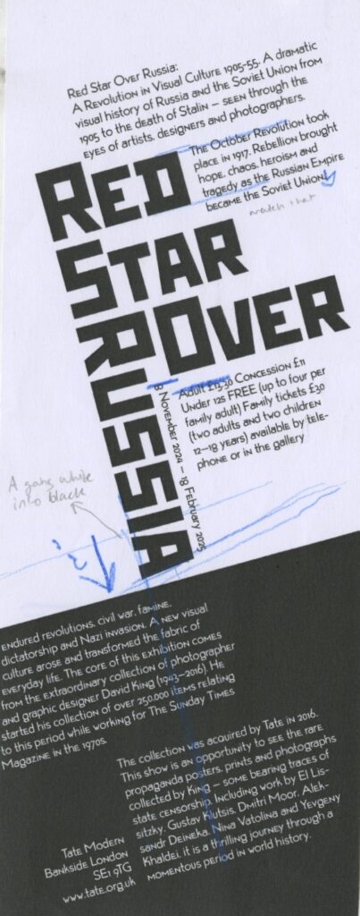
Poster 2:
115mm x 207mm – One type family, as many variants and sizes
Feedback:
I rearranged the title so that it reads Red star over Russia rather than Red over star Russia which at the start I didn’t notice it too much as well as lining up the text with header.

Poster 3:
245mm x 100mm – Two typefaces and Two sizes
Feedback:
The two blocks of text were too disconnected and felt too separate and so I brought the ‘A’ down into the black area and inversed the colour to white.
Final three posters Feedback
These are the scan in of the posters and the square one is not readable as its an invert poster and when printed, the white doesn’t come through properly.
This one above, when I showed peers, they said that it read as Red over star Russia which was not intended.
The portrait poster felt like two separate pieces of information
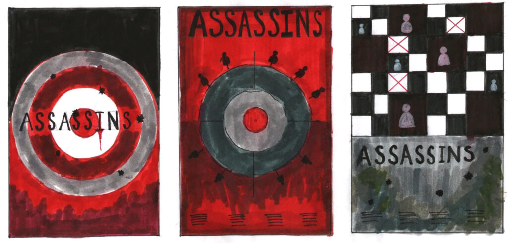
Final three posters:

Mounted posters:
Brief:
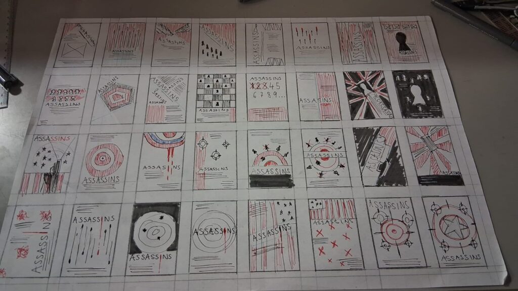
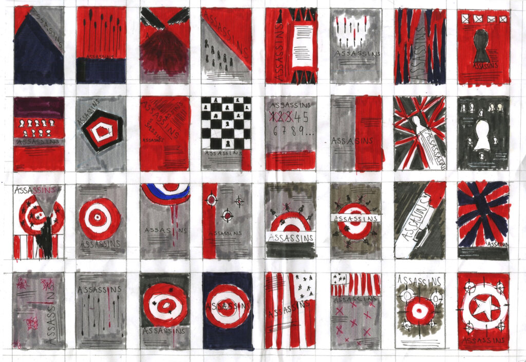
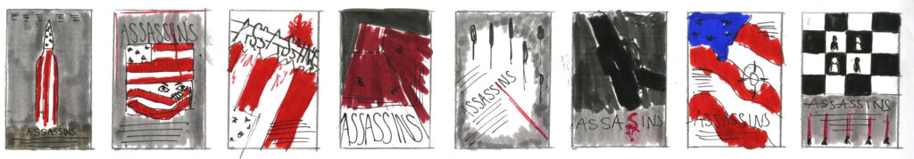
Working on A3 layout sheets you are asked to generate at least 40 different thumbnail ideas (50-60mm tall ) for a portrait format theatre poster. select five of your ideas and subject them to thorough refinement and development (at the same scale as previously). Selecting five to further develop and then the best three of the five and work up to detailed client visuals.
- A3 sheets containing thumbnails for a minimum of 40 different ideas
- A3 sheets documenting the development and refinement of 5 ideas
- Three client visuals approximately 120mm tall mounted on grey card
Feedback:
- The thumbnails were not too visual on how the end outcome would look and better with more colour
- The spacing between the thumbnails were good
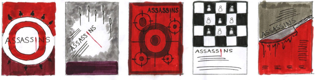
Final 3: